
A Good Country Album Cover???

we’ve made it to week 3!!! we almost didnt i cannot lie. i wrote this one a day before you may be reading it, so i squeaked it in, either way —>
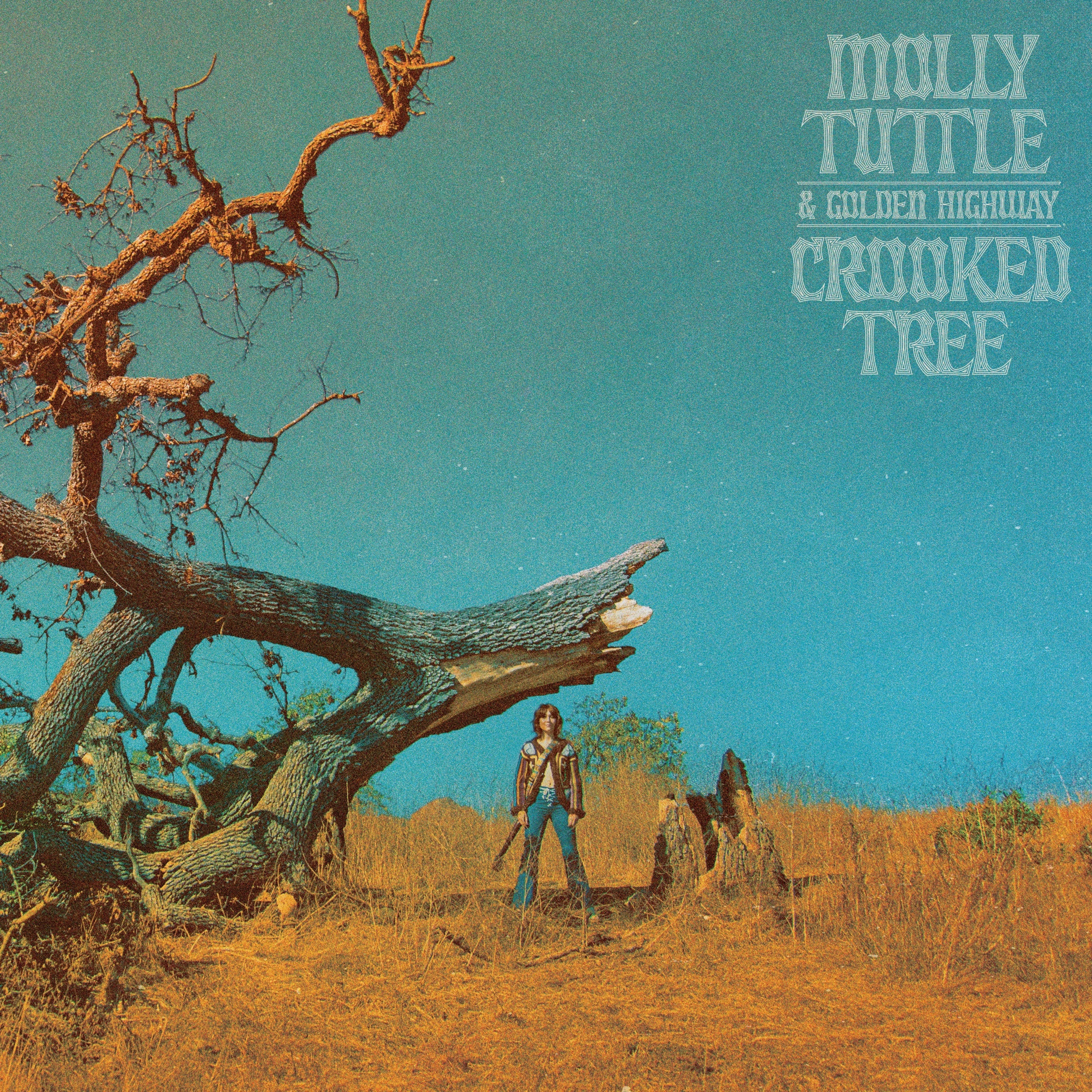
Crooked Tree
Molly Tuttle & Golden Highway
a good country album cover. i know its soooo hack-y to bag on pop country or country as a whole, but regardless of what you think of the music?? the covers for pop country (barring luke combs’ fun ideas, kacey musgraves’ few recents, and others i’ve never seen), are juuuuuust bad man. legitimately name another genre that collectively or individually has worse album covers. i don’t know who’s making these decisions but damn near all the covers are just, *the artist* and *their name*.
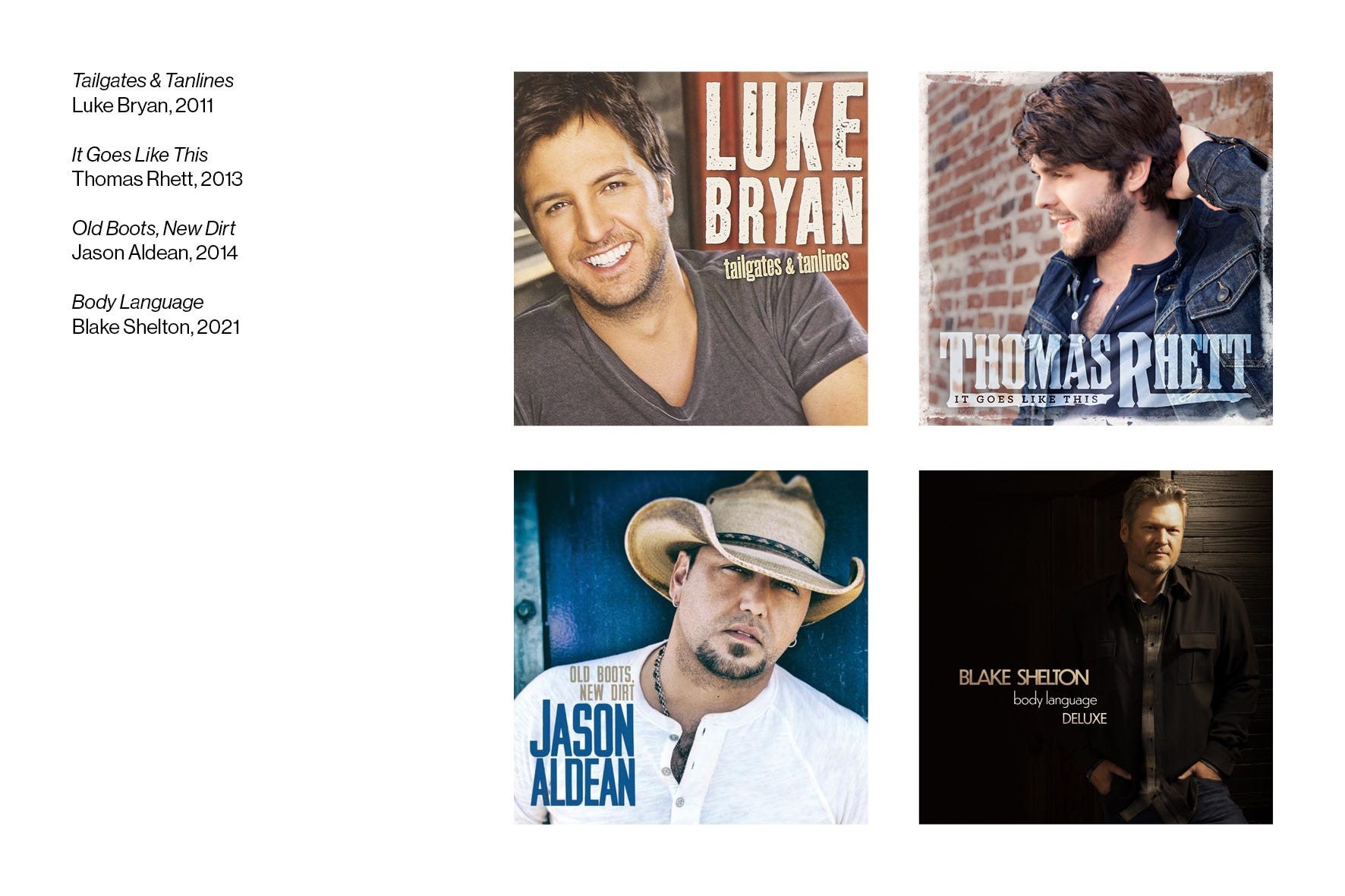
i honestly don’t like being too critical, and i don’t wanna be a snob, cuz someone worked on these and it could’ve been their big break, like we’re all looking for, but i just don’t understand the decisions. it doesn’t do the artist or the album any justice, it doesn’t draw me in even a little bit, if anything its just off-putting, and ultimately upsetting. pop country could do so much better.
now i don’t mean to hype this molly tuttle cover through the moon or anything, but it is quite nice, i hope you’ll agree. the colors are immediately captivating, and compliment each other so well. this separation of colors and where they separate reminds me of Punisher by phoebe bridgers. even the way molly is positioned and scaled is similar. this works well because the cover is easily identifiable at tiny scales, as you’d be able to make out the pop of teal and golden sand.
just now as im writing this right now i just realized that the tree towering next to her has broken in half on the ground. see thats interesting. theres some mystery. is it a heartbreak album??? lets listen to find out.
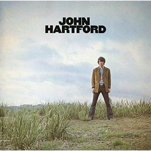
mainly though, i love this because i’m getting HUGE 70’s folk album cover vibes. check these out—
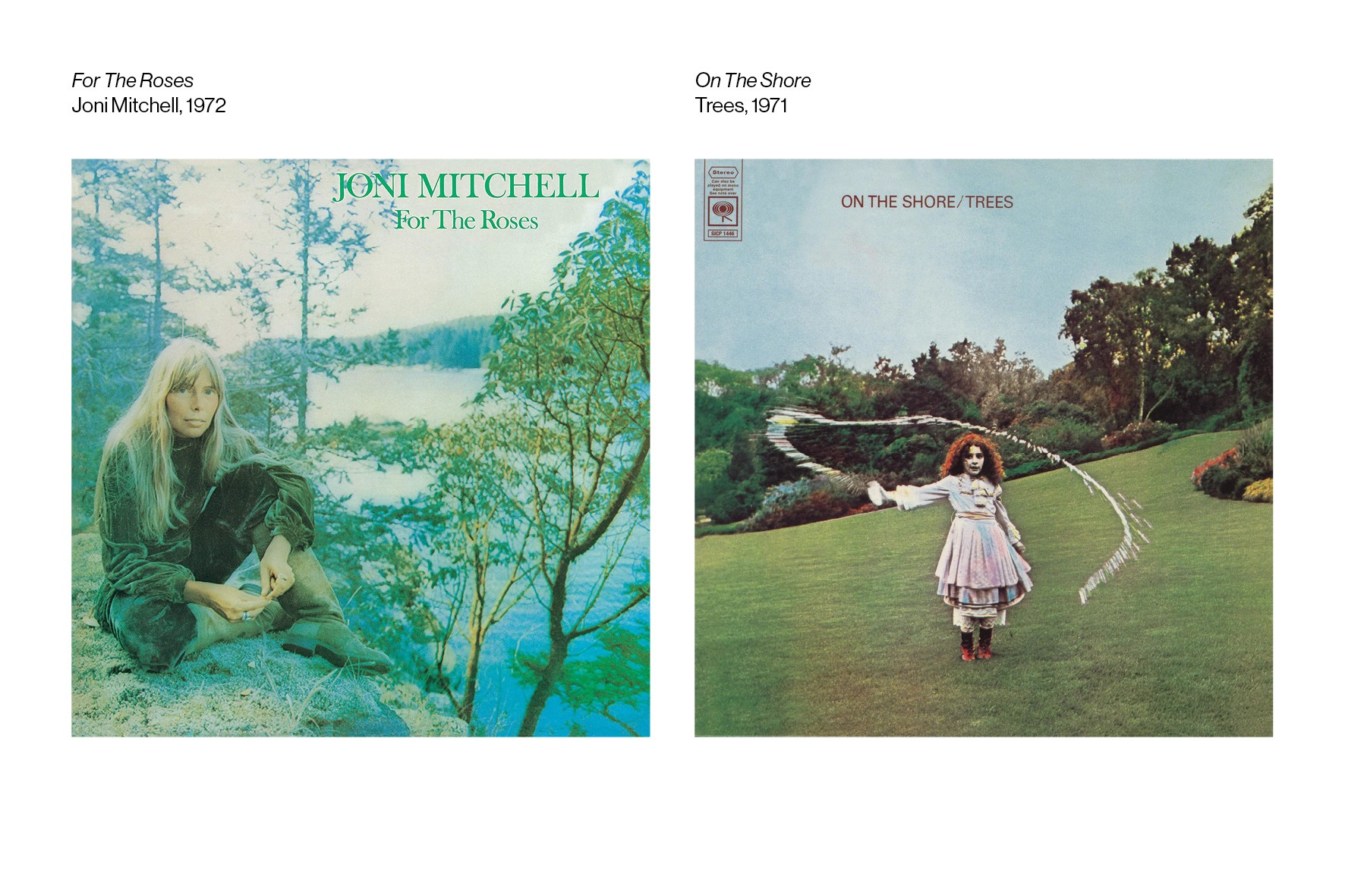
two gorgeous covers in color, texture, composition, mood and feel. tuttle’s cover shares these traits and executes very well.
tuttle herself even confirmed john hartford’s self-titled record as influence:
the type is done nicely too, it sets itself apart from these other country covers by displaying intention in the type-setting. the ligature on the “TT” in her last name, and how it mirrors words scrawled into the exposed bark of a tree (hence the title), all show intention and consideration in the designer’s hands.
DESIGN BY ?????
could not for the life of me find out who even shot the cover, which is crazy as photographers are usually credited 100x more than designers (yes i’m bitter). if anyone knows lmk!!
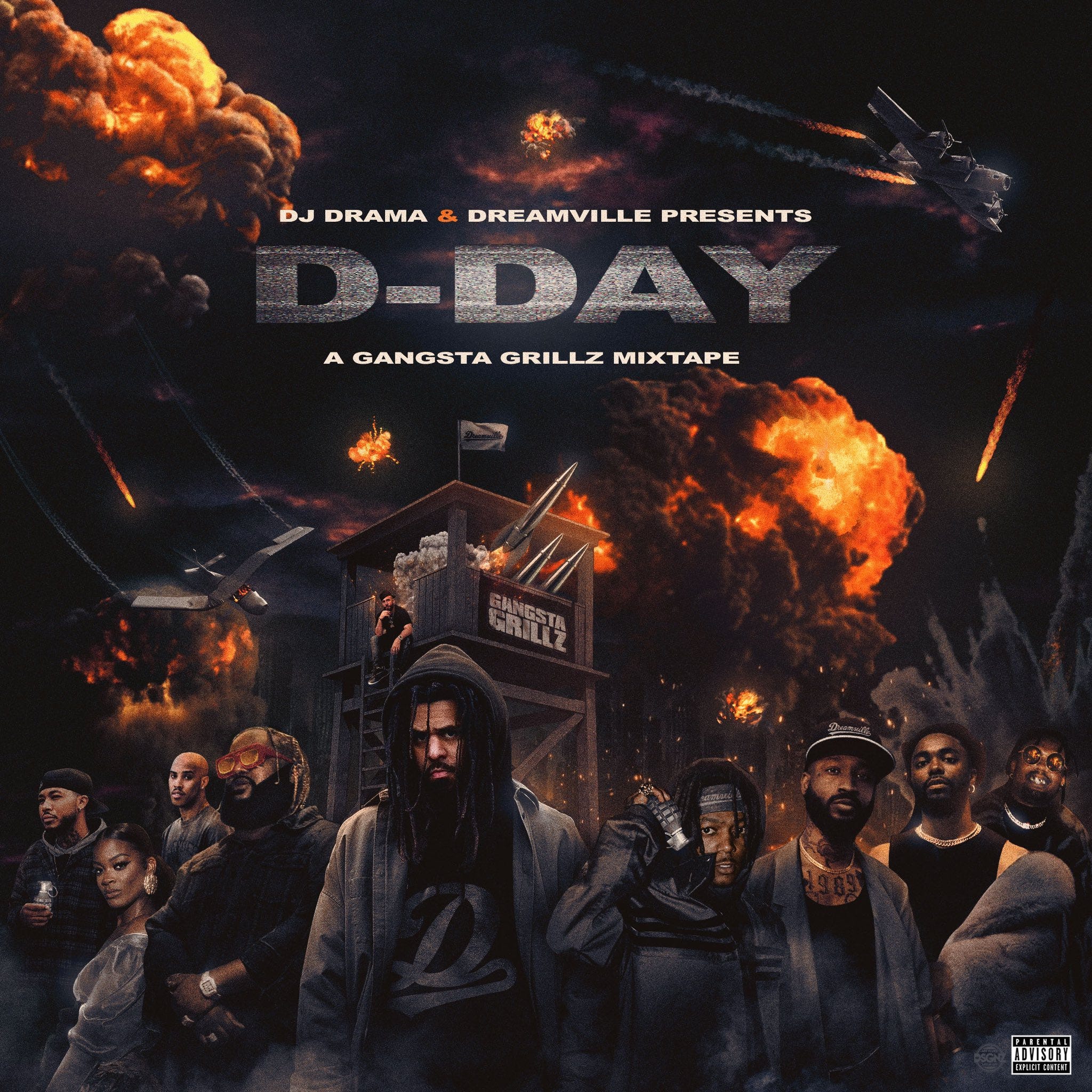
D-DAY
Dreamville & J. Cole
ok so this is a semi-big one huh. a touch of context: j. cole is one of my favorite rappers by far, i own all his albums on CD, and The Off-Season was my favorite album of 2021. im a fan.
D-DAY is a mixtape by cole’s label and hip-hop collective Dreamville, featuring all the artists you see on the cover, hosted by DJ Drama, legendary hip-hop DJ and music exec.
this context + history is so important in understanding and appreciating this cover art!!! DJ Drama has been releasing and hosting these mixtapes since 2001. his tapes, but more importantly hip-hop mixtapes in general hit a stride in the 2000’s to the early 2010’s. the cover featured here is a clear nod to the styles of those exact covers!!
you can immediately tell that the over-the-top nature that ruled this era is channeled in the dreamville cover.
in an article for Dazed, Tobias Hansson tells us—
“The music needed equally big and outrageous artwork to represent it, so mixtape covers transformed into ultra-condensed, totally uncensored, and often bizarre collages of ideas.”
for sure some of these covers are done much better than others, just on a technical level. you don’t have to look too hard to see that certain elements in the collage are much lower resolution than others, which sort of collapses the concept, but it almost doesn’t matter, as these covers aren’t taking themselves too seriously.
that being said, the dreamville cover is a big technical step-up i think!!! the fact that this started as a blank white canvas is crazy to me. this sort of from-scratch photo-compositing is incredibly tricky, and the designer, KD Designz, lives in this style. it’s no wonder he’s so good at it.
really everything from the lighting of each object and character, to the upward-facing perspective, to the consistent grain throughout is all done so well! i do have nitpicks, as some of the objects further back could benefit from more blur or less lighting to push them further back in our field of vision. im also not crazy about the type, im usually into more flat type in terms of effects, but the thing is—this type fits like a glove in context. again, it harkens back to the type style of those older mixtapes, all of which fit the vibe they existed in.
overall, i dig the D-DAY artwork, its fun, it doesn’t take itself too seriously, its nothing like past dreamville artwork really, and its cleverly seeped in history and nostalgia!!!
DESIGN BY KD DESIGNZ
thats this weeks entry, i hope you learned at least one cool thing!!