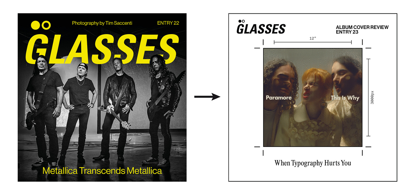
Last entry saw a pivot in the design for this newsletter, mainly in the title card graphic that usually lives up top. It went from a sort of full bleed publication style graphic, with a large header and photo of the artist, to a white square with the album cover front and centre, mimicking printing the cover on paper and marking it up.
That change took a lot of iteration and changes, there was even a version where I made the background into one of those green cutting mats you see in design studios. Nothing felt right, even the white background mentioned earlier. I felt like I had to leave it, just due to the fact that the Paramore review had to drop, and was already late.
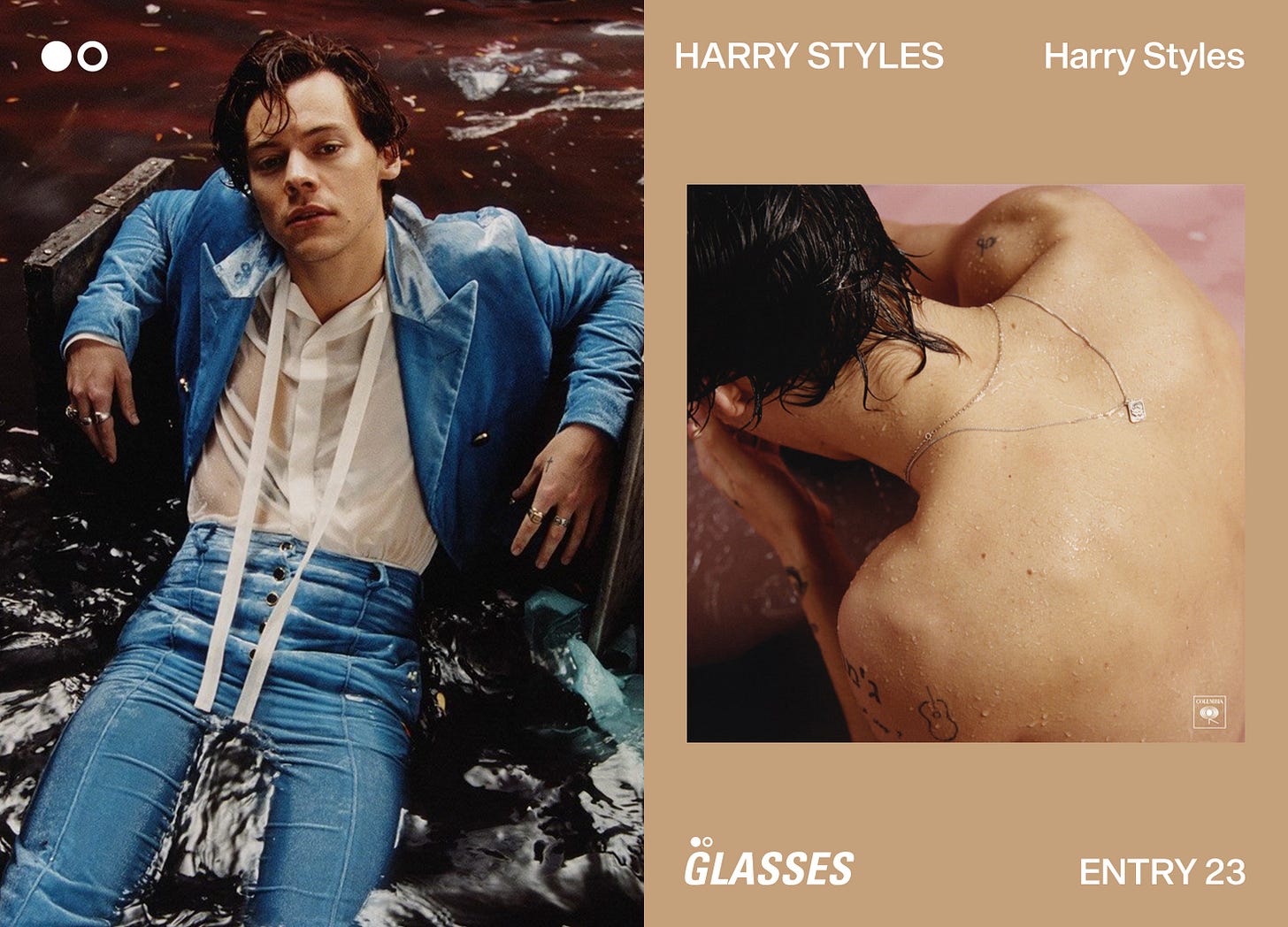
Well. I’ve done yet more R&D. I have hopefully landed on something that feels like a nice middle ground between the two. I love having a picture of the artist, but also need a good presence of the album cover, because it is an album cover review after all. Also, just dropping the cover into the frame of the white square was boring, and I wanted to do more designing than that for each entry.
Behold, the new title card for GLASSES. I hope you’re into it, I feel it has more personality than the second iteration, and again, merges the two in a graphically interesting way. It’s a dynamic design system, as the colour behind the album changes depending on its palette, and the artist photo changes too of course.
Here’s to this new iteration sticking around!!! I think it’s nice, and here’s a little celebration of the first visual era—
and then the refinement/longest visual era—
To a bright future of GLASSES :) Thanks for sticking around while I figure out the identity of this new thing!!!


I’m liking this new one you’ve got cooking
Thanks for showing your thought process, love your work. New on here, but I'll definitely be sticking around... Would love to know your personal origins in this space.