Always Blur Your Tomatoes
...and other vital design tips.


Welcome to the first entry of GLASSES, the (hopefully) weekly newsletter dedicated to design, album cover reviews, cultural discussion, and music recommendations.
Quick background—My name is Sam, I’m a graphic designer working primarily in the music industry (album covers + packaging, merch, promotional pieces, etc.). I love music, visual art, fashion, and pop culture. This is my Instagram, and this is my website.
Each Tuesday I’ll be reviewing 2-3 notable album covers that dropped that week. If something releases and I don’t cover it, drop me a line and request it!
If you think your buddy would like this shit, go on and share it to them! Let’s grow this little community.
CRASH
Charli XCX
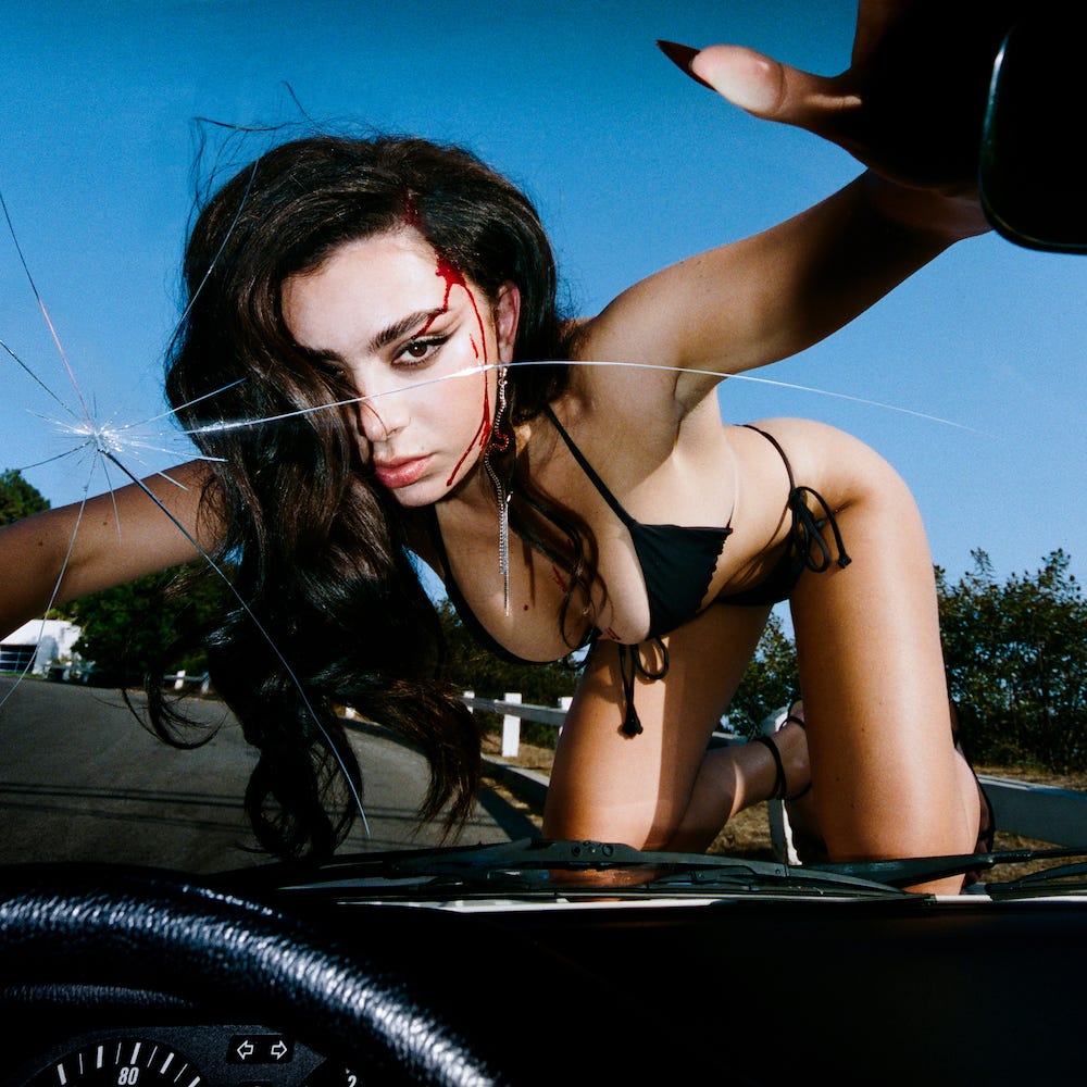
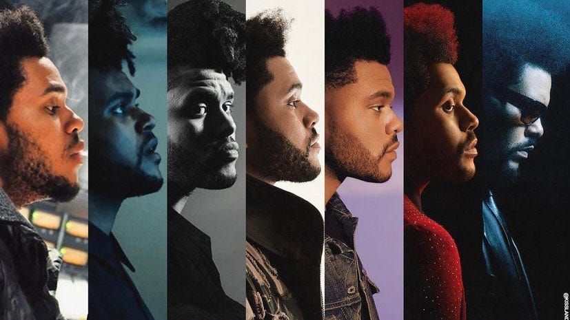
Made evident by the content of the cover and the supplementary promotional material, this campaign is clearly photography-lead. If the photography is killer (in which case, it is here), then great, no prob. As a designer though, I tend to lean towards more graphic-heavy covers, or at least when the rest of the campaign is graphically and typographically focused. Photography can be great for simple iconography, with bloodied Charli in her black bikini, you’ll be able to look back and remember that image as her “CRASH era.” Similar to how The Weeknd goes through some sort of transformation for each project—
Overall, I love this cover, the main photograph is extremely dynamic and filled with energy. It’s got motion to it, it feels like what you’re seeing is actually happening in front of you, like Charli jumped out into the road and caused this crash you’re now in together. The crack of the windshield is serendipitously to the left of her face, leading your eye from left to right down her body. Her hand grabbing a hold of the top corner of the frame makes it feel like you’re that much more sucked in. The blue sky in the background works as an oddly calming gradient, juxtaposing the chaotic scene jammed into your face.
Whoever’s decision it was to pull the red from her bloodied face to the rest of the album’s typography did a great job in visually pulling the whole package together.
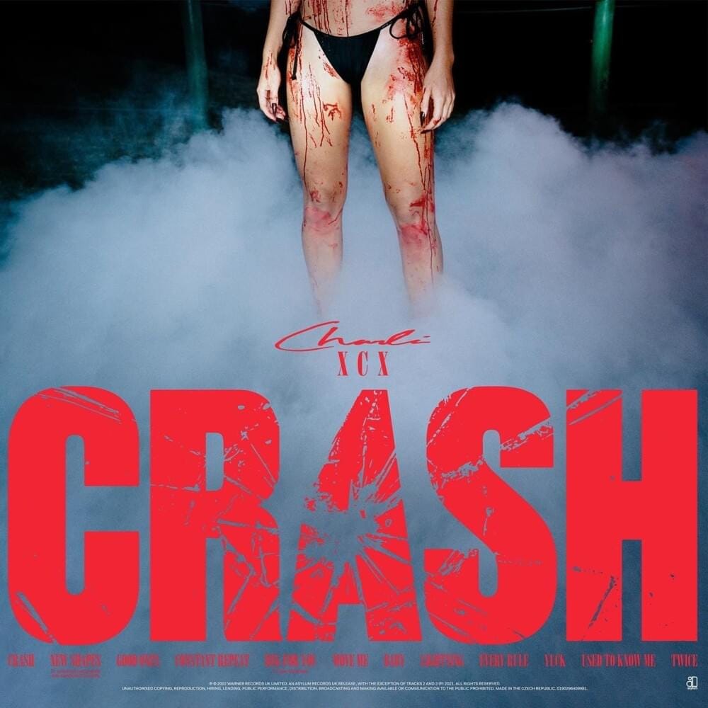
The album’s main logo type is done gorgeously, it’s bold, it’s loud, and thematically fits like a glove. CRASH even got a cassette release, and my fucking god is it pretty.

It harkens back to how they used to do lots of cassette releases, where the original album cover’s square aspect ratio doesn’t adapt to the cassette’s rectangular shape, leaving the cover in full. The (hopefully) grid-assisted layout of the type, UPC code, and track list are lovely and retro, using what appears to be a mix of Helvetica and Times to fill out the rest of the information. Super well done all around, hats off to you Collin, imogene, and co.!!!

COVER PHOTOGRAPHY BY TERRENCE O’CONNOR
DESIGN BY COLLIN FLETCHER
CREATIVE DIRECTION BY IMOGENE
Georgia Gothic
Mattiel
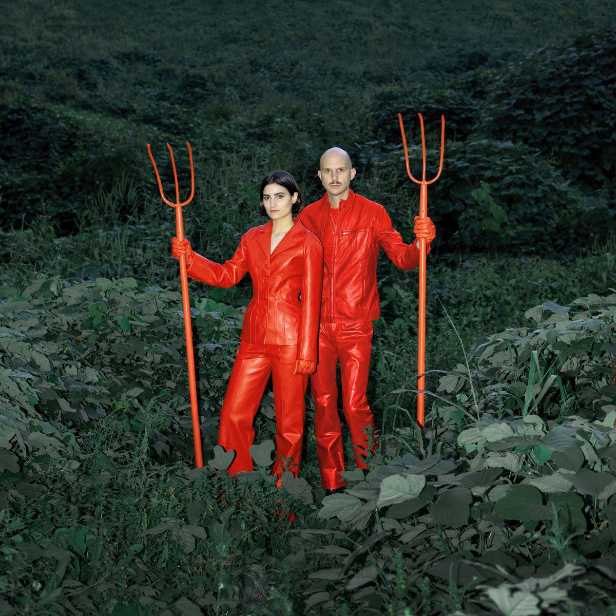
I first saw this cover in HMV while perusing the shelves for new CDs, and it stood right out (and made me listen to it). The dark green forest background’s complex makeup seems like it would pose an issue in having the figures stand out, but the crimson red of their outfits paired with the sharp edges of the pitchforks fully makes the band pop out. Even from afar and at a smaller scale in the store, the cover got me to walk over to it.
The photo is an homage to Grant Wood’s famous 1930 painting, “American Gothic.”
“Red-leather-clad and pitchfork-wielding in a playful nod to Grant Wood’s celebrated painting of 1930, Mattiel’s Mattiel Brown and Jonah Swilley proffer songs which ponder the American everyday of the 2020s as they serve up an album tasting more like home than ever before“ (bandcamp, 2022).
When I flipped over the CD though, the back cover layout and type work fully sold me.
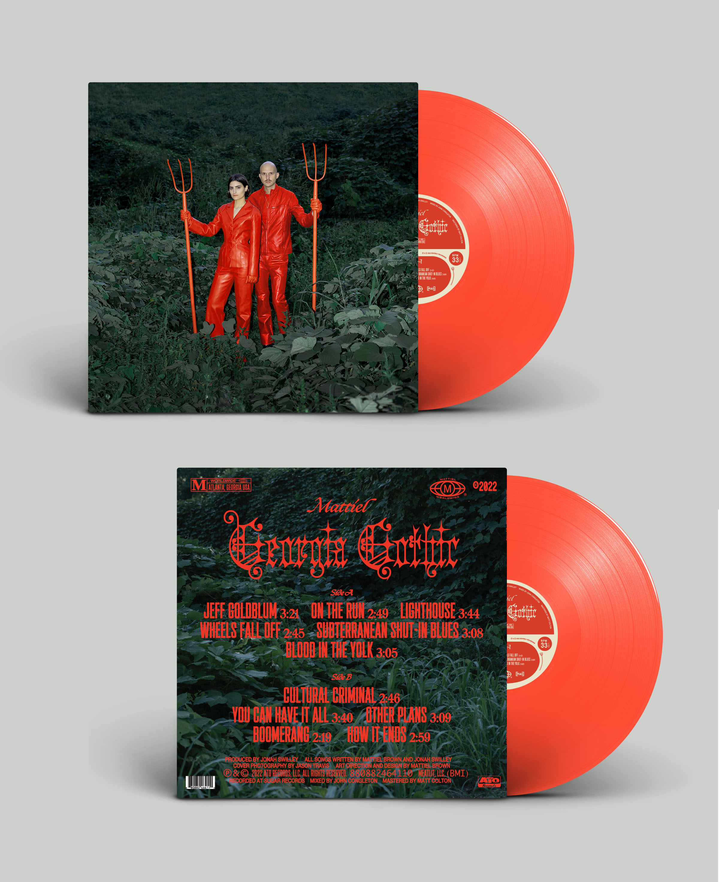
The way Brown was able to look at the release as a full package allowed it to come together so well in this way. It’s got the perfect amount of green grass and leaves to allow the red to smack you upside the face, colors alone.
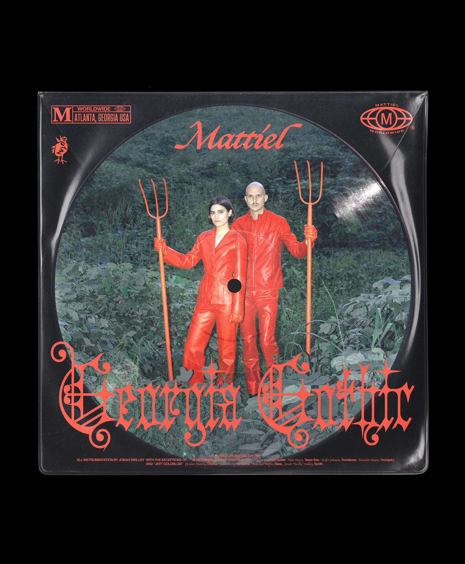
The typefaces??? Forget it!!! The way that specific black letter, Clavichord feels so new and so old at the same time was the perfect choice for the title logo. “Mattiel,” the band’s logo type, is set in Apple Chancery (but looks surprisingly good???), with the track list being set in Plaak Extra Condensed and Ogg. The supplementary type is made up of various weights and versions of Helvetica, allowing the header type to breathe.
Overall, one of the better album covers and album identities I’ve seen in a bit. Really energised me. I love type-heavy packaging, especially (and obviously) when it works in perfect harmony with some stellar photography. Major props to Mattiel Brown for somehow being an incredible musician and designer.
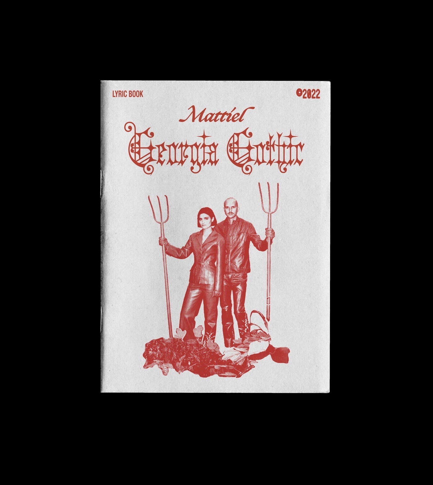
COVER PHOTOGRAPHY BY JASON TRAVIS
ART DIRECTION AND DESIGN BY MATTIEL BROWN
mainstream sellout
Machine Gun Kelly
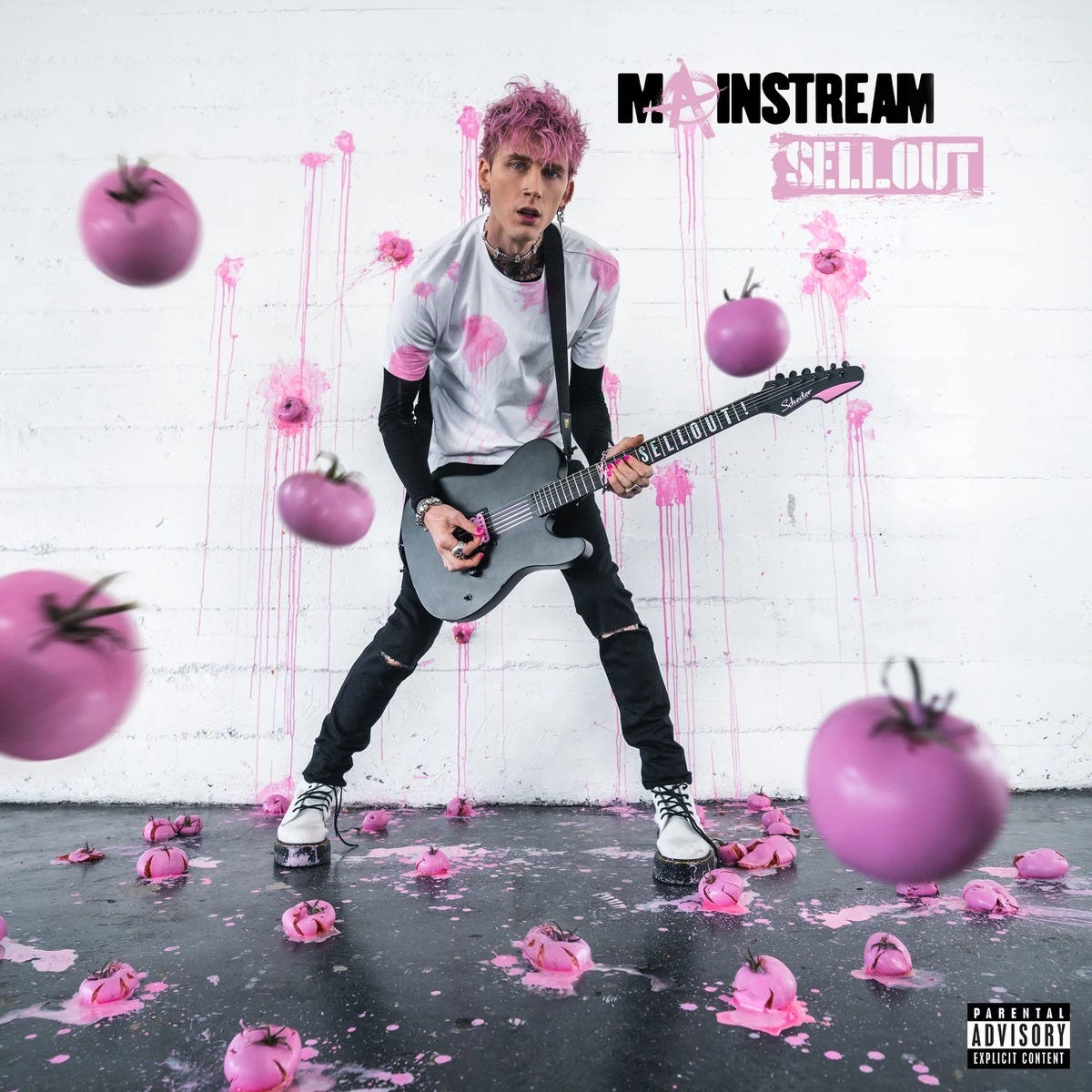
Hot take, I like MGK. I wasn’t really a fan until Hotel Diablo, circa 2019, a year after RAP DEVIL dropped. He had a cool look, cool wardrobe, and his music was good. Songs like “el diablo” hit super hard, had great delivery, and were great to listen to in the summer. So many people hate him for valid reasons, but either way, we’ve ended up here with this “mainstream sellout” cover art.
The whole shoot is practically done, Jordi and his team posted a video of them holding tomatoes by strings, with more real tomatoes squished on the wall and splattered on the floor. On paper, this is super cool. It’s nice to see bigger artists still do this kind of thing, when it could be easier done digitally.
That being said, this should’ve been done (or at least heavily edited) digitally.
The tomatoes in the immediate foreground could’ve been isolated and manually blurred out way more, to portray proper dimension and perspective. The tomatoes on the ground closest to the bottom of the frame could’ve benefited from the same effect. It’s all just a little off.
The type…well…I don’t have too much issue with the graphic presentation of the type itself, more the placement of it (unless you wanna point out the hilarity of a multi-millionaire flaunting the Anarchy “A”, shoutout HIVEMIND). If I had a hand in this, I would’ve probably digitally imposed the type massively onto the back wall, behind him.
Compositionally, the cover isn’t too bad. There’s a clear horizon line at his feet where the wall meets the ground, and his figure sits nicely in the frame. My main gripe is that all the elements are kinda the same size??? The front tomatoes should’ve been way bigger by having them bleed off the page much more. The type should also be larger, as I mentioned, maybe huge on the back wall (practically hand-painted???) to give it more compositional harmony.
The album has a few alternate covers, which is quite nice. The photography is more engaging.
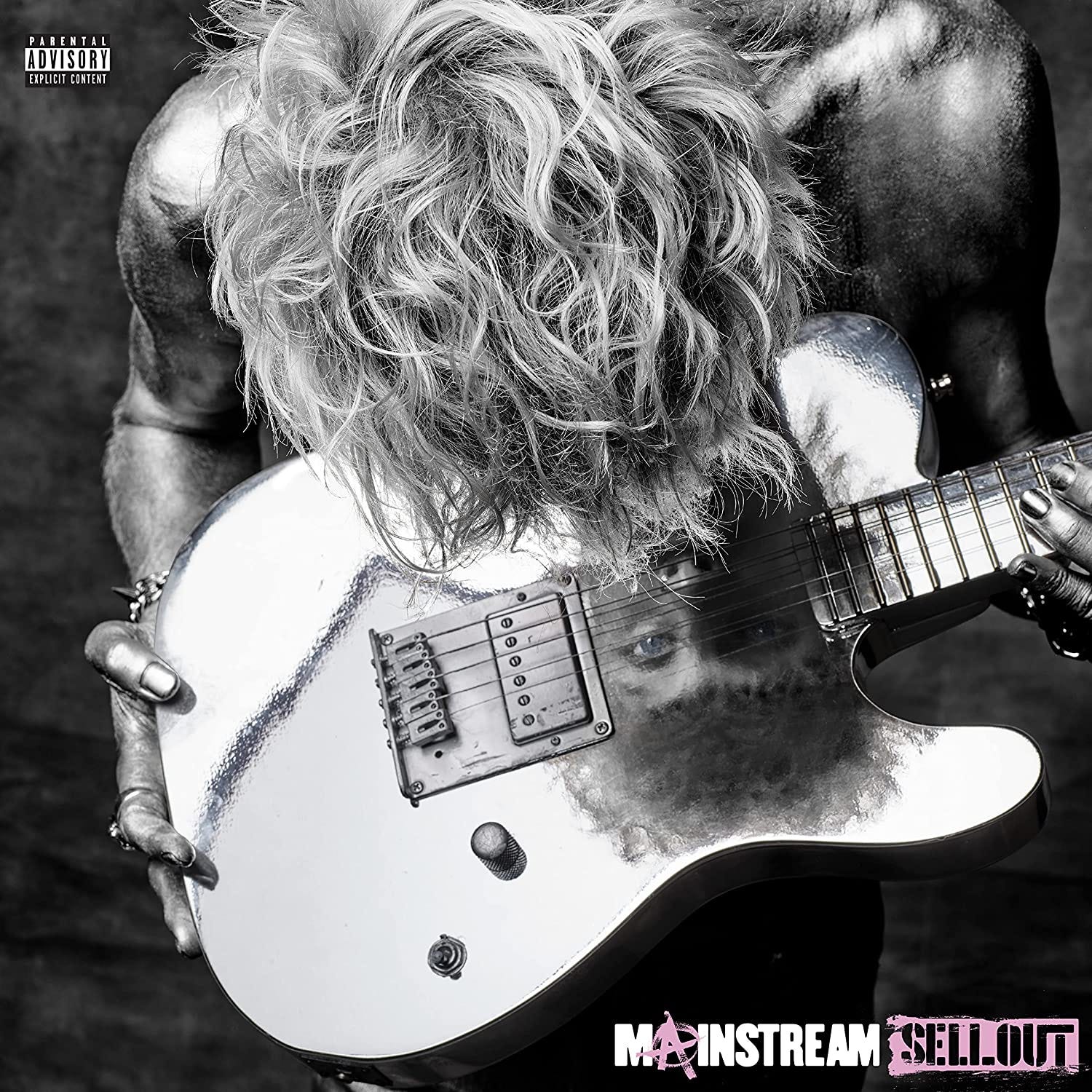
This shoot was done by Mark Seliger, and it’s just more fitting, isn’t it? The original cover sees MGK dressing a little bit off for his age, making him look like someone trying to hold onto their fleeting youth. These ones here are more visually interesting, and more mature even? They’re cooler and edgier to me, and might work as incentives to grab each different kind of physical release for fans.