


Do You Still Like Post Malone?
ENTRY 09: posty's confusingly minimal album rollout


almost at ENTRY 10 y’all. been waiting to do this one, as posty’s got some of my absolute favourite visuals of all time, they’re very close to my heart and got me deep into graphic design. super inspirational work that helped shape my identity as a designer/artist.
Twelve Carat Toothache
Post Malone
i still very much love post malone. he’s top 5 for me. his fourth studio album, Twelve Carat Toothache arrives this week, and it feels like i’m the only person excited for it. i’ve been so deeply confused by the public perception of post malone since 2019’s Hollywood’s Bleeding, one of my favorite albums of that year. it’s pretty clear that the dude has general respect, as he’s one of the more kind individuals in his space, always cited as being humble and respectful to everyone. i’m more confused about the perception of his music and the hype (or lack thereof) behind it.
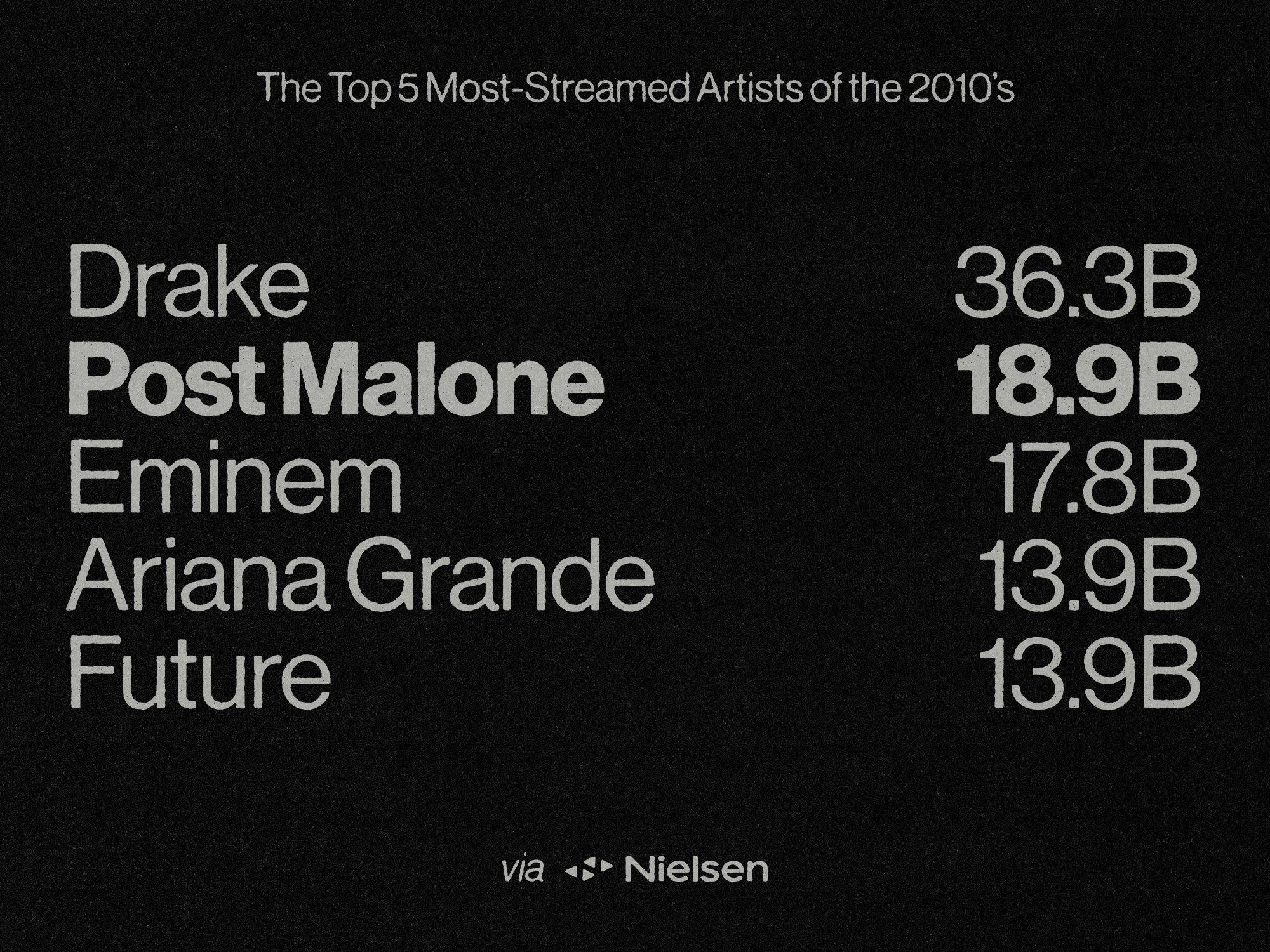
post malone was the second highest streamed artist of the 2010s, racking up almost 19 billion streams. drake was #1. ed sheeran was #9.
this shit is just mind-boggling man. i can’t stop thinking about this. “cooped up (feat. roddy ricch)” peaked at 29 on the billboard hot 100. “rockstar (feat. 21 savage)” went number 1, along with “psycho (feat. ty dolla sign)”. the lowest charting single from b&b was “candy paint,” as it had very little promo, and landed at 34 on the hot 100.
“cooped up” is really good to me. it’s nothing new, sure, and roddy’s verse leaves a lot to be desired, but it’s classic post. he’s got this sick and twisted grasp on melody and his refrains get stuck in your head way too easily. i’m just so confused as to why it’s not performing better!!!
i even asked a few people what they thought, and here are some theories—
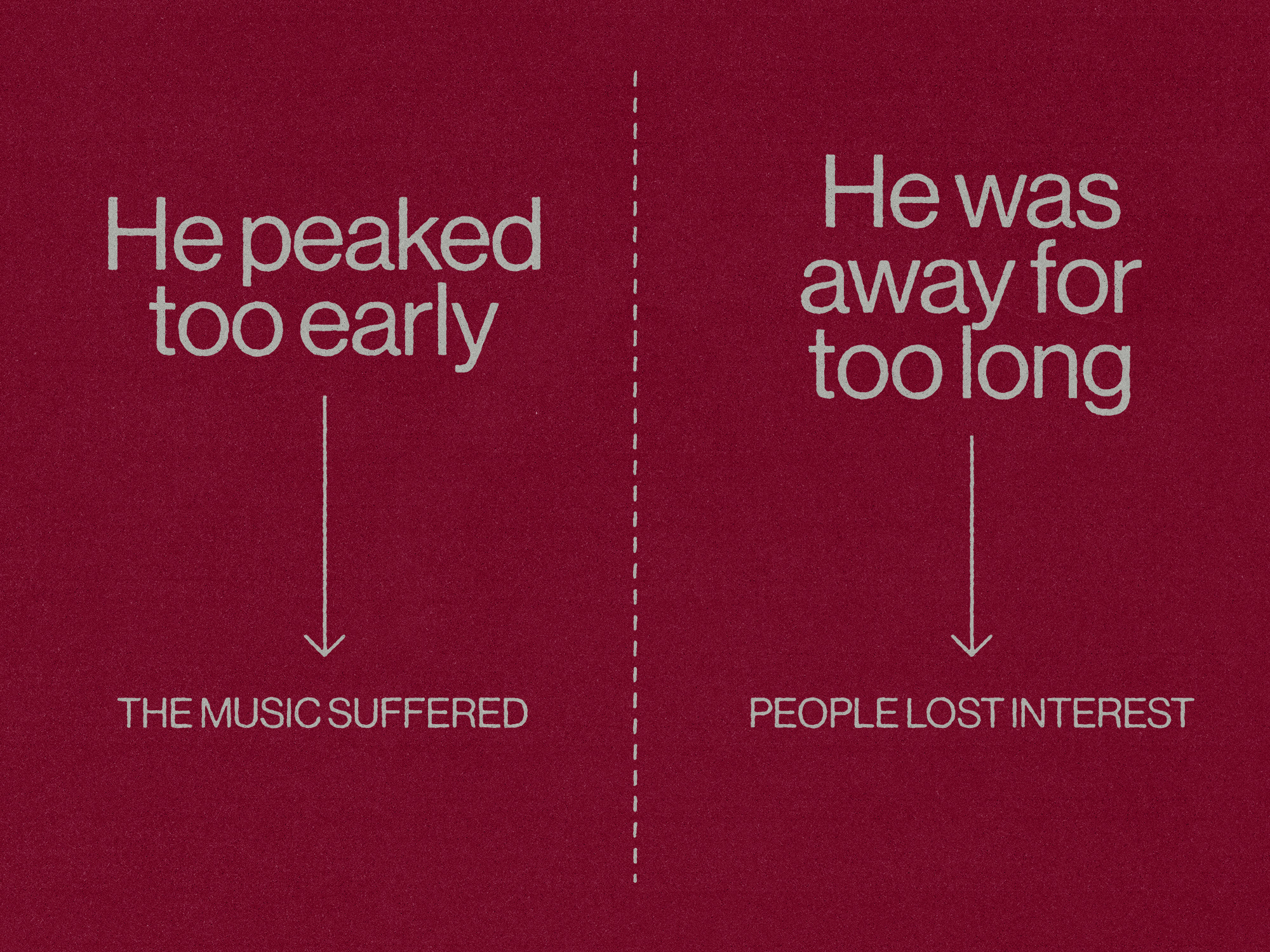
i wholeheartedly disagree with these, due to the fact that kendrick and frank ocean can go away for 5-6 years and still be the single most hot artists on the planet the minute they speak up at all. now i know post isn’t the same as kenny or frank, but again—he was the second highest-streamed artist of the decade. i know i’ve been waiting for new shit from him for a minute now.
ANYWAYS
ever since he came into the game with Stoney, posty’s visuals have been hands down my favorite music graphics i’ve ever come into contact with. led by my favorite graphic designer and biggest influence to date, bryan rivera, and co. (travis brothers), the visual identities weaved from Stoney to Hollywood’s Bleeding have been beautifully grimey, extremely identifiable, and stylisticaly copied to absolute shit (me included).
the merchandise ALONE is something to marvel at. an incredibly wide range of pieces have been made for each album, with a spread and mix of styles from underground to mainstream influence. mixes of messy typography and inky illustration bring together this tactile and muddy feel to all his merch, of which i have a few pieces myself. rivera even did an It’s Nice That interview about this signature style of his.

when you see all of this compared to the one (1) merch piece we’ve been given so far?
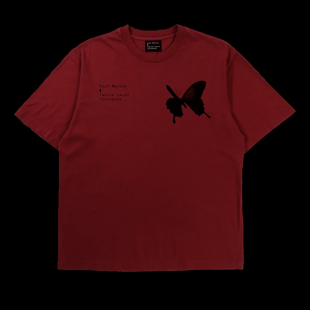
dunno man. you tell me. maybe we’ll get more down the line but this? just does not hit the same at all for me.
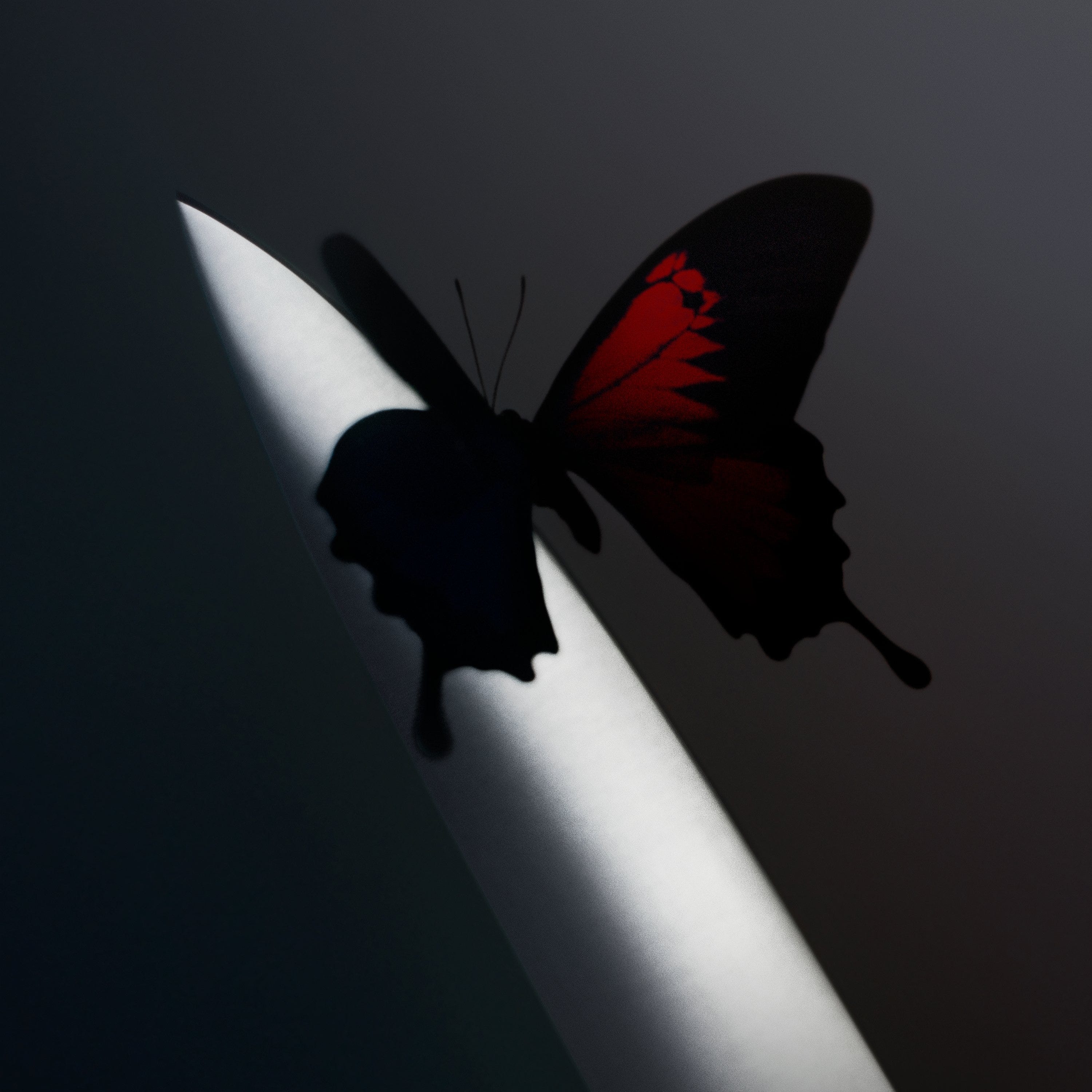
the actual goddamn cover itself
okay so yeah the cover right. i’m lukewarm on it. initially, i was kinda like. that’s it? i was wondering if it was just a placeholder tbh. i think other people shared a similar sentiment. his other covers have just been soooo good and fun, that this one feels a bit too simple.
looking at his previous album covers (again, all led by bryan rivera + co.), there aren’t any crazy visual threads running through. albeit tiny on b&b, post is featured on each cover except for the newest. when you look at the two recent covers side by side, they almost seem like sisters. the similar hue of dark grey/blue, and a subtly lit center focus. they’ve all had such personality. in context, i suppose it does fit alright? the more i look at it the more i do appreciate it, i’ll definitely be grabbing the physicals, i think they adapt the cover to a more interesting composition.

i’m not sure how the new cover was actually made. there are a fair few credits online, including jordan hemingway, a photographer, but i don’t know if this is a 3D render or not!! if this is a full on photo with just some post production/color grading, then jesus absolute christ, what a shot. the composition is perfect, and the lighting is just stunning. and to get a butterfly to somehow stay still like that ???
now regarding what’s actually pictured, i guess its up for interpretation. it seems to be most clearly a knife of some kind, as you can almost make out the darker edge to the tip of it, showing the blade. some have even said it reminds them of an apple pencil … lol. could be a toothpick (hence the title), a needle (dentist?), but its probably just a knife.
i’d really love to know what you guys think of post’s new cover, and if you’re hyped for the release this friday. pls sound off in the comments !!!
i agreeeee i post malone was either my top or one of my top most played artists the last few years so i'm super excited for this album. i knew it was coming out but the advertising wasn't aggressive? or i just haven't been paying attention, which is partially true. but anyway the rollout has been very laid back, im tryna remember back to the b&b and hollywood's bleeding rollouts but nothing really sticks out... maybe that's why it's not performing better, or proof that it's not. who knows. ANYway love to hear it sam keep up the good work <3