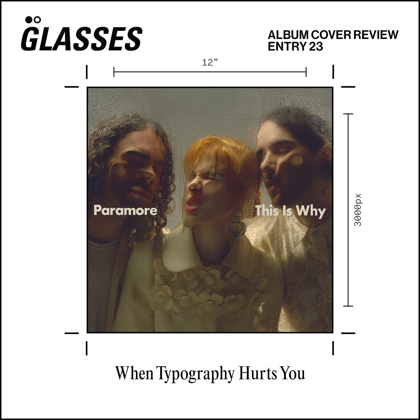
Paramore - This Is Why | ALBUM COVER REVIEW: When Typography Hurts You
ENTRY 23: also—an important GLASSES refresh!
Paramore’s six year hiatus is over, and they sound better than ever. This album cover however…
GLASSES refresh! I was doing a lot of thinking about this newsletter recently, namely its function and purpose. The main goal is discussing/reviewing these album covers, and the little title cards I make for each have not communicated that at all til now. Structurally, they felt too cookie-cutter-publication, like I was doing a feature or interview with the artist, and not dissecting their album cover. In this new iteration, the focus is now fully on the cover in question.
I made soooo many changes and iterations to this little graphic to get here, and while I do love the covers from the past and their dynamic colours and photos, I think this new version is more concise and holds more meaning as to the function of this publication. I hope you like it!
The Album Cover
This Is Why is Paramore’s sixth studio album. So much has happened since the release of their 2017 album, After Laughter. Without getting into it too much, there’s been a couple lineup changes, and Hayley Williams even released a few solo projects since then (they’re super good, check them out).
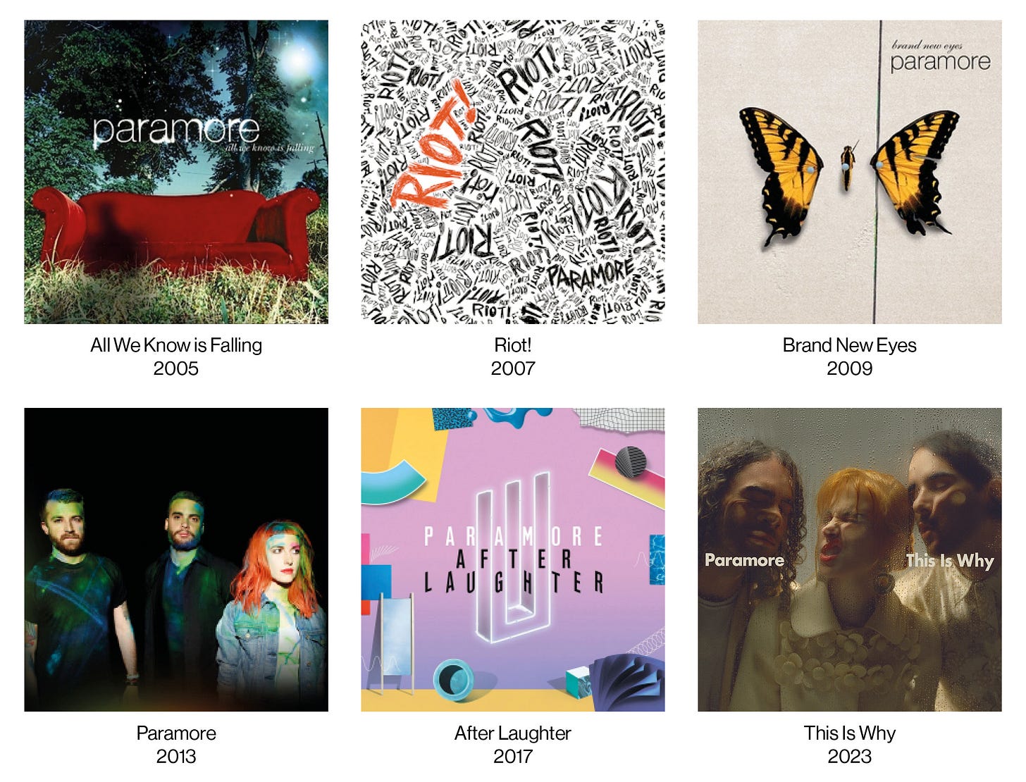
Viewing the cover in context, there aren’t really any visual trends over their discography.
My teen years were basically soundtracked by each Paramore release, as it was my sister’s favourite band at the time, constantly having them playing on the home stereo. Their early covers are pretty much of the time, with Riot! being their best in my opinion. It’s extremely loud and expressive, like most of the music on the album.
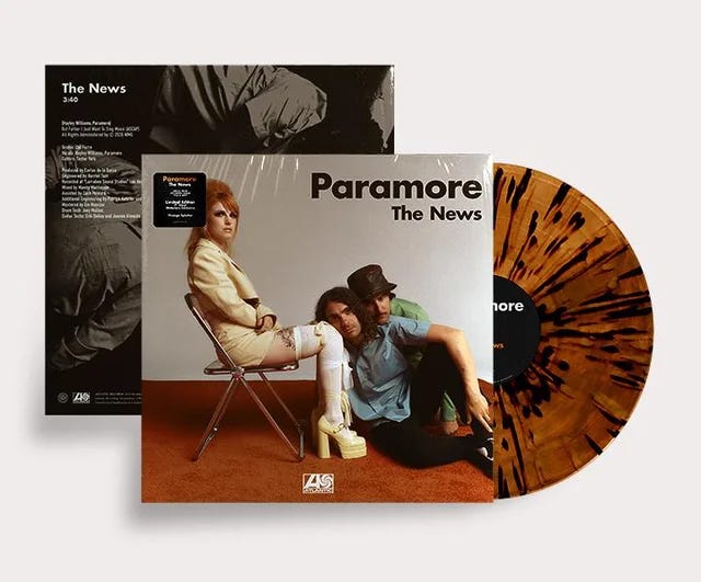
This Is Why almost has a similar palette to Brand New Eyes, with the focus on cream and earthy tones. The band’s 2013 self-titled release is the only other cover to feature the band itself (even being changed later on to just Hayley), but other than that, the new one basically stands alone visually.
The Poor Typographic Decision
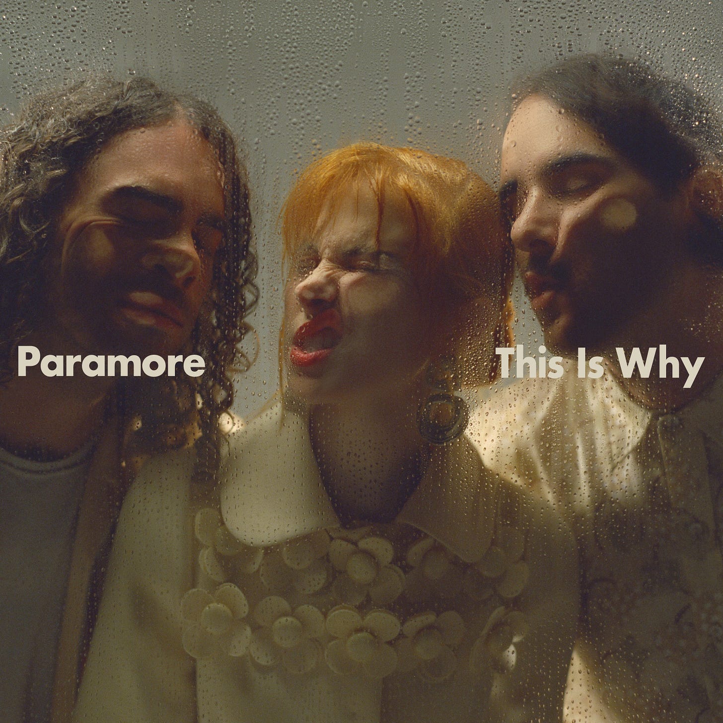
The cover for this new record is a full frame photo of the trio, all with their faces pressed up against some sort of rained on glass pane. The bands name and album title is cleanly written in a cream coloured Futura Bold, directly across the middle. If you’ve ever read any of these newsletters or even seen any designs of my own, you know how much I’m obsessed with type. The use of it here though? Pretty unnecessary and harmful to the overall concept and illusion.
Speaking with Jack McArdle from Studio AAA, he convinced me that the type here does nothing for the design, and would’ve looked much better without. When asking him what typography is warranted on an album cover, he said:
“To me, it’s when it doesn’t dilute the idea.”
Jack argues that initially, it would look like the band are pressed up against the glass in your phone’s screen, or even trapped inside the packaging of the physical release.
“The text breaks the fourth wall, now it’s not believable. If you want text on it, put it on the sticker of the physicals. And for digital, great news—the text is already below it on the streaming services.”
We agreed that if they wanted to use type like this, to do it practically! Use some Letraset on the actual glass, or write it in window paint, something other than this. Isolated, the type itself is well done, with the design being done by FISK Projects.
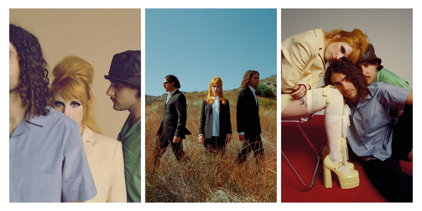
The photography by Zachary Gray is extremely effective! The shoots he did with the band looked really fun and really capture the energy of the group.
I really do love the range of shots here, each of these with the potential to be their own special edition album cover.
The Design Peripherals
Luckily, one of the photos from these shoots was used for a single cover.
Again, I think the big typography is unnecessary here, as it doesn’t add much of anything to the composition. I do like the inclusion of the Atlantic logo at the bottom, though. I wish more groups and artists did that.
Looking at more physical pieces from their online store, I do, however, like these album posters. The type works here, going at the top and bottom, as it doesn’t distract from anything going on below.
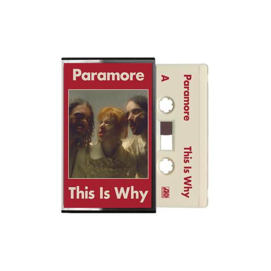
I’m a sucker for a nice cassette release, and this one is gorgeous. Simple and clean, this is another great implementation of the album type, as again, it doesn’t interfere with the visual. The supplementary use of red everywhere is lovely too, I picked up the CD, and it’s used in small little corners of the packaging.
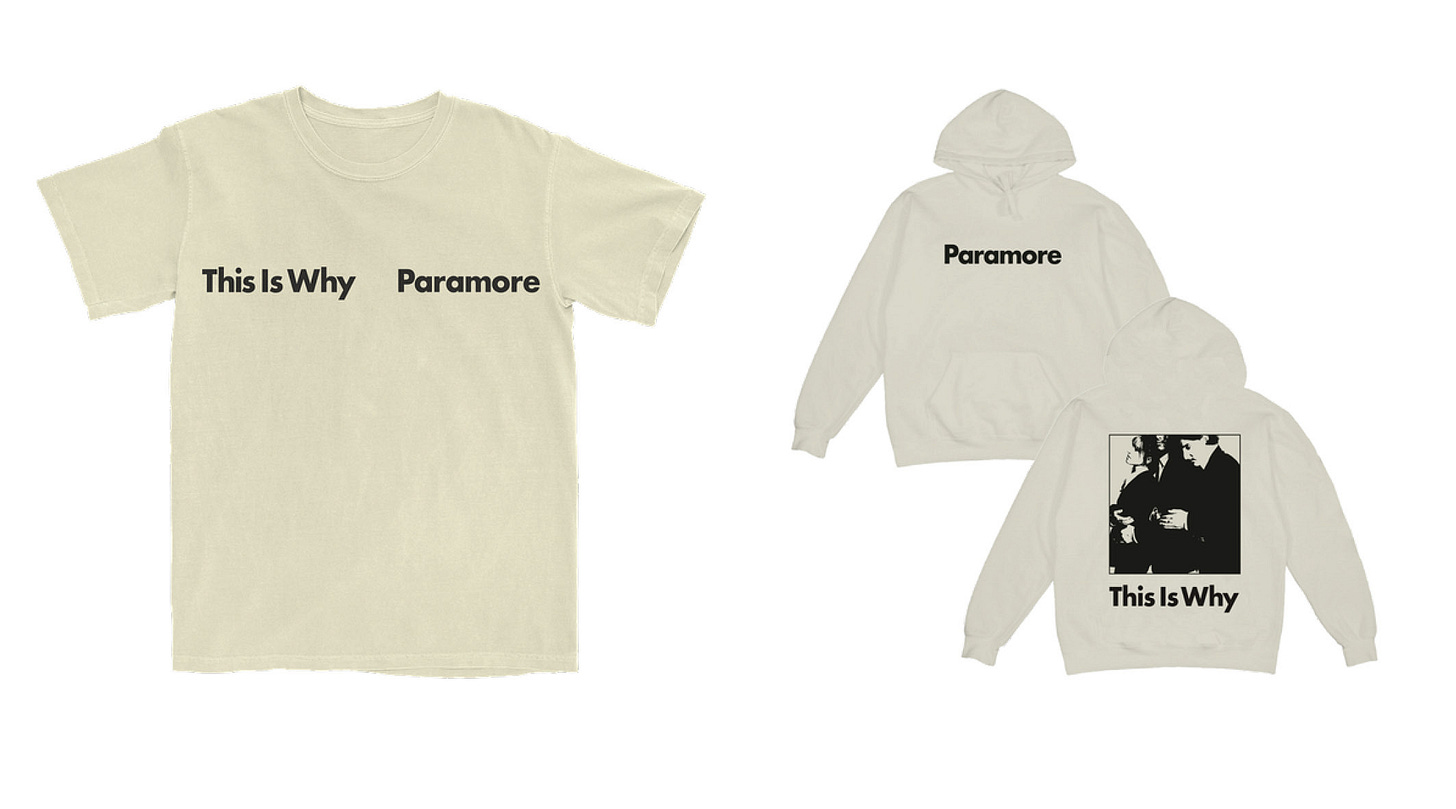
The initial merch is pretty basic, as it usually is in the first little capsule, so hopefully we get some more interesting stuff down the line on tour. I love the cream and black pairing though, really nice.
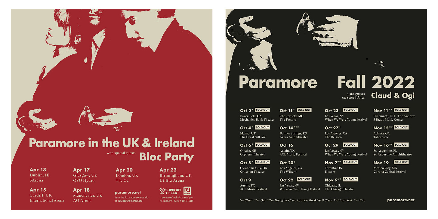
The tour posters are similarly done, very simply designed. I’m glad to see the consistent use of Futura Bold, but this is expected coming from top dogs like FISK.
Overall, pretty great collection of visuals for one of Paramore’s better releases, if not their best. Again, the cover would’ve been more effective without the type, but alas. I’d love to know what you think of the shot, and if you also grew up on Paramore!




Even if they did the text on the bottom it would’ve worked. Overall I enjoyed this and hearing your guys thoughts