


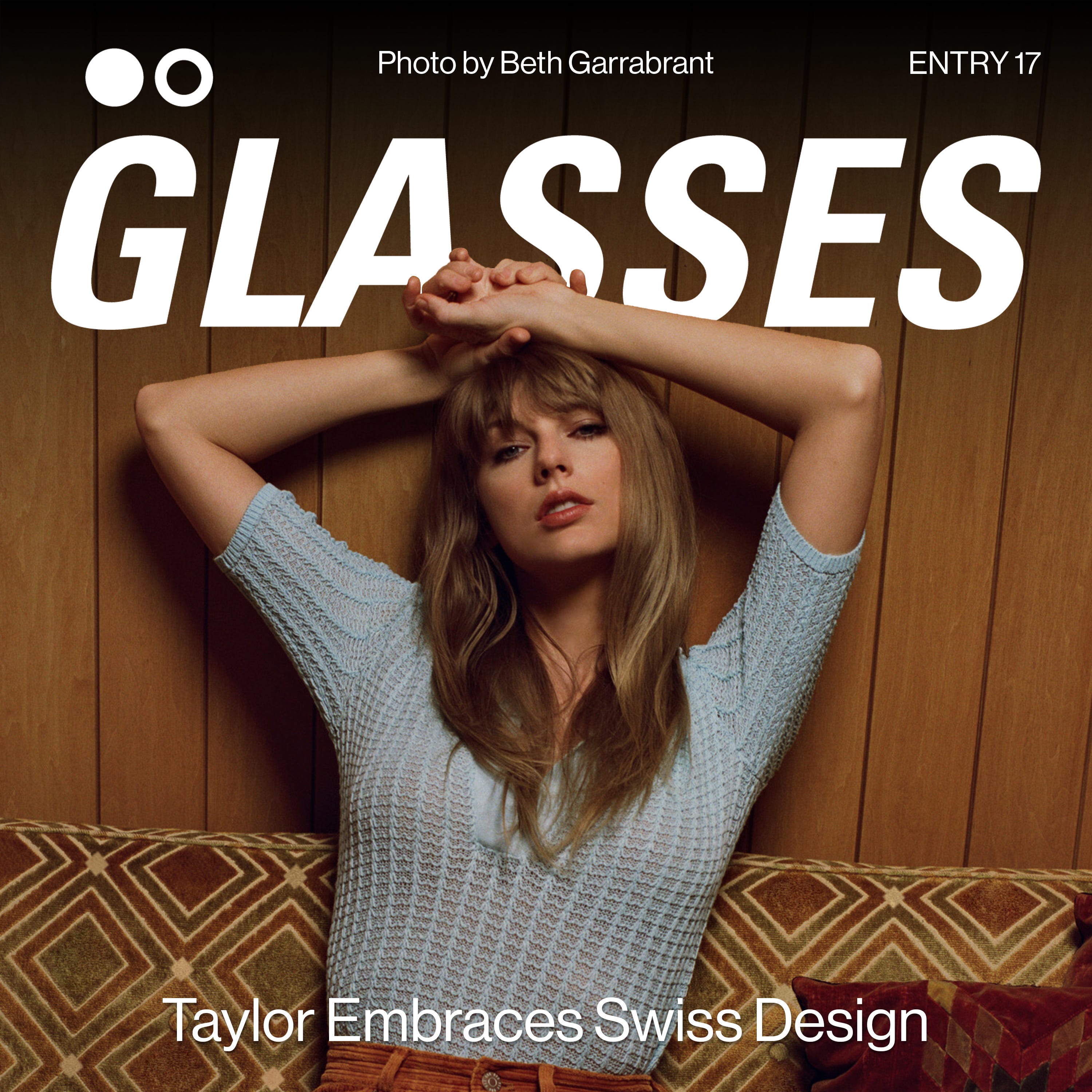
Taylor Swift - Midnights ALBUM COVER REVIEW: Taylor Embraces Swiss Design
ENTRY 017: type comes to the forefront

taylor’s tenth studio album, Midnights is easily on its way to be the most successful record of the year, and is doing so in style.
Midnights
Taylor Swift
Midnights is the tenth studio album from taylor swift. as of this entry, she’s on track to move 1.5 million units first week. fuck me. who even thought that could be done anymore ?? for context, drake’s Honestly, Nevermind from earlier this year moved 200k units first week.
“Taylor Swift’s ‘Midnights’ Has Already Surpassed 1 Million Units in the U.S. It also has the largest sales week for any album since 2017, is the top-selling album of 2022, and sets a modern-era record for single-week vinyl album sales.”
unreal. let’s place it in context of her other releases—
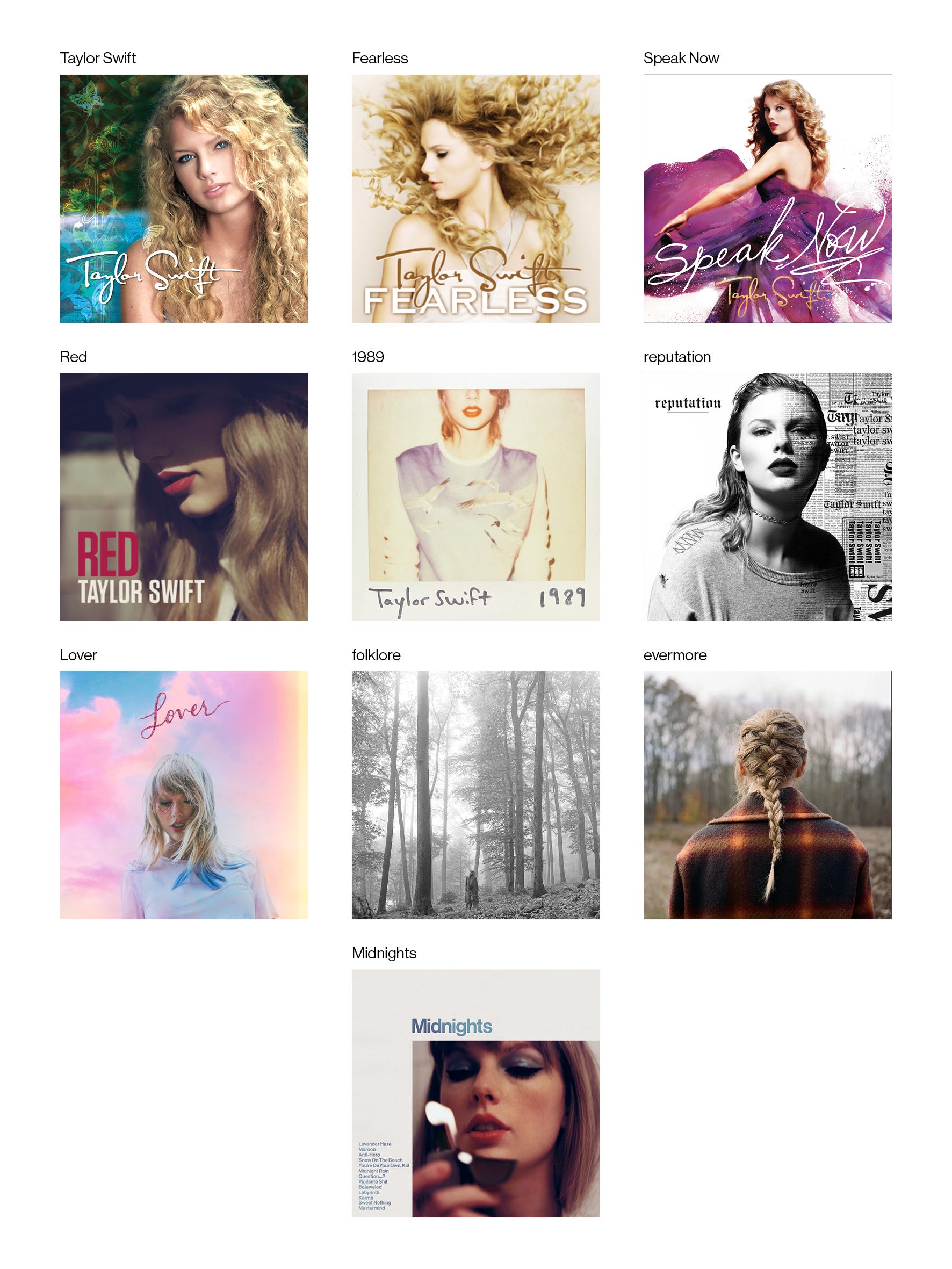
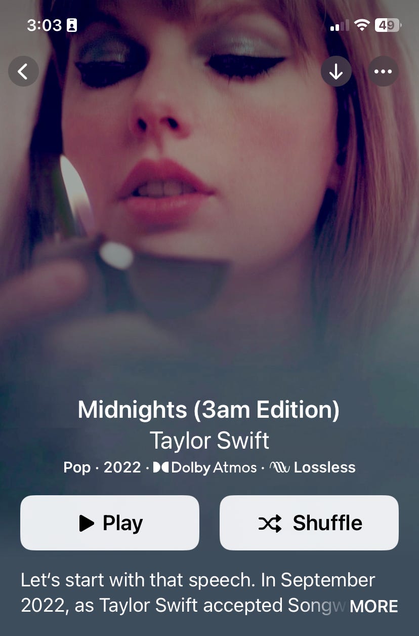
placing this cover in context of her previous works, this one stands out a little bit. with its off-white edges and outer type placement, the closest formal similarity is 1989. the latter being more raw in nature, as it’s a depiction of a sharpie’d-on polaroid. Midnights is clean cut and sharp, its edges made digitally instead of printed.
every one of taylor’s albums until folklore had some prominent title typography on the cover. a nice mix of handwritten and typed, some are definitely more tacky than others (everything until Red). folklore, evermore, (and the two new re-recorded Red and Fearless) stopped the trend in place of full photo-based covers. it seems she took a more artful approach with this group of recent covers, maybe to fit with the stripped-back indie direction of the music.
swiss graphic design
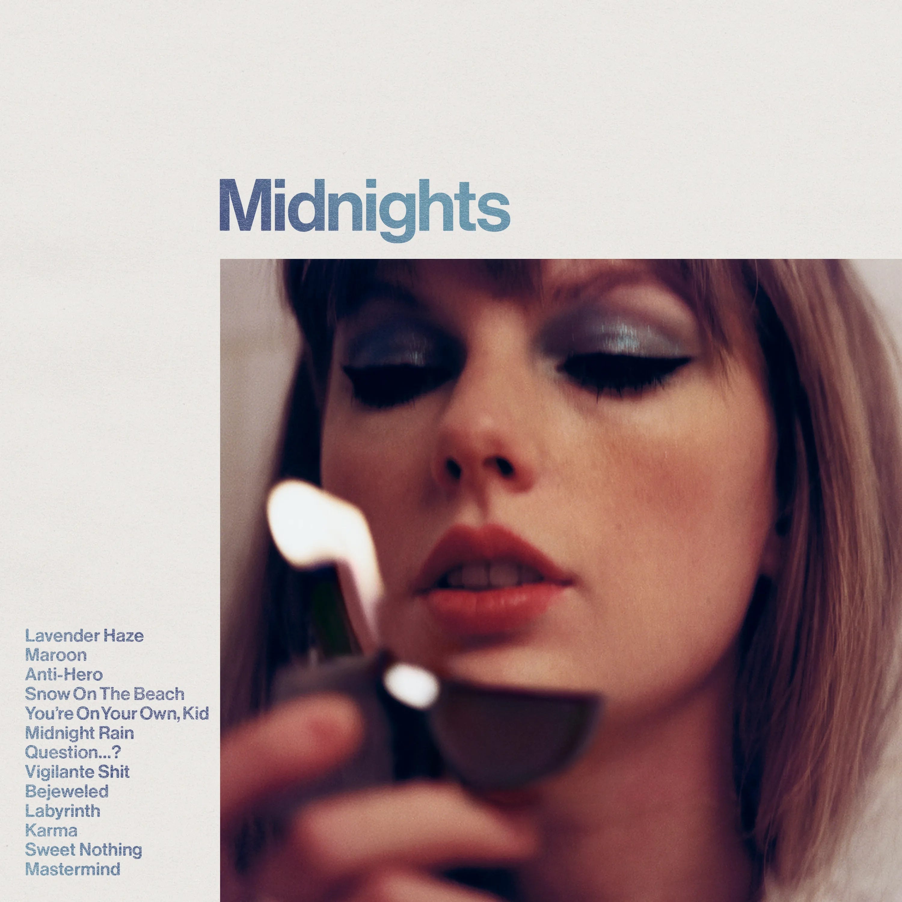
the most prominent feature of Midnights cover is its minimal Swiss design styling. also known as International Typographic Design, this massive graphic design movement can still be felt today. it’s marked by its cleanliness, objectivity, and legibility.
“Philip B. Meggs‘ History of Graphic Design explains that International Typographic Design begins with a mathematical grid. These grids are considered to be the “most legible and harmonious means for structuring information.” - PRINT Magazine
the use of grids naturally creates lots of strong lines and alignment within the designs. this helps balance out each element, create a strong hierarchy, and to maximise legibility. we see this in Midnight’s title being a large bold Helvetica Neue, contrasting with the smaller tracklist down below, set in the same font.

the use of helvetica is significant due to it being one of the absolute cornerstone fonts of swiss design. its consistently being used as taylor’s new artist logo and in other peripherals.

unsurpisingly, apple music’s animated cover rids of the white borders and type, and zooms in on the photo of taylor.
the memeability
like her extremely popular and memeable counterpart drake, taylor’s new album is a natural canvas for recreation. this is in full-part due to its swiss design roots. the simple placement of type + image makes it easy to place in your own content.
i’ve seen so many different remakes of the cover on twitter and instagram, the range being guy fieri to spotify boasting the album’s new streaming record.

her team must be jazzed about this, as its basically free marketing. it reminds me of almost every drake cover, but mainly the easy memeability of 2015’s If You’re Reading This, It’s Too Late.
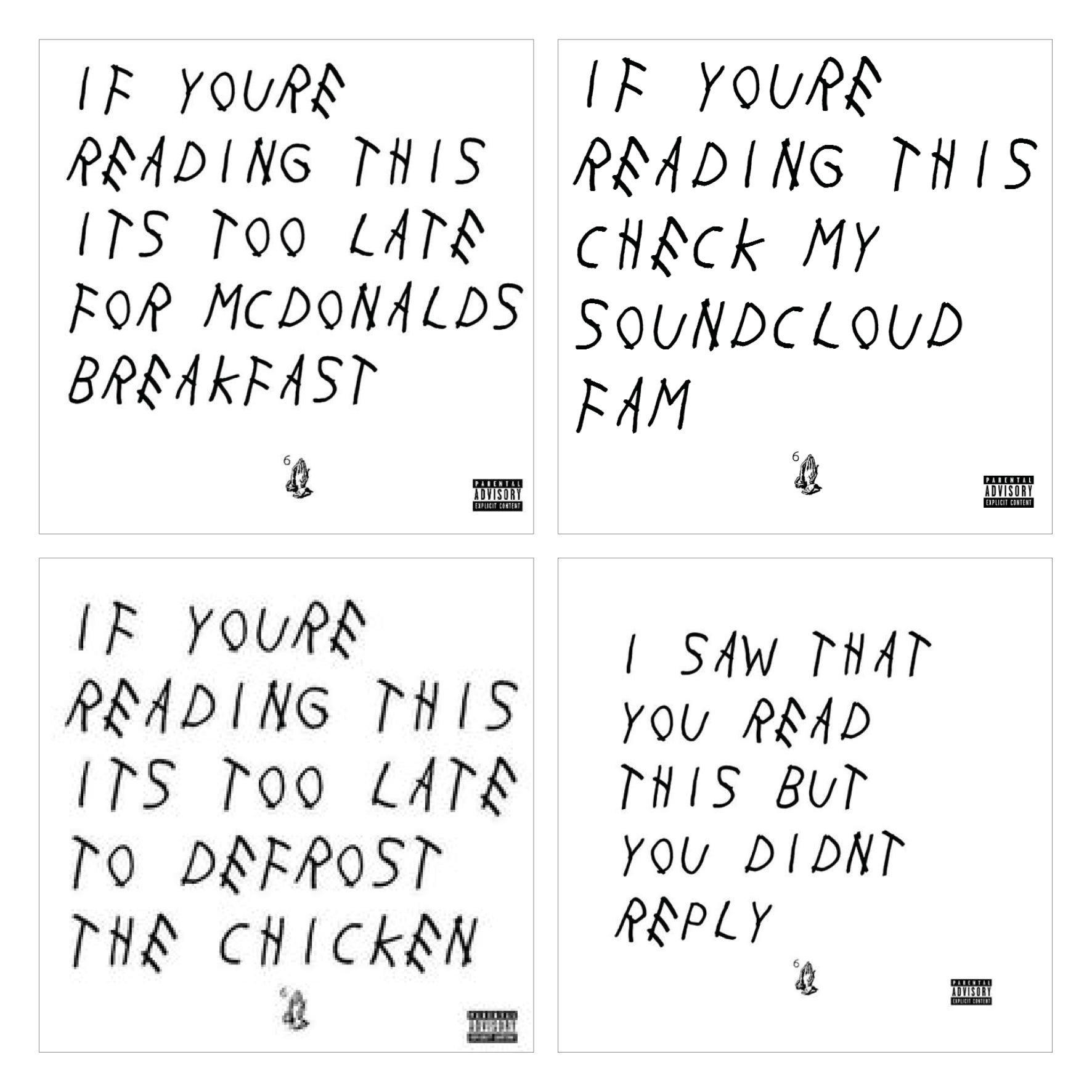
this trend makes me wonder why more teams don’t choose type-based covers due to their extreme memeability. remaking the cover as your own just circulates it that much more.
overall, i’m way into this taylor swift cover, it's definitely one of my favourite of hers. the album itself is cool, not crazy memorable in my eyes, but an okay pop listen. lemme know your thoughts!