


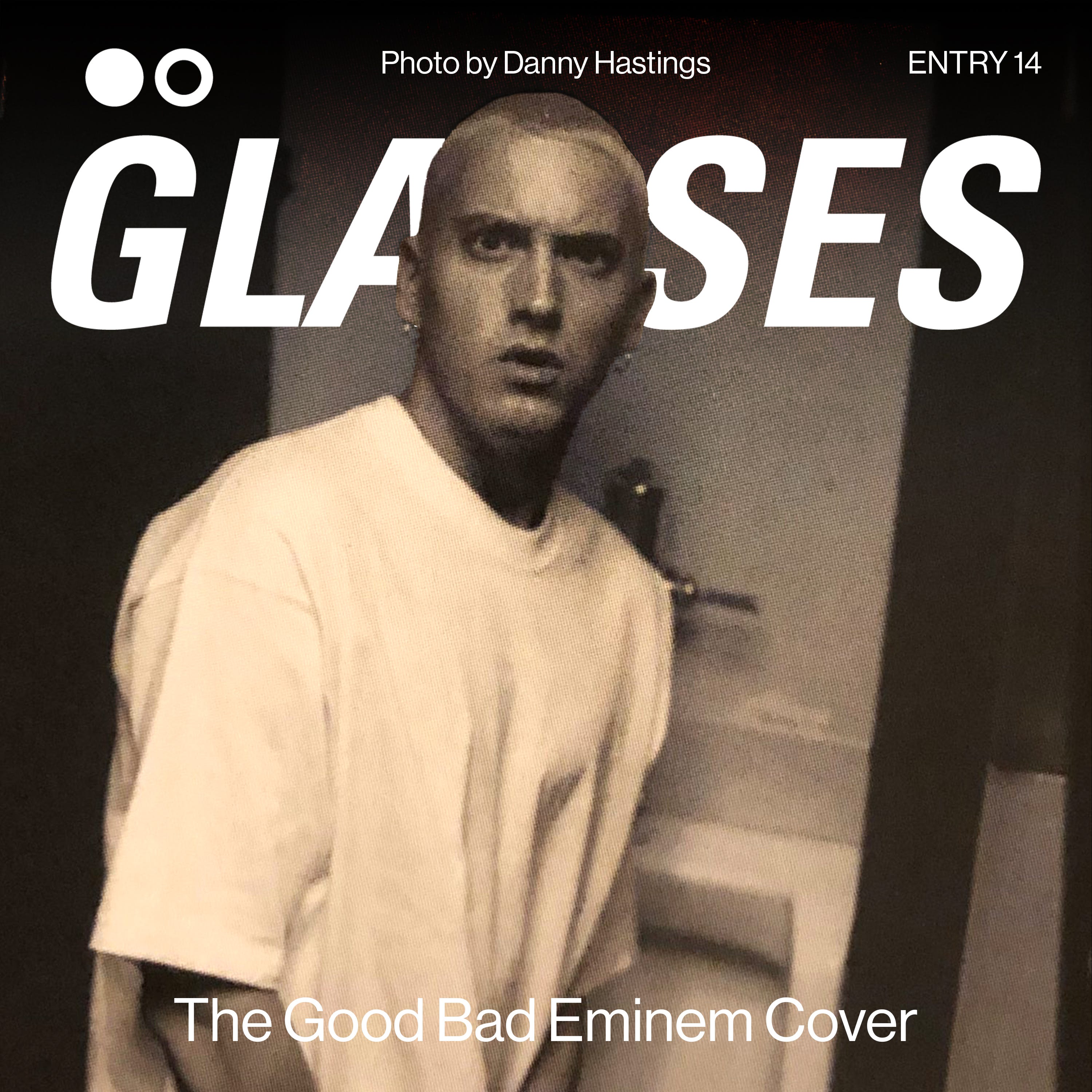
The Good Bad Eminem Cover
ENTRY 014: shady's new cover mirrors his music as of late

a look into the expressive and illustrative cover for the highest-selling rapper of all time.
Curtain Call 2
Eminem
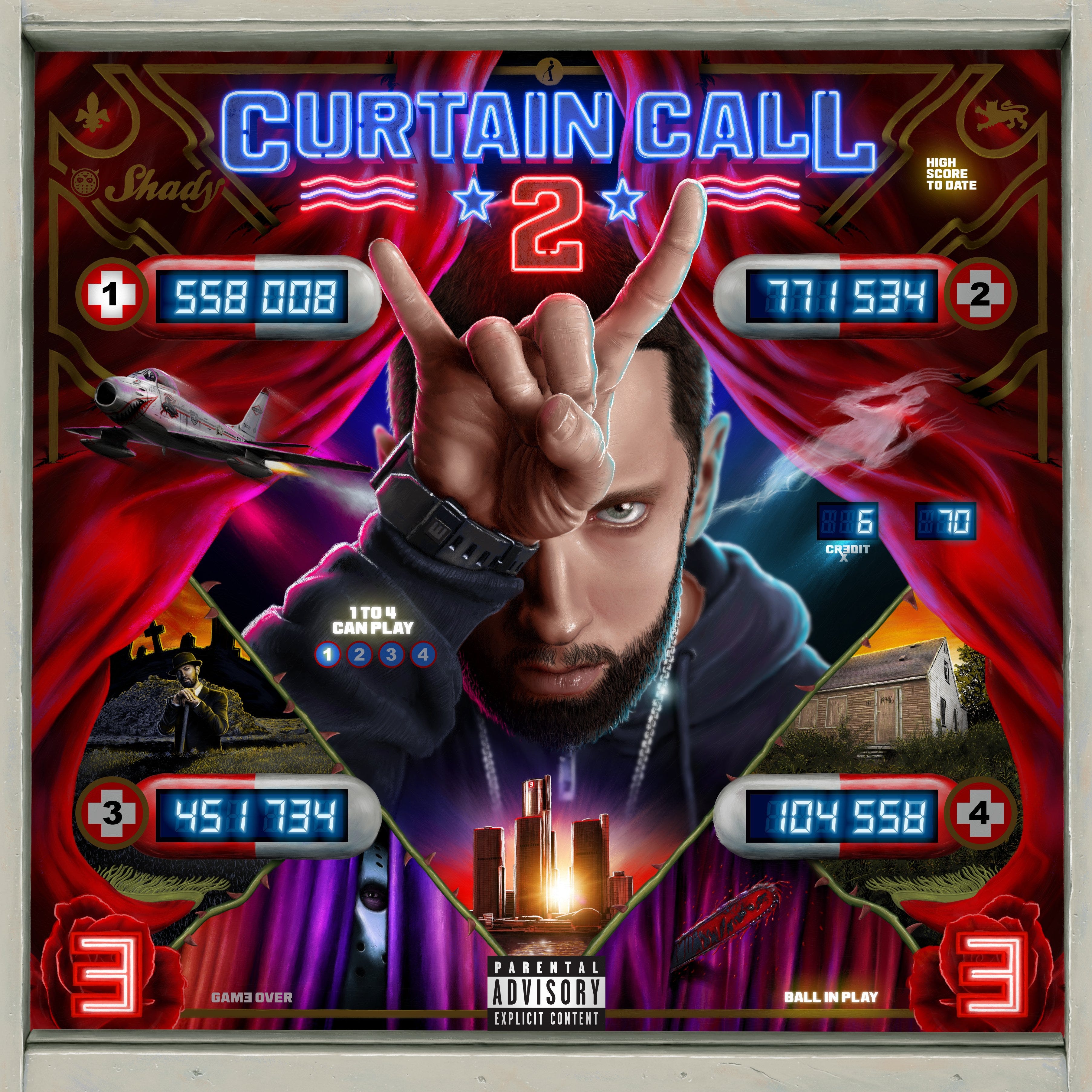
this is Eminem’s second compilation/greatest hits album, after 2005’s Curtain Call: The Hits. not a clue who did the art, nobody is tagged anywhere (again, major goddamn bummer that is).
comparing to CC1, this cover is obviously much more visually complex and loaded. CC1 is more simple, with em’s suited up legs and feet in a bowing position. we have some very dated type overlayed with some ornamental graphic additions around it.

CC2 is much more ambitious in its creative direction and execution, going full on with the pinball backglass homage.
as you could probably guess, the internet has already clowned this cover to absolute shit, because of course it has, and because its eminem, but i think this shit is a technical MASTERWORK!!!
the only opinions i really wanna hear on this thing are from illustrators. as a 2D graphic designer, i can’t even fathom with my weenie brain how something like this would be done. zooming in on the hi-res, i can recognise some Procreate brushes on em’s face and in the highlight strokes around his hand.
to think this whole thing may have been done on a fucking iPad blows my shit ass mind man. it’s either that or it was done in tandem with a Mac or something, which has to be how they did it.
for what this thing is (pinball backglass), it very much knocks it out the park in terms of style. here are a few other examples along with some music-based ones for context.
i would venture to say this piece of artwork is technically perfect, and couldn’t be done any better than how it currently is. whether you like the creative direction decisions that were made to evoke a pinball backglass, that’s a different story. the craft is undeniable!

oddly enough, this cover is a lot like eminem’s music. the technical skill is immaculate, some of the best out period. however, its ability to come together and create a harmonious piece is simply lacking. for what it’s worth, i like this cover, it’s a bit too visually complex for a cover in the streaming era, but would honestly make a nice special edition version or something.
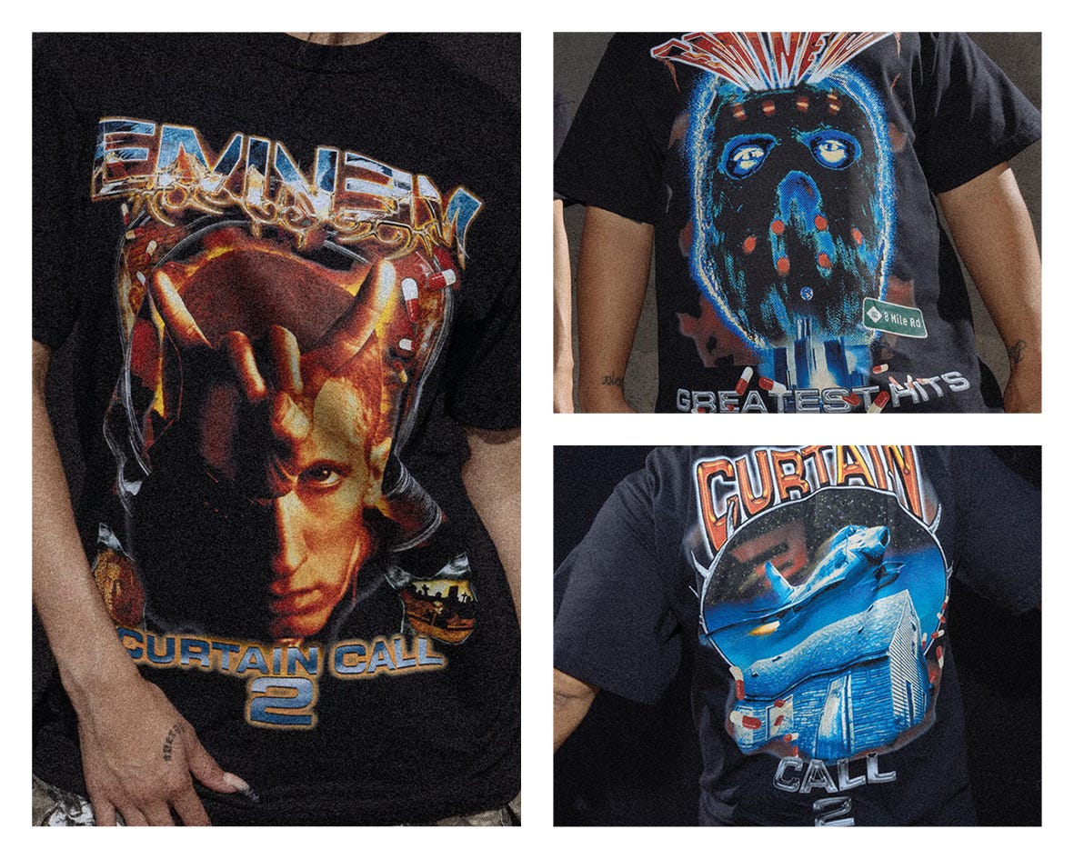
the merch
we have two pieces of merch so far, and i think they’re pretty nice tbh. i’d prolly wear these honestly, i think it evokes the cheesy vintage rap tee design quite well, and isn’t trying to be anything more than what it is.
what do you guys think? are you a fan of the cover? what do you think of the creative direction? there’ll be a poll or 2 on my stories, so keep your eyes peeled, and i’ll try to share results next week! thanks for engaging and caring about design + music :)