You’re a B*****d, Harry
ENTRY 02: he can’t keep getting away with it.
yo thanks for reading the first entry !!!! i got more traffic than i thought i would which is amazing. thank you.
its week 2. there was a particularly large album announcement this past week that shook a lot of people up, me included. one of my favorite modern artists, harold goddamn styles released the cover, title, and release for his new album, “Harry’s House,” and man. mannnnnn. lets just get into it.
first i wanna talk about this cool pop album that came on my radar through just being on apple music somewhere.
Uncanny Valley
COIN
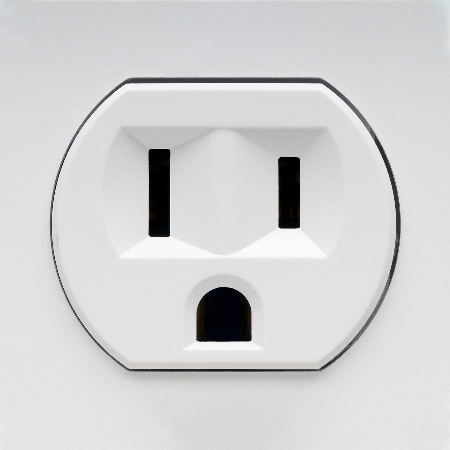
this shit man ????? the best and most obvious thing about this cover being great for me is making something tiny and insignificant (a socket) beautiful and very much significant. graphically, this thing is just killer. its so recognizable, they didn’t do too much of anything with what is just a normal socket.
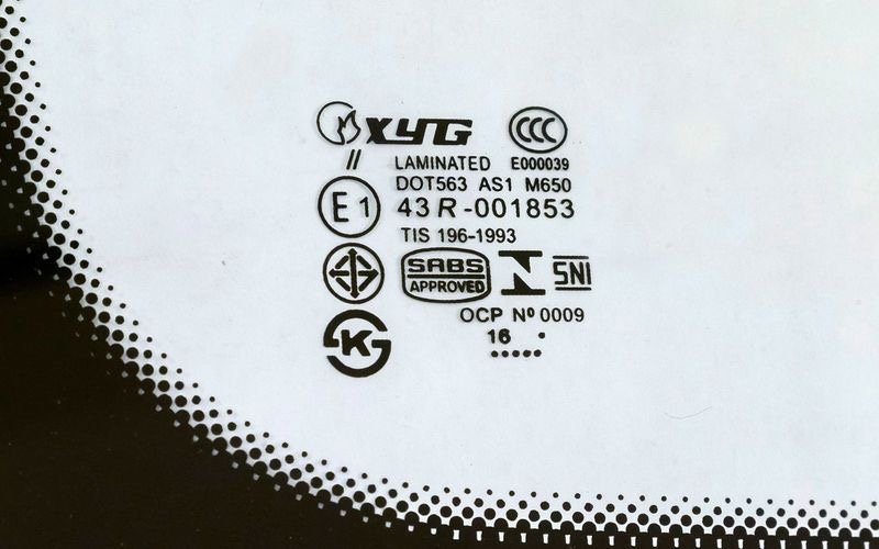
always loved the concept of blowing small things way up to this scale, giving them importance of some kind. there’s an entire book/catalog (searched for an hour could not find for the life of me, sorry) that’s just filled with pages of car window safety graphics??? its a gorgeous collection of beautiful overlooked design.
it took me til just now to realize that the left prong socket is longer than the right one. obviously this gives off an expression of almost confusion or surprise, but also fits squarely in the album’s theme of “uncanny valley.”
“…so much of the core of the album is this kind of living in this uncomfort, which is the idea of Uncanny Valley, too. It’s something that looks so human and so familiar, but feels just a little bit off.” - Chase Lawrence, vocalist
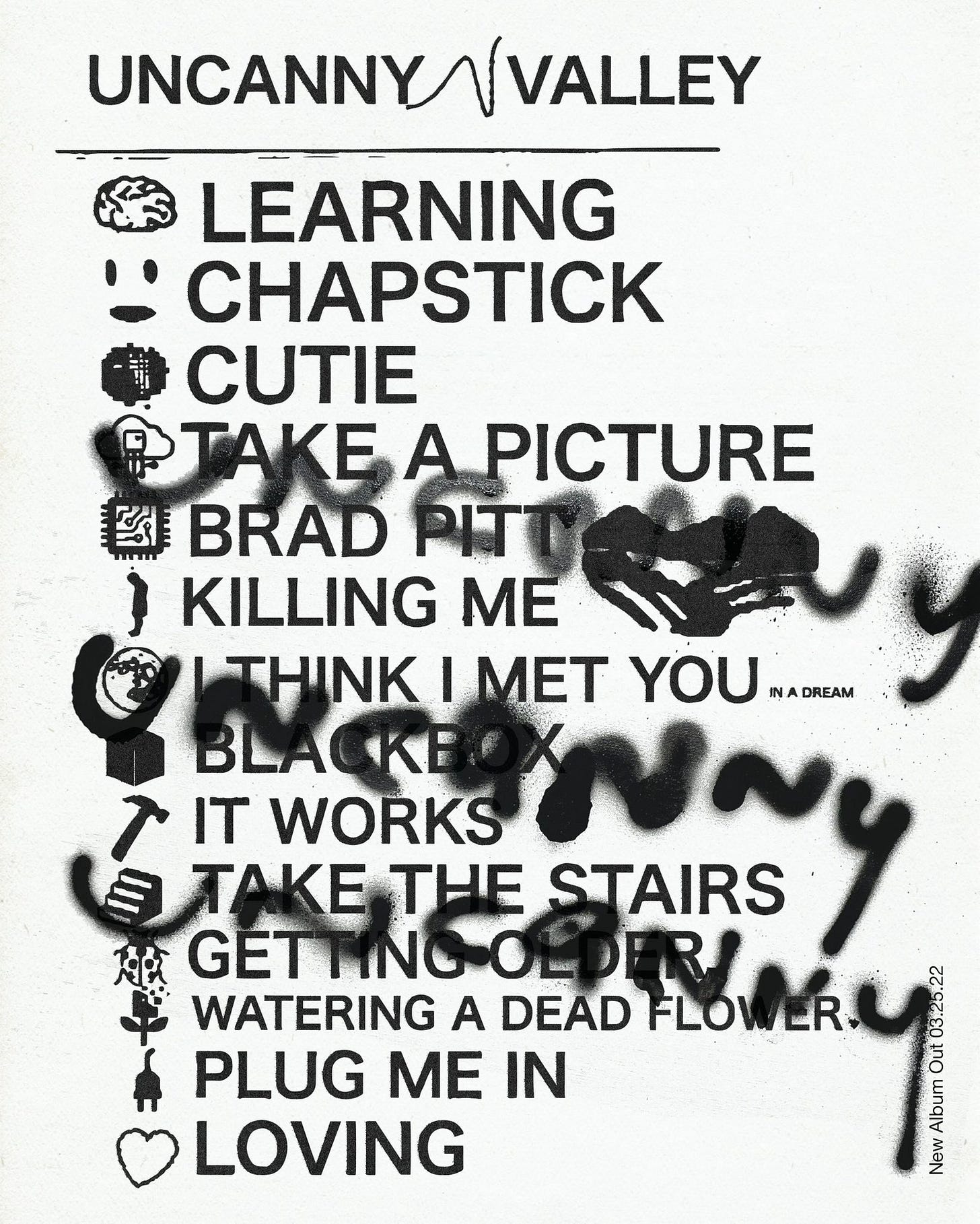
the supplementary design is also wonderfully done.
lovely textures, have to imagine this was practically done?? the little ink blots on the edges of the type lead me to believe that. one can only recreate physical effects so much!! killer stuff here. tour flyer is also insane and extremely fun.
DESIGN BY ANDREW EVAN
Harry’s House
Harry Styles
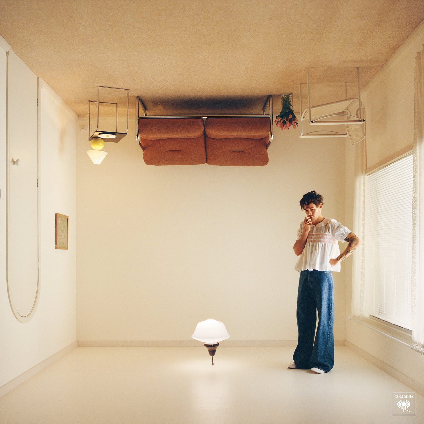
lets get into this. boy am i excited. i literally don’t know where to start so!!! the photography. hanna moon is her name, and she murdered this. i did some digging and was able to find the stylist and set designer too, harry lambert and patience harding (links below). it had to be such a harmonious working experience between these people and the rest of the team.
the composition here is immaculate. the way the lines of the room come to the middle, where harry isn’t was such a good choice imo!!! him being to the right is great, it adds a bunch of visual tension wouldn’t you agree?? way more interesting than if he was sitting on the couch. from the little egg on the plate to the almost dr. seuss-ian curvature of the door, all the furniture in the room acts as shapes to draw your eye around, telling a little story. what’s harry doin?? why’s he upside down?? is the room upside down or is he?
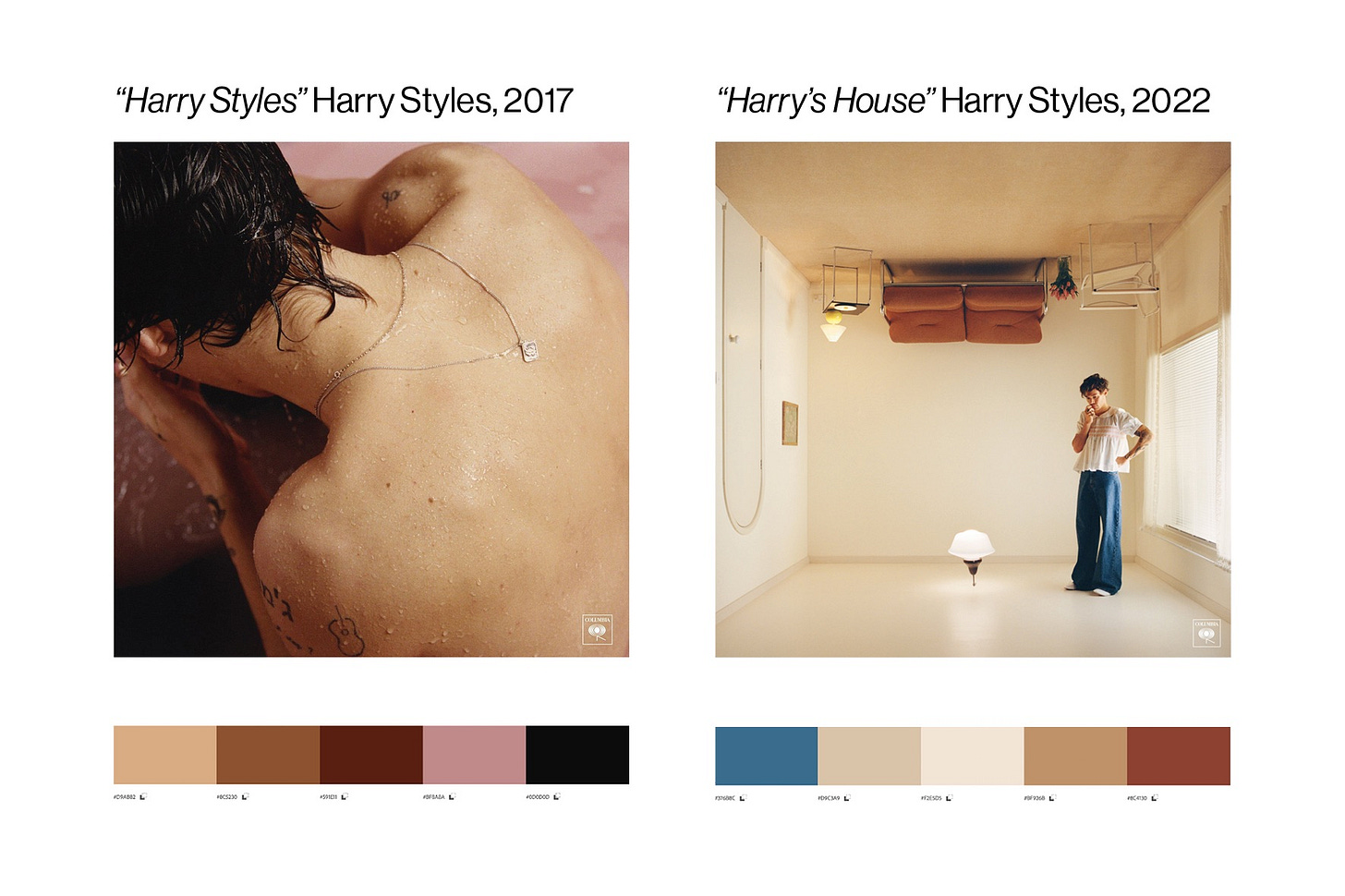
the colors. to gain a little context, lets briefly compare the colors here to harry’s self-titled debut from 2017.
very similar!! i have to think this was somewhat intentional, but also has to do with harry’s adoration of the 60’s and 70’s. with the george harrison soaked opener, “Meet Me in The Hallway”, the brash dad rock of “Kiwi”, and the delicate acoustic yearnings on “From the Dining Table,” it was super clear where harry’s sights were set. if we’re doing predictions, i think we’ll hear a bit more of that, if not a more refined and combed-through version of it. i mean, how many artists this big still place their label’s logo on all their album covers? so far, it’s the only graphic placed on any of his releases. no type thus far. speaking of type—
as of me writing this, we have one small glimpse into the type accompanying the campaign.
we have what appears to be his refreshed logo-type for this next run, and a little “new album” graphic.
i dig these so far. they seem to fit quite well, and definitely have me excited for the drop. again, very 70’s heavy, and spots the burnt orange from the couch on the cover.
overall, killer campaign so far, extremely hyped for this release, harry and the direction of his team never disappoint!!


