


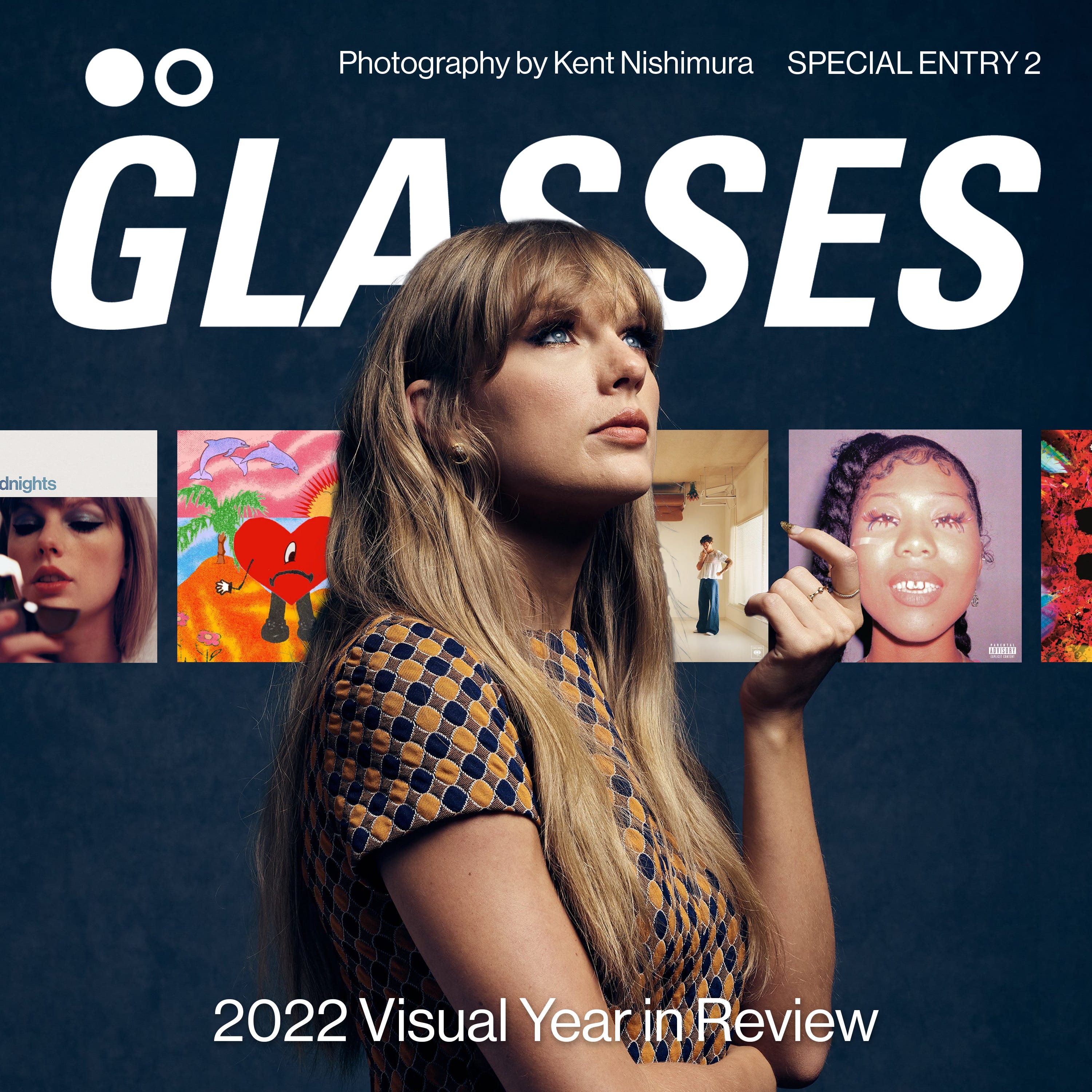
2022 Visual Year in Review
2022 Visual Year in Review
SPECIAL ENTRY 02: reviewing visual trends of 2022's top albums

To start off, 2022 was an incredible year for music. We got huge returns from Kendrick Lamar and Beyoncé, and releases from some of pop music’s most familiar faces. Whatever genre you look to, there were incredible and dynamic offerings in each.
What I’m here for though, is to visually review the year’s top releases. Bad Bunny, Taylor Swift, Drake, Beyonce, Harry Styles, Future, Kendrick, it feels like all the world’s most popular artists dropped this year. What were the visual trends of the year’s biggest album covers?
Based on Spotify’s 2022 Wrapped statistics, the top 3 most streamed albums of the year were Sour by Olivia Rodrigo at #3, Harry’s House by Harry Styles at #2, and Un Verano Sin Ti by Bad Bunny at #1. Bad Bunny was both Spotify and Apple Music’s top streamed artist of the year.
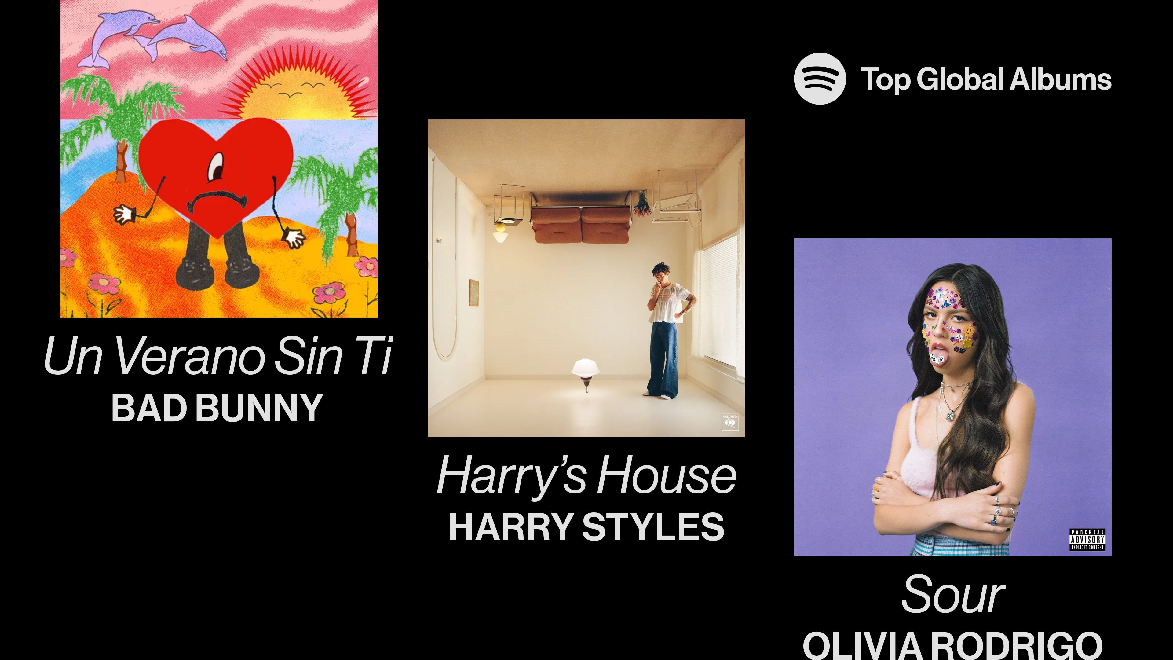
#3 | SOUR, Olivia Rodrigo
Sour, a 2021 release, being #3 is honestly very surprising. To think, Midnights by Taylor wouldn’t have popped into this spot! I love Sour so so much, it was one of my favourite albums of 2021, I even got the CD. It’s a really focused and concise pop debut from Olivia, and makes me excited for whatever she follows up with.
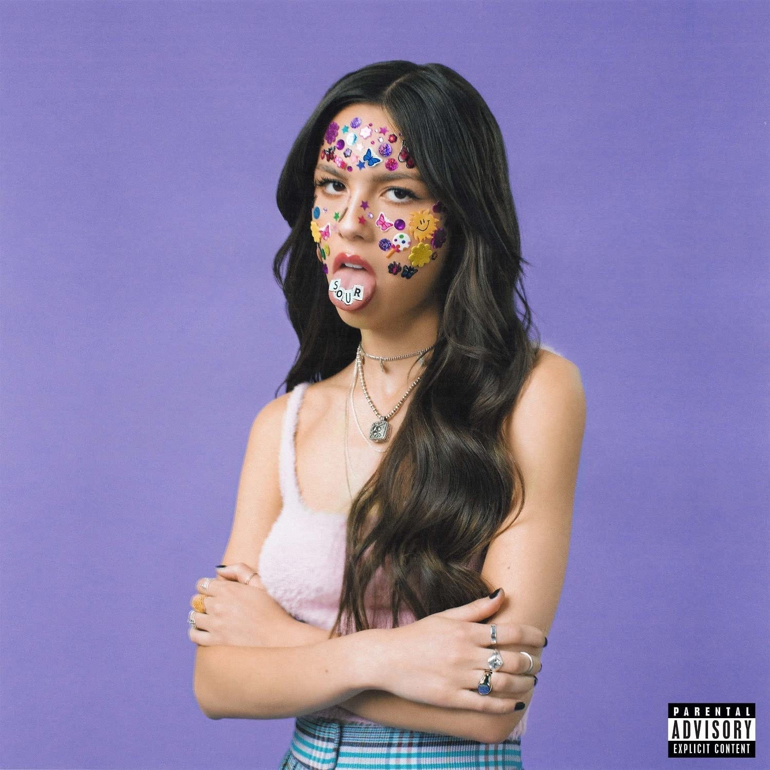
Shot by Grant Spanier, visually, the album cover is purely photographic. It features Olivia standing cross-armed on a light purple backdrop with scrapbook-style stickers and jewels covering her face. The album’s title is cleverly spelled out on her tongue in cut out letters, being the only graphic intervention here (aside from the Parental Advisory stamp).
The cover also appears to be ever so slightly textured, looking like Grant may have printed it out and scanned it back in, giving it a more tactile feel. The rest of the album’s visual rollout is in this vein, having physical photos, collage, and again, scrapbook like photo composites and scenes. I do love this cover for Olivia, it’s very direct, which is always good for a debut album, as we don’t know much about the artist yet. It’s visually iconic and extremely adaptable to various aspect ratios and print applications.
#2 | Harry’s House, Harry Styles
I’ve done an entire dedicated review of this album cover when it dropped earlier this year, so if you want a more in-depth take, definitely check that out!

Shot by Hanna Moon, this cover is also purely photographic. It features Harry standing right side up on the ceiling of what could be a living room, with set design by Patience Harding. This set feels straight out of the 60s or 70s with its modernist furniture and retro colour palette of burnt oranges, blues, and tans.
There’s no type here, the only graphic inclusion being the Columbia Records logo in the bottom right, appearing on every Harry Styles record so far. Again, an incredible cover, maybe my favourite of the year. I’ve had this CD at the top of my shelf on display for the better part of the year, along with RENAISSANCE and Mr. Morale & The Big Steppers. This set of colours comes straight to mind when I think of Harry, as his solo career has been built off homages to these past decades’ stylings.
#1 | Un Verano Sin Ti, Bad Bunny
This is where things get interesting. Bad Bunny’s global smash of an album features an extremely bright and expressive front cover designed by Adrian Hernandez, or “Ugly Primo”.
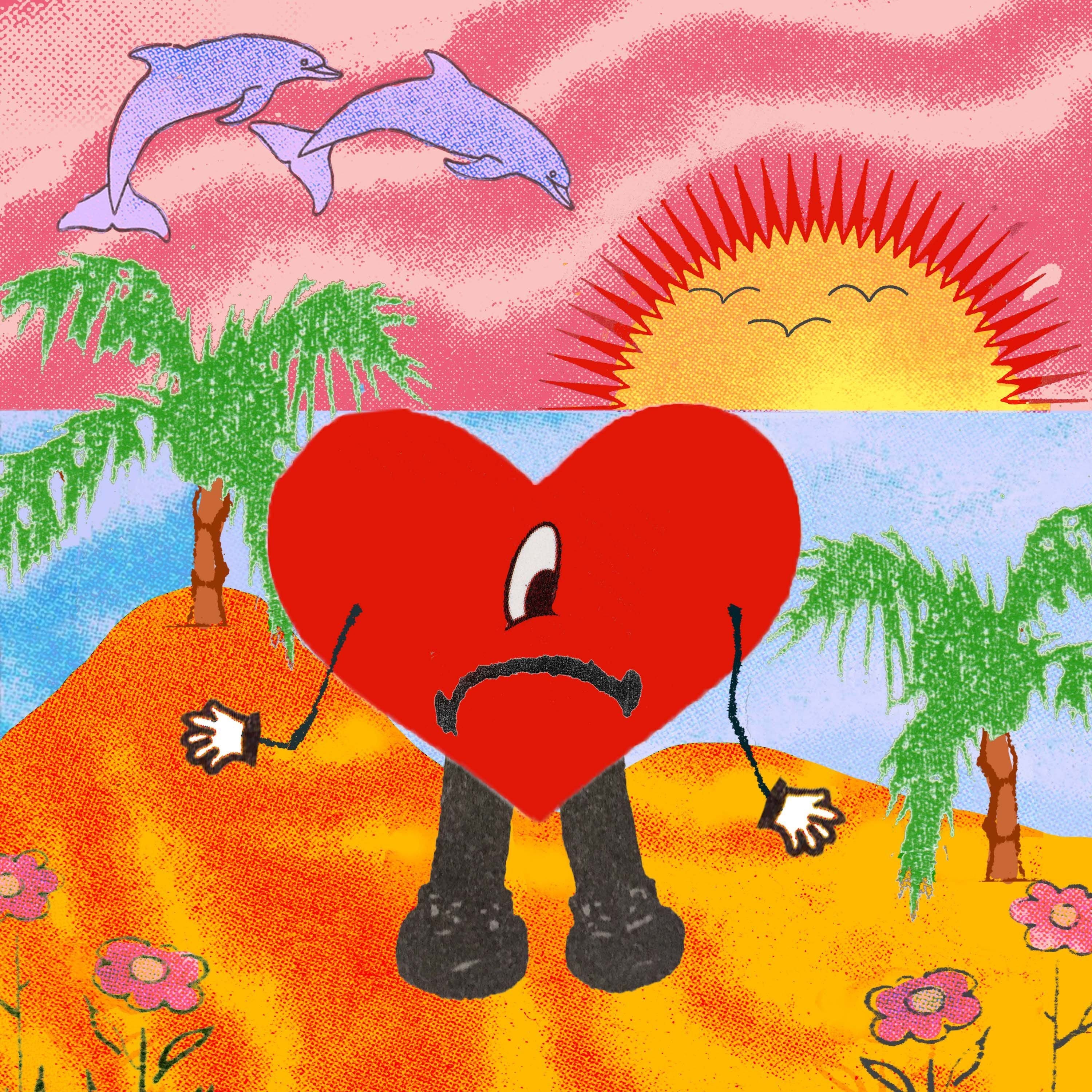
“He reached out to me with the idea of the cover and how he wanted it to look…He pretty much had it laid out for me and I helped execute that idea and turn it into an art piece. That’s kinda how the cover came about—he left it open to interpretation.”
Adrian Hernandez, billboard
The most visually interesting of the three, the cover features what appears to be a mixed media illustration and collage of a frowning heart in a summer scene. With halftone textures, some line work, and other illustrative elements, the cover is exciting and energetic, matching the summery vibe of the album’s Latin pop. With little room for blemishes or imperfections, Sour and Harry’s House are decidedly “flawless” shots. Bad Bunny’s offering breaks the overarching trend of a clean photographic cover in favour of something more vivid and human.
Conclusion
I wanted to choose the top globally streamed albums of the year because aside from putting up impressive numbers, these were also the album covers that statistically had the most eyes on them. It’s always interesting to me how people engage with the music they listen to, whether they mainly listen on their phones or laptops, or are physically playing them while holding the covers in their hands. If you have any of these records on CD or vinyl, you can appreciate their details that much more, given the larger scale of the visual.
Photography definitely always leads the pack when it comes to visual stylings of album covers, this is nothing new. I salute and admire the photographers working in the different creative industries today, and as a graphic designer am SUPREMELY and EVERLASTINGLY jealous of their consistent ability to be credited on almost every post and feature of their work. Bad Bunny’s illustrative cover was cool to see, given that he could’ve just used a photo of himself, and even Midnights’ Swiss graphic design-inspired cover was quite a shock given Taylor’s recent visual output.
New music is easily one of the most exciting things in my life, and one of the only things I’m consistently looking forward to, as it’s pretty much guaranteed. What do you think of the biggest covers from this year, and what do you hope to see on the homepages of Spotify and Apple Music in 2023?