Drake & 21 Savage - Her Loss ALBUM COVER REVIEW: The Everlasting Influence of Virgil Abloh
ENTRY 018
the heavily anticipated rap collab of the year is here, and so is its divisive cover.
Her Loss
Drake & 21 Savage
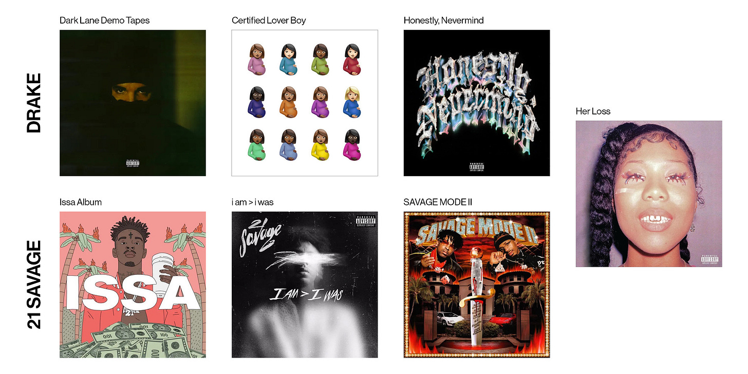
Her Loss is Drake’s first collaborative studio album, and technically his eighth studio album. it's 21 Savage’s third collaborative studio album and third studio album.
lets look at this cover in context of the last three covers from each artist—
drake’s recent covers (barring Dark Lane Demo Tapes really) and the music attached to them have been almost completely critically and publicly panned. check twitter or ask anyone who’s tapped into pop music and they’ll tell you that CLB and Honestly, Nevermind were both huge missteps for drake.
visually speaking, if i had to quantify the reactions to each cover, it’d be something like 95% hate for the cover of CLB (with the last 5% just thinking it’s funny), and 70% hate for HN.
people don’t criticise 21’s music or covers the same way. it could be because he doesn’t have anywhere near the global reach of drake, or that people just like his shit more.
this album’s cover probably has a 90/10 split.
the fake promo run
days before the album dropped, drake and 21 posted photos of them on the new Vogue october issue.
this magazine, along with an NPR Tiny Desk appearance and The Howard Stern Show interview, turned out to be fake. it worked on me bro. for two consecutive days i ran around the city going into different stores trying to find this fucking magazine that didn’t exist !!
inside is a collection of spreads that would appear in a real Vogue mag, but with some intrusive and grimy graffiti over top. there’s also fake ads with drake & 21 photoshopped in, along with 21’s tattoos placed on the models.
a super creative promotional move, as it creates a physical collectors item that fans will wanna get their hands on for years. it also seems to be a flex of sorts, with drake and 21 saying they don’t need these promo spots that smaller artists would kill for. fake ones will do.
the formal review
the album cover features a close-up (of what appears to be film) shot of model and exotic dancer Qui Yasuka. she’s also a 3D designer !!!

yasuka has on some eccentric eye makeup, a Chanel earring, as well as some prominent teeth jewellery. her face fills the entire frame, finishing at the top of the neck, creating a confident and personal composition.
the texture on the hi-res cover is gorgeous too.
you can really see the paper and ink grains, showing that it was most likely printed out and scanned in? love these details!
given the probable use of film and potential use of colour correction in post production, the colour palette is made up of varying shades of purple, black, and orange. this gentle, almost pastel-like nature of the palette contrasts with the (literally) in your face and RAW feeling of the photography. this is extremely effective!!!
given the nocturnal and trappy atmosphere of the album and press shots, this use of colour is interesting. it puts a different feeling on the music itself. when listening to it, i see oranges and purples, not moody washes of black, grey, and white.
the massive influence of virgil🕊️
the treatment of the tracklist graphic below is very Virgil/Off-White.
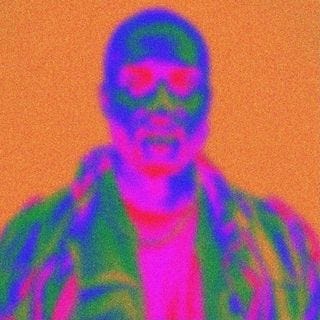
this grainy photo-negative-almost thermal look reminds me so much of Virgil’s still-standing instagram profile pic.
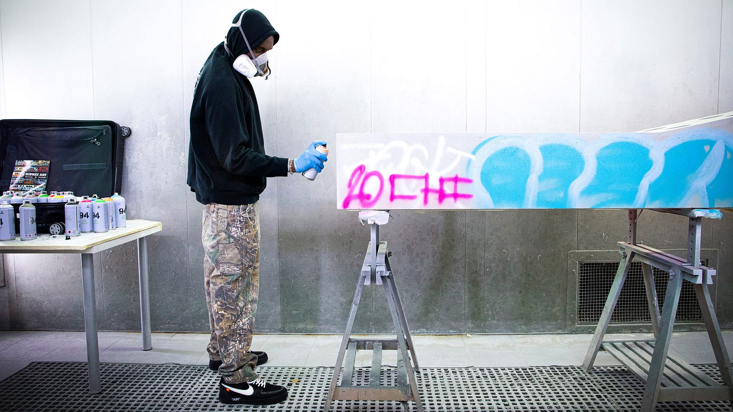
the graffiti used in the magazine is reminiscent of Virgil’s “Efflorescence” furniture series that highlighted graffiti, brutalism, and “street culture”.
As a "reflection of our generation", the designs have been spray-painted with the designer's brightly coloured free-hand markings, reminiscent of city graffiti in a bid to evoke "street culture". - dezeen
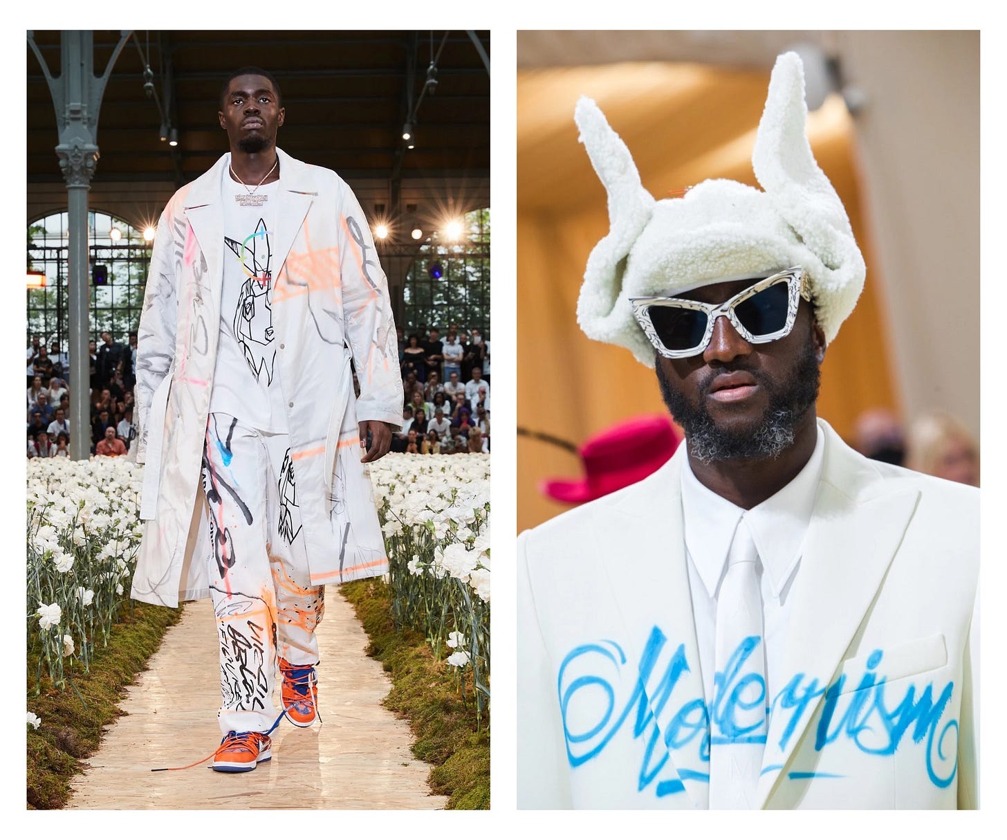
we also have his 2019 Off-White collab show (left) with Futura, where he had full-print graffiti on a series of garments. there’s also the famous 2021 Met Gala look (right), where he had “Modernism” airbrushed directly onto his suit.
the design peripherals
as far as i know, as nothing is officially credited, Ben Dorado did all the designs here. don’t know if he took the cover photo, but i know he did everything else, including the Vogue spoof.
ben posted some BTS of the process on his stories recently, and luckily i grabbed them.

such a gorgeous, understated, and simple graphic treatment, this kinda type is some of my favourite styling right now. i don’t have any personal experience with this, but it looks like he printed the title and subsequent tracklist (below) on some sort of clear transfer paper, scanned it in, and digitally exported everything.

he seems to have used helvetica medium or bold, and stylistically stretched it. helvetica being an absolute STAPLE of Virgil’s design language, as common as helvetica is, this is a big part of his influence on display. this font choice, along with the use of graffiti, and the haphazard “something’s off” graphic placement, all point to Virgil. you could argue against this, but given drake’s cultural proximity and previous relationship with V, even dedicating Honestly, Nevermind to him, i can tell his design philosophies were heavily influential in this album’s visual universe. but hey, make your own mind up!!!
overall feelings / recap
it’s still early, but the cover is growing on me since i first laid eyes on it. drake’s covers aren’t usually this raw, they always feel a bit more considered (you may hate it, but he did pull Damien Hirst for CLB). people online have mentioned often that this feels more like a Griselda cover than a drake one, but i think pairing him with 21’s more street demeanour justifies the change in aesthetic.


