Drake - For All The Dogs | ALBUM COVER REVIEW
ENTRY 31: drake may never appear on a cover again
Explore the intersection of sights and sounds with GLASSES, a deep dive into the expansive world of music graphic design.
The Album Cover
For All The Dogs is Drake’s eighth studio album, and despite being his fifth release since 2020, has remained an extremely anticipated record.
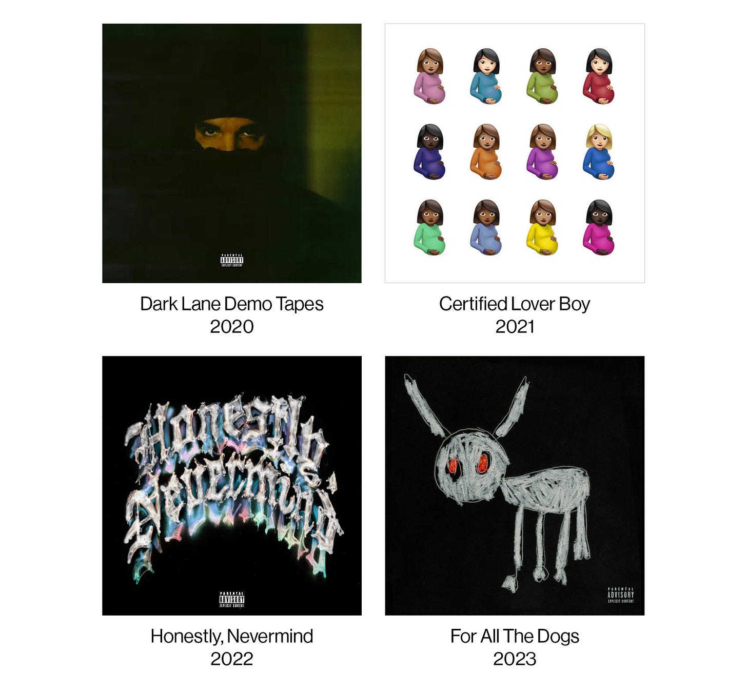
Let’s have a look at this new cover in context of his last four (solo) releases, and look for any visual trends.
There aren’t any glaring visual trends, other than 3/4 of them being black. Each cover does have a clear subject, even CLB with its 12 pregnant emojis. That’s obviously the most lighthearted one here, and I’m honestly really interested to see how that one ages in 20 years.
Honestly, Nevermind and For All The Dogs have a menacing vibe to them, both had fans speculating some rappity-rap-rap dark energy, and while we got a little bit of that on Dogs, they turned out to be the same Drake albums we’ve come to expect.
The only true thread continuing through every Drake album cover is some element of absurdity or meme-ability to simply get people talking. He has to know this, the guy isn’t stupid, he’s one of the most self aware stars in the world. “All publicity is good publicity” clearly being hung up somewhere on his mansion walls.
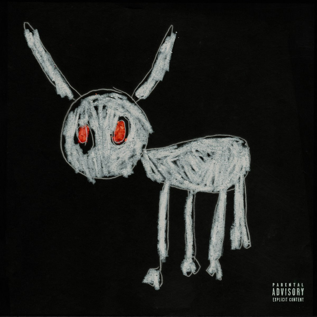
While Dogs’ cover isn’t as immediately polarising as CLB, the fact that his 5 year old son drew it is enough for a lot of people. But from what I’ve seen about it, it appears to be generally favourable in the public eye.
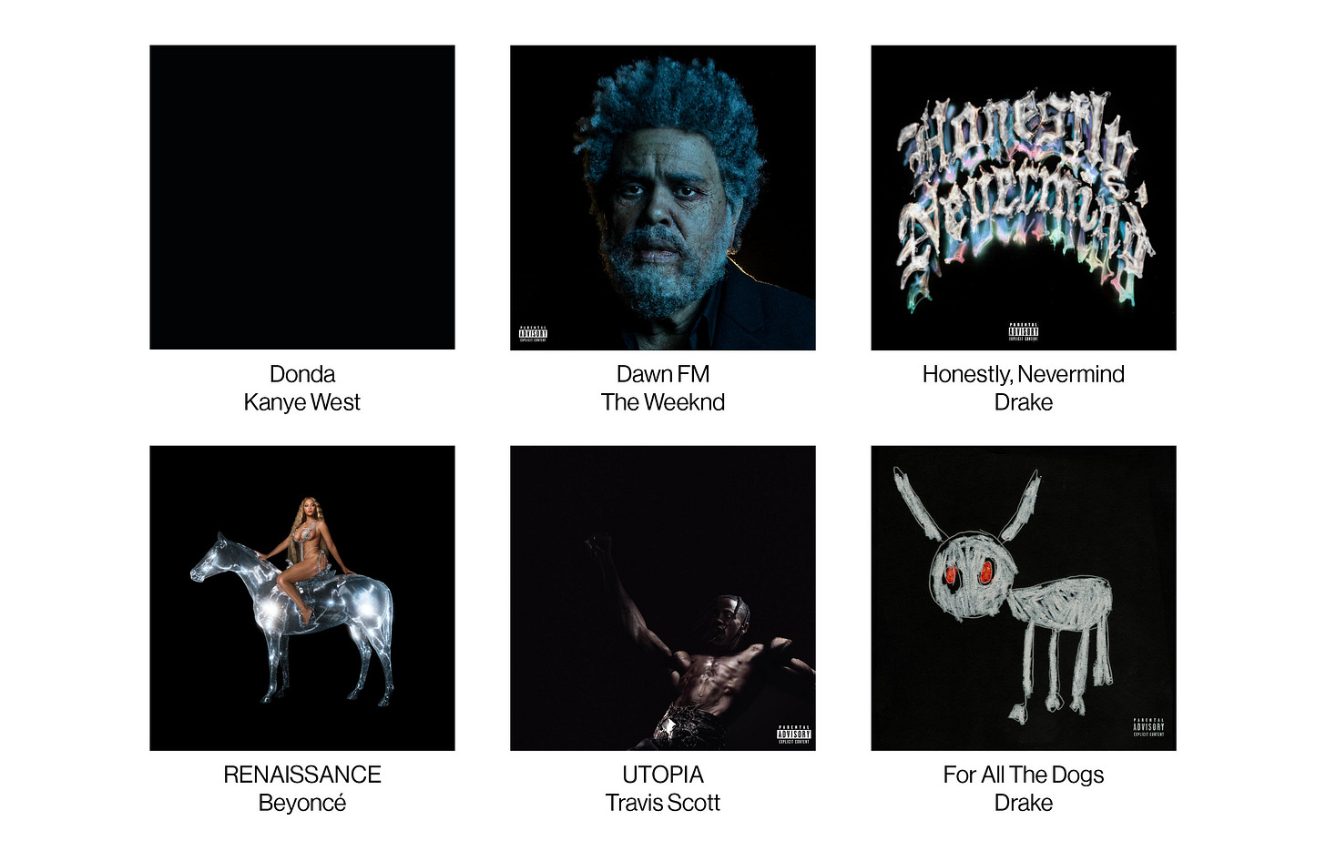
Simply put, the covers great. The (almost) pure black background fits in line with the current trend of triple-A album covers doing the same, and sets a nice base for the photo-negative drawing to stand out.
The greenish-chalky color of the figure is so great, it contrasts nicely with that vibrant, bloody red of the eyes. The parental sticker is depicted in a similarly illustrated style, using the same chalky white, providing some simple cohesion. The aforementioned “photo-negative” of the figure was something I speculated before Drake put out the 8am in Charlotte video, where we see Adonis holding the original drawing on a white piece of paper.
The invert is actually so serendipitous as it looks so much better in my opinion. The fact that Adonis used a crystally-blue for the eyes on the original made them flip into that mean red we see now. Take a look at what the cover may have looked like with less post-production.
Also in the same video, Adonis reveals that the figure is actually a goat, and not a dog, as most of us probably assumed. He says it’s “Daddy Goat”, referring to Drake of course. I guess it makes sense with the long horn-like things on its head, but they could’ve flown as ears too. I’ve been pretty sick of the whole GOAT schtick going on not just in rap but most of pop culture the past however many years, we’ve gotten way too many goat-themed album covers too. Imagine thinking Polo G is the greatest of all time lol.
Something I wanted to point out is Drake’s appearance (and lack thereof) on his album covers. He shows up on 8 of 15 of his releases. Just over half, the string from 2019’s Care Package (barring 2020’s Dark Lane Demo Tapes) to now with 2023’s For All The Dogs, doesn't feature him in any way, whereas up to 2018’s Scorpion, he was on most of them in some way.
For comparison, J. Cole appears on all but one of his album covers with 2013’s Born Sinner, and Kendrick appears on all of his studio albums (he’s the baby on the Standard Edition of good kid, m.A.A.d city).
While not insanely important, I think it's interesting enough to note and consider when evaluating these people’s covers, as it reflects their artistry and view of their own work.
What do you guys think of the new Drake cover? The album itself? Were you expecting anything different? Disappointed? Surprised? Let me know!





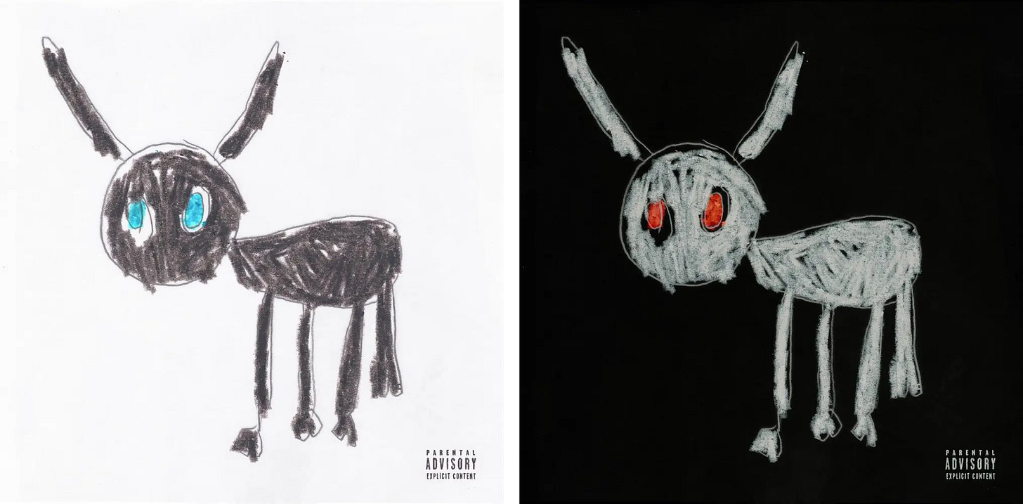
Love to see the artwork inverted, makes so much more sense now!