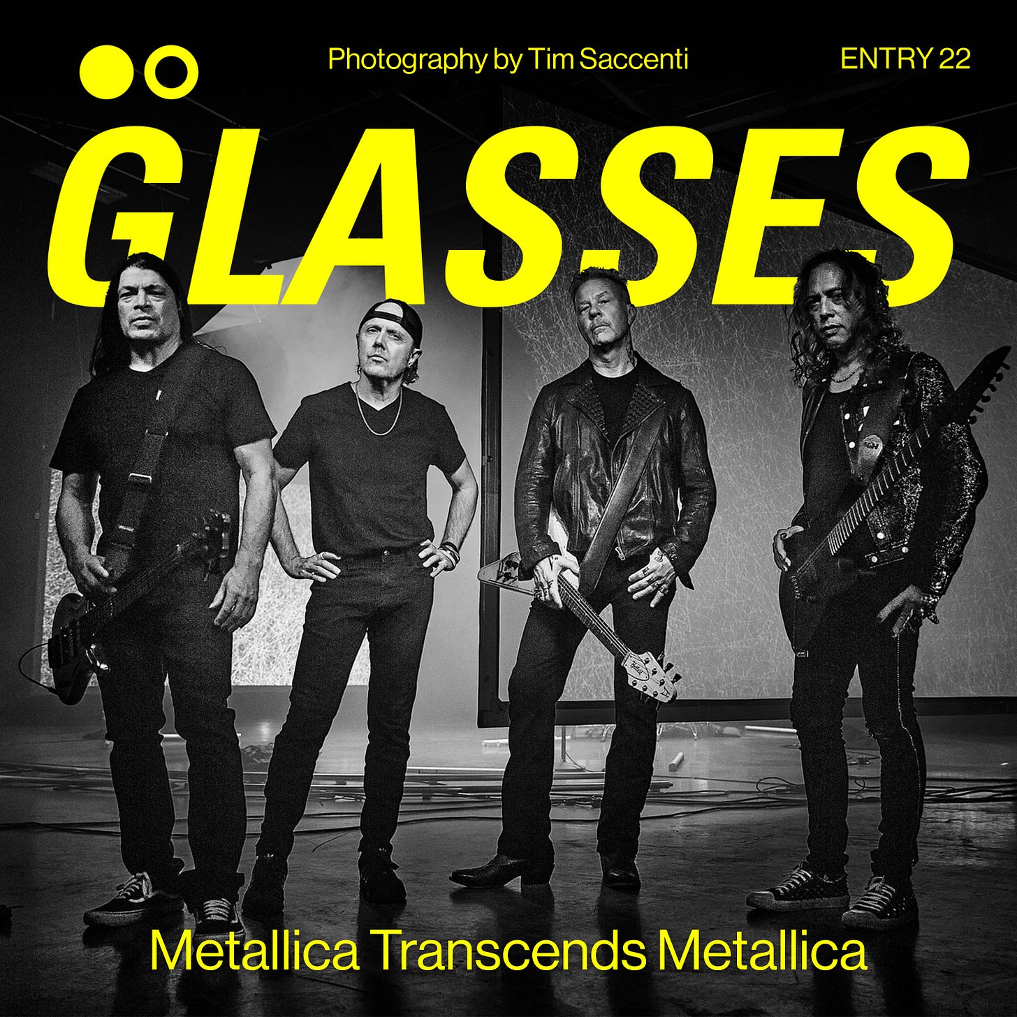
Metallica - 72 SEASONS | ALBUM COVER REVIEW: Metallica Transcends Metallica
ENTRY 22: the thrash pioneer's graphic statement
The biggest band in the world is back with another punishing return to form—and an appropriately polarising album cover.
The Album Cover
72 Seasons is Metallica’s 11th studio album. Their release schedule since 1997’s Reload has been quite spaced out, with five years being the minimum time between any studio album to date. The most being a whopping 8 years between 2008’s Death Magnetic, and 2016’s long-awaited Hardwired…To Self Destruct.
Now 7 years after Hardwired, we have their newest offering, 72 Seasons.
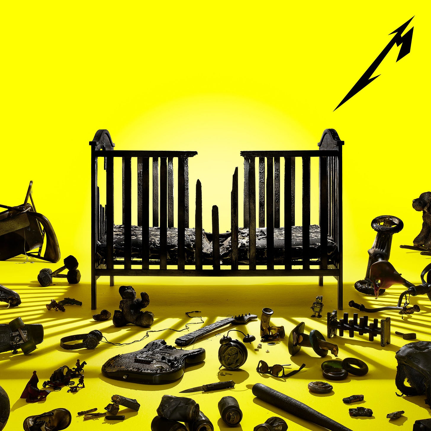
The album cover this time around has a blinding safety yellow background, with a rendering of a broken baby’s crib right in the middle. Surrounding the crib is a collection of various objects including a charred Fender, a steel chair, a tricycle, a baseball bat, and lots of other children’s toys. Everything here is a deep black, all looking like it was destroyed in a fire.
In the top right is the newer Metallica “M” logo, pointing to the middle of the cover. We don’t get the full Metallica word mark this time around, which feels important.
The Metallica logo is not only one of the most recognisable logos of all time, but one of the most parodied.
For the group not to include it in its full form is another way of them saying “we don’t need the logo.” They have enough name recognition at this point (you’d hope), that they don’t have to plaster every little bit of output with the full word mark for you to know who it is. So in a way, this is Metallica transcending “Metallica”.
When placing the new cover in context of their other studio releases, you can definitely see certain visual trends being created and then broken or played with.
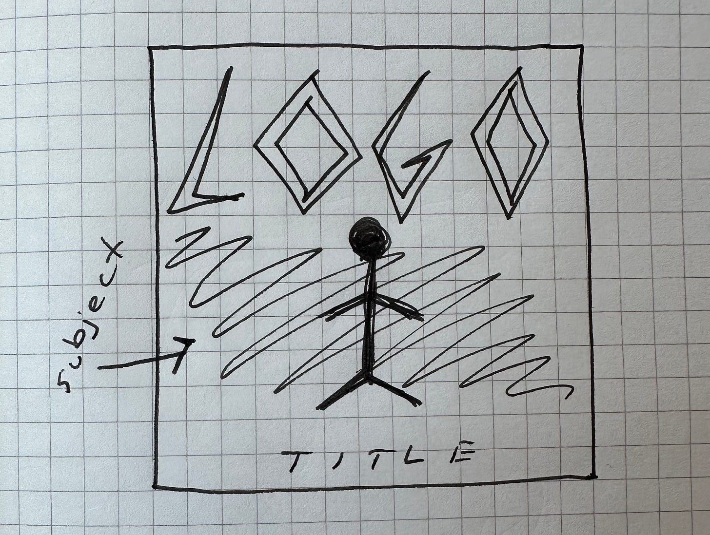
Up until St. Anger, there was a bit of a compositional formula for their covers, as is the case for most metal covers. Big band logo at the top, subject in the middle, and the title written at the bottom. Obviously there have been countless covers to not use this mould, but this tends to be the blueprint within the genre.
Compositionally, we are getting something different from their earlier releases. The subject remains in the middle, but there’s no huge and towering logo at the top or even a title written anywhere. On some webstore mockups though, there does exist the bands name and album title written in the top left. We obviously can’t be sure what will be on the actual physicals, so we’ll have to wait and see.
I hope the type doesn’t actually show up on the physicals. The scale of the scene is much more striking without it, and the “M” logo does a great job of leading our eyes to the middle, the album type sort of kills this.
Lead vocalist James Hetfield spoke about the album’s title in a recent interview:
"72 Seasons came out of a book I was reading about childhood, basically, and sorting out childhood as an adult. And 72 seasons is basically the first 18 years of your life. How do you evolve and grow and mature and develop your own ideas and identity of self after those first 72 seasons?”1
With the themes of childhood and growing up, the crib obviously makes sense, and the burned items around it look to me like things that may inform one’s identity as they age. You learn how to ride a bike, play the guitar, figure out what music you like, start lifting weights, etc. With this reading, the cover carries more weight for me. The broken bars in the crib appear to represent leaving that infantile state, growing up and moving on from this stage of your life.
The Peripherals
THE SINGLE COVERS
The single covers so far from this album run have been purely graphic and illustrative. The two in question, Lux Æterna and Screaming Suicide have sister covers that alternate in colour but match in composition and depiction. I actually really love these, I like how the team thought of creating this visual universe and considered all the touch-points leading up to the album cover.
I’m not sure why the Screaming Suicide cover’s M shadow bleeds off the page in the way that it does, as I much prefer the enclosed composition of Lux Æterna. They’ve stuck with the tight design language of safety yellow and true black, which is great to see. So far, the entire run and all of its peripherals have been entirely cohesive and utilise the same visual tools. Creative directors, please take note! This is absolutely the way to do it!
THE TOUR POSTER
The tour graphics are a tad underwhelming, but we do see the full Metallica logo here, showing that they obviously haven’t completely abandoned it. I suppose I like the burnt globe render, as it fits into the scene of the main cover, an item that could’ve been laying around the crib. I think I’m just not a huge fan of the serif they’ve chosen to use everywhere, I would’ve tried a more basic sans serif for this. I’m hoping the merch for this era is killer! A great opportunity to do some really fun work.
Overall Thoughts
I would say this cover is slowly growing on me, as I learn more about the album’s themes, it feels more substantial and thorough. The consistency of the bold colour palette here is lovely and refreshing for the band, recalling the bright immediacy of a cover like “Ride the Lightning” from 1984.
The singles have sounded incredible so far, and I’m praying the rest of the record sounds just as good!
https://metalinjection.net/news/james-hetfield-explains-the-meaning-behind-72-seasons


Big fan of the main image. The singles are slick, but I’m not sure they are so successful from a narrative point of view - I feel like it would have been nicer to see a different perspective on the main composition, or to focus in on one or two of the elements, much like they have for the tour poster with the globe. Overall really like it though, the yellow and black is very striking.