Metro Boomin - HEROES & VILLAINS | ALBUM COVER REVIEW: Metro's Hollow Homage to Pink Floyd
ENTRY 019: If you're gonna do it—go all the way.
The Atlanta super-producer returns without a sophomore slump in sight.
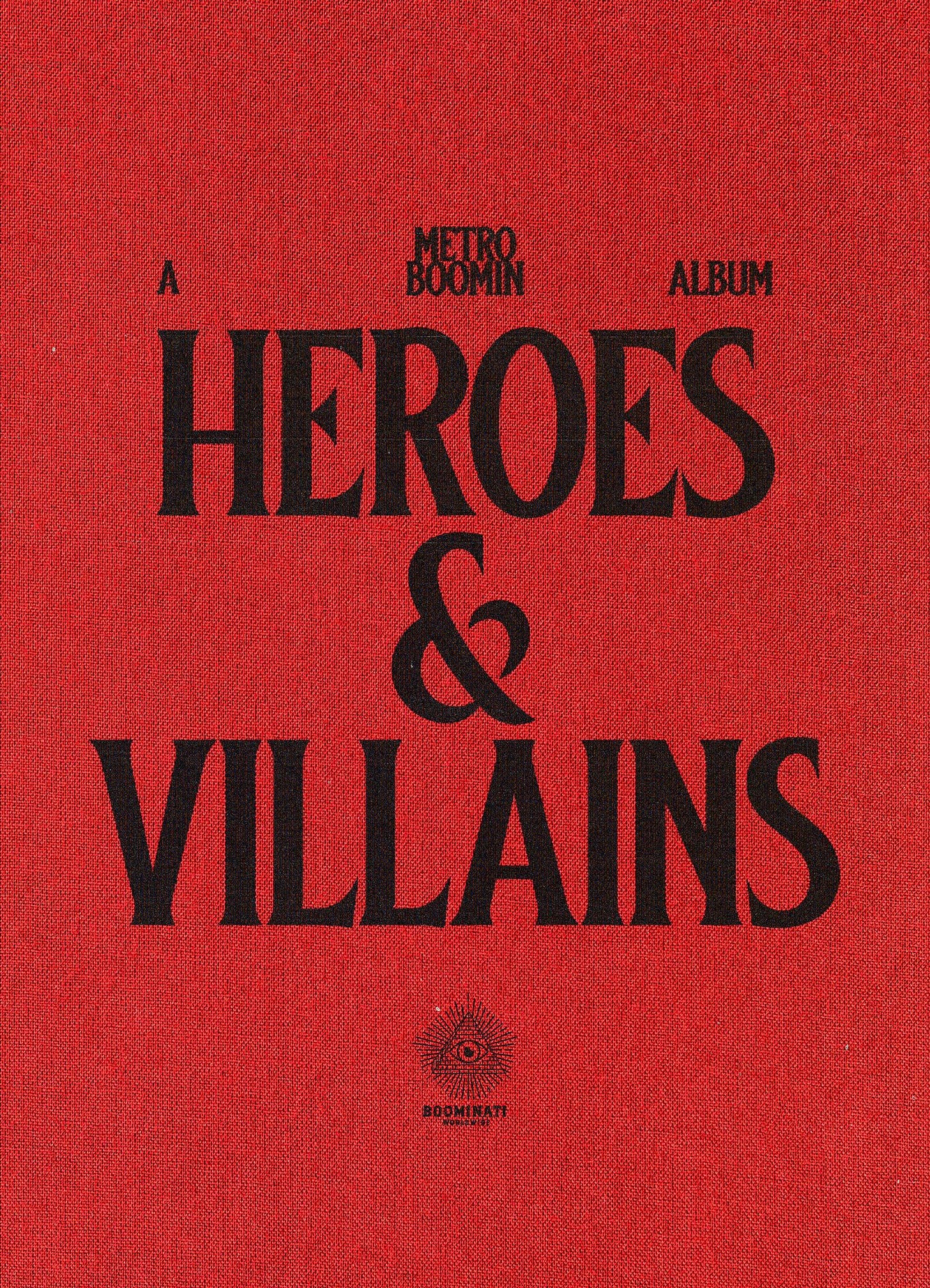
HEROES & VILLAINS
Metro Boomin
HEROES & VILLAINS is Metro Boomin’s second “solo” studio album, and fifth studio album overall (including collaborative efforts).
Not only is the title a continuation of his first album Not All Heroes Wear Capes, but it’s also a visual nod with the incorporation of fire on the VILLAINS cover. Capes featured an almost full coverage of a fiery explosion, whereas VILLAINS has fire only on the left-side Metro, all contained in this elegant cream frame.
The Empty Pink Floyd Homage
Metro is doing an homage to the cover of Pink Floyd’s 1975 album, Wish You Were Here. The problem is, it's a completely hollow reference.
Wish You Were Here was Pink Floyd’s first album after 1973’s massive mainstream entry The Dark Side of The Moon, and it's packed with meaning for the band.
“The title clearly derives from the theme of absence. It is an ironic request that implies the opposite, referring to postcards sent from abroad by people who are probably rather pleased that you’re not around. Your absence is what is wished for, not your presence. Accordingly a postcard came with every vinyl package.”
— Aubrey Powell and Storm Thorgerson, “100 Best Album Covers: The Stories Behind the Sleeves, Wish You Were Here”
HEROES & VILLAINS doesn't really have any kind of similar themes at all, it’s just a cool visual reference. Even Floyd’s use of the man on fire was fully intentional and fits with the album.
“The theme of the album duly surfaced as “absence” — emotional and physical absence. In relationships, when people withdraw their commitment — their emotional presence — and become absent, it is often for fear of getting hurt or being “burned.” Hence a burning man — a man on fire.”
— Powell
As far as I know, Metro’s team didn’t use practical effects for the shot either, it’s all digital. If he comes out with some behind the scenes and I’m dead wrong, I’ll shamelessly eat my words and give credit where it’s due! For WYWH, they actually lit the guy (stuntman Ronnie Rondell) on fire after covering him in gasoline.
The Peripherals
Reference-based critiques aside, this album cover is pretty great. Featuring photography from Gunner Stahl, the cover is technically well done and convincing. It’s got a lovely cream-coloured frame around the photo, rather than a pure white one like the original. Metro stuck with a striking black background behind the figures, contrasting nicely against the cream frame. There’s also an all-black parental sticker below the photo. Like Pink Floyd’s, this cover scales quite well, as the black rectangle on white square is very recognisable even at the tiniest of sizes. It reminds me of Blonde by Frank Ocean in this way too!
HEROES & VILLAINS received a pretty massive rollout with many different pieces. This is great because it means that creative professionals were (hopefully) paid well to build out each individual piece of the album. We have photography from Gunner Stahl and Elissa Salas, title typography from Mihailo Andic (one of my contemporary design heroes), comic book covers from Alejandro Tordezailart, video work from Hidji World, and so much more! This group of creatives damn near matches up with the hefty list of features on the album.


These peripherals, all done by top creative professionals in their respective fields, are insanely cool and unbelievably well done on their own. Together though, I feel like it all unfortunately falls apart. There’s almost zero cohesion across the visuals. You have the slick photography and compositing on the cover, the gritty and textural title typography, the cartoony and expressive comic book covers, and the movie-style billboards. When you bring in this many creatives from this many fields, you gotta have someone at the top making sure it all works together. Otherwise, it just feels detached from itself, lacking the kind of consideration a rollout like this one deserves.
Do you like the disjointed and varied nature of the rollout, or would you prefer a more visually-united collection? Please let me know!
Final Thoughts
Look, this is not an article where I shit on hip-hop (which I obviously adore) in favour of “““real music””” like classic rock—but you have to admit, the way Pink Floyd and co. did theirs is way more interesting and engaging. With not only a complete thematic tie in, but the practical effects they employed to pull this off, they created an entire universe around the album. Without these pivotal thematic ties and (frankly, dangerous) commitment to practicality, Metro’s reference ends up feeling empty and superficial.


metro boomin make it boom