Miley Cyrus - ENDLESS SUMMER VACATION | ALBUM COVER REVIEW: Modern Pop's Reference Culture
ENTRY 021
Miley Cyrus is back with her best album cover yet.
The Album Cover
Endless Summer Vacation is Miley Cyrus’ eighth studio album.
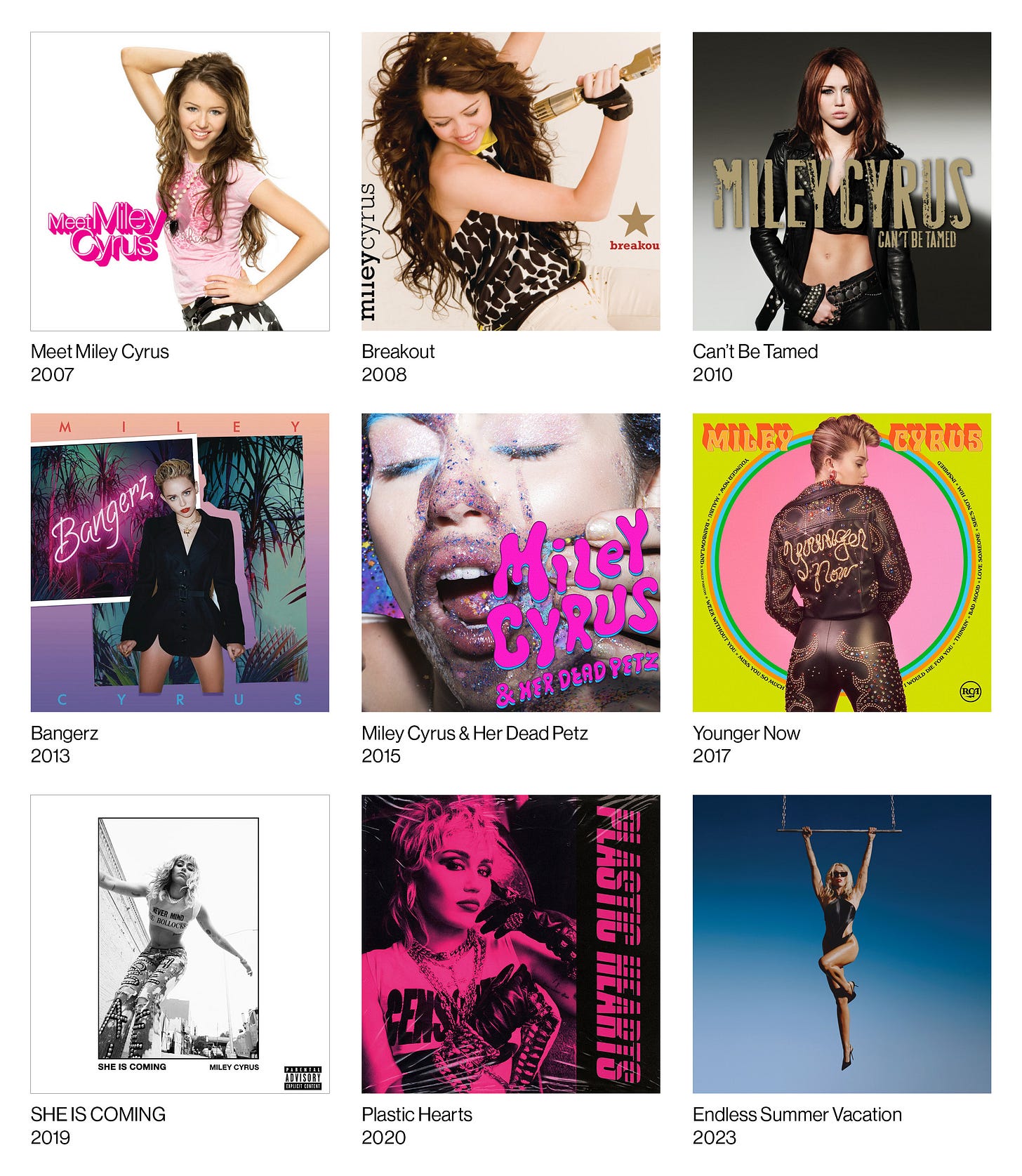
Miley has been in the music industry for 16 years now, with her debut album coming out in 2007. It’s crazy to think that we watched her grow up from a Disney sensation all the way to a legitimate pop & rock star, carrying one of the most expressive and powerful singing voices in recent memory.
Placing her new album cover in context, each one features Miley herself, most with wide shots, and one close up on Miley Cyrus & Her Dead Petz.
Endless Summer Vacation is the only cover of hers not to feature notable typography or graphic intervention of some sort. One of my favourites being Younger Now’s perfect homage to classic country album covers, with its bright colour palette, cheesy typography, and opulent wardrobe. The other being She Is Coming, with the minimal white-framed layout, the simple Helvetica type, parental sticker, and the shot of Miley in her punk-inspired outfit.
Plastic Hearts…as good as an album and career move that was for Miley, and boy do I mean that, this cover does not work that well. I never liked this cover, it doesn’t feel referential in the same way the music does, calling back to 80s hard rock and pop. Also, I understand it’s in the title, but the fake plastic wrap is just not the move. Even the physical vinyl, wrapped in real plastic, has the fake plastic texture baked in.
All that being said, this new album cover of hers is my favourite so far! It’s up there with the other two I mentioned, and man is it perfectly executed.
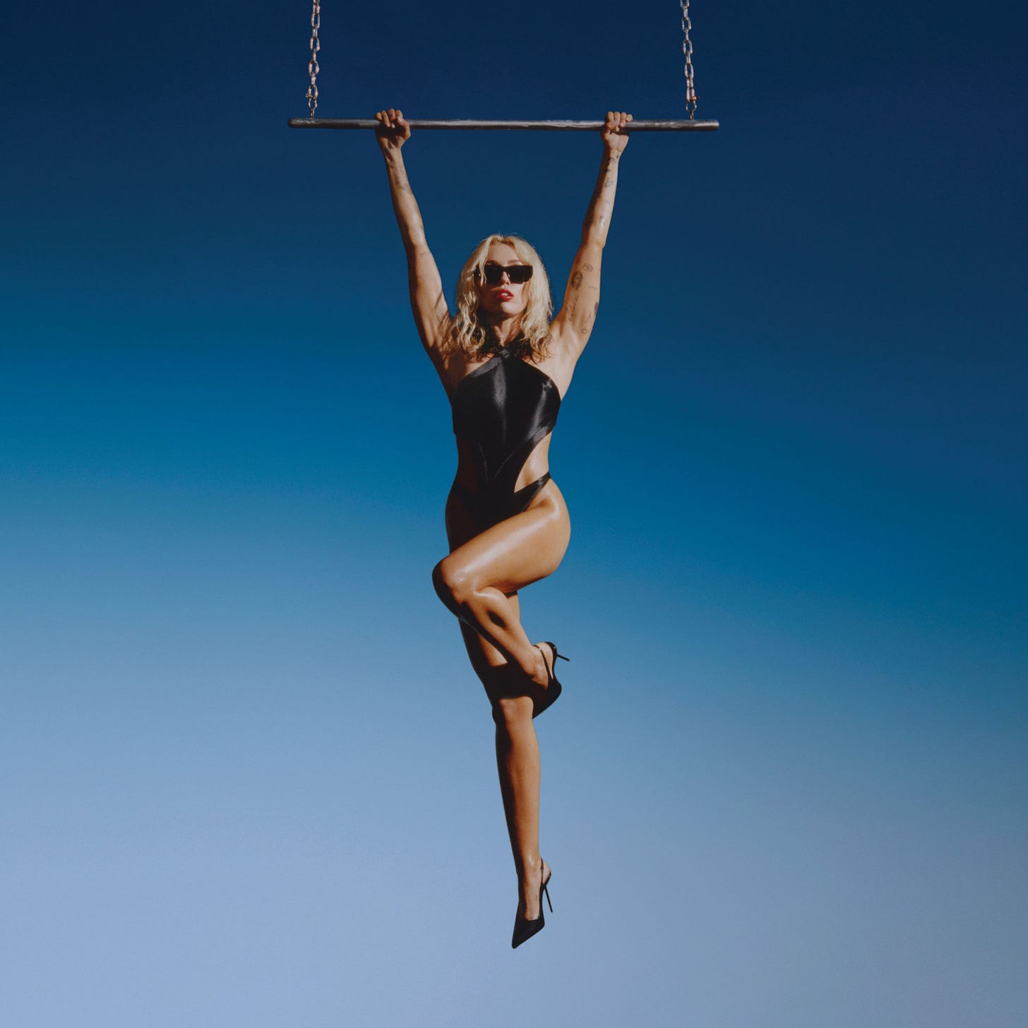
Shot by Brianna Capozzi, the cover features Miley hanging by her hands from a chained-up trapeze, seemingly in thin air. She’s got on a tight black leotard, black heels, shades, and red lipstick. Her signature blonde locks cascade down her shoulders like sunlight.
“According to a press release, the stunt was fully executed by Cyrus for the cover without using any visual effects.”1
The strongest part of the cover may be the sparse composition. I love the gradient backdrop, it provides a great surface for Miley’s figure to stand right out, and adds a surreal element to what’s being depicted. It looks like she’s hanging in the middle of actual nowhere, with nothing underneath her. If we see the blue as the sky, then where would the trapeze be coming from? My friend also pointed out that because of her heels, how would she even land on the ground?
The colour grading is A1, it has this ever so slight glow to it, making it feel timeless and a bit retro. It also seems like the black point has been reduced just a touch, to give it a more faded and ethereal look. I can only imagine how great this cover will look on vinyl or CD, with a big beautiful hype sticker on top, housing all the necessary type.
The Visual References
Miley, similarly to Metro Boomin and SZA in late 2022, is referencing a few visuals with this shot. Firstly, and most notably, it appears to be a stark visual reference to a famous shot from Madonna’s 1992 coffee table book, Sex.
Madonna is also suspended from a mystery trapeze, this time fully nude, over an expansive body of water. Sex, inspired by punk rock and high fashion, was a controversial release at the time, many describing it as “hardcore pornography”.
Culturally, this reference makes perfect sense, as Miley has always been inspired by Madonna, even dueting on stage during her 2014 MTV Unplugged set.
"I grew up listening to Madonna and a lot of what she represented for me is what I try to rep to girls now, is not being afraid of sexuality and really being who you want to be and doing what you want to do…”2
Both have been notable figures of sexual liberation in popular culture, as well as generally controversial and polarising over their careers.
…but wait
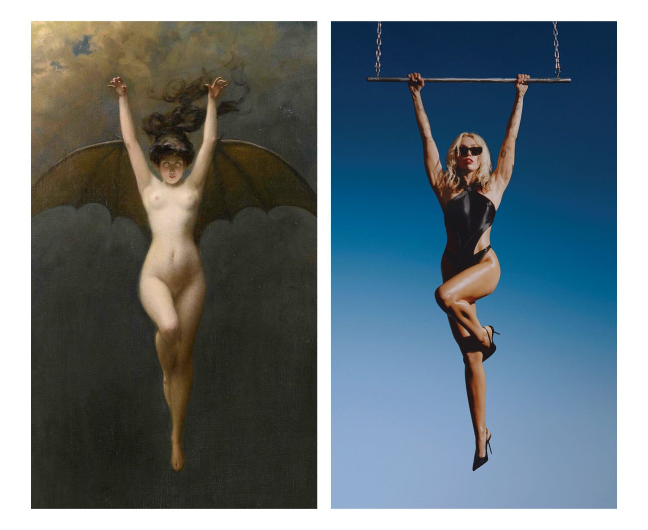
There’s another visual reference that can’t be overlooked. Albert Joseph Pénot’s 1890 painting, “La Femme Chauve-Souris”.
Twitter user @Ia_vie_en_rose posted a picture of the painting under the announcement for the cover, intriguing me to look into it more.
Reed Enger, writer for Obelisk, “a place to explore the wildly diverse world of art history”, speaks of the painting’s otherworldly qualities.
“…walking the line between pinup exploitation and—a sort of empowered ferocity.”3
Miley’s pose almost exactly mimicking “The Bat Woman” definitely does evoke this “empowered ferocity,” with its tight triangle shape, pointing directly down the page. The addition of sharp heels on Miley accentuates the powerful tip of the triangle. The angle of their outstretched arms is almost identical, as well as the curling up of their legs.
Enger also mentions how Pénot’s works will miraculously come back decades later in different ways. This holds true for this new reference, and might make sense as to how Capozzi and company may have come across the painting.
“And occasionally one of their works hits a nerve centuries later, reappearing, usually uncredited, to haunt the fringes of the popular consciousness.”
What’s also notable is the gradient background found on Pénot’s painting. Enger appropriately describes them as “cloudy chiroscuro skies”, opposed to Miley’s clean blue gradient, also mimicking a sky.
My theory is that Capozzi, Miley, and the creative team wanted to evoke this same power and mystique found in “La Femme Chauve-Souris”, paired with the culturally controversial and liberating shot from Madonna’s Sex book, to aptly represent this seemingly “New Miley” teased in the promo.
The Peripherals
Speaking of promo, Jacob Bixenman’s creative direction here is similarly bare and minimal. Leading up to the album, there were posters across the globe with white on black type, featuring quotes from the music, along with the repeating line “NEW YEAR NEW MILEY”.
She posted these on social media as well, and both work in their respective physical arenas. The simple use of Helvetica Condensed pairs beautifully next to the striking photography, and both successfully compliment each other just as they should. I imagine this will be how the hype stickers on the physicals will be designed too.
I’m a huge fan of the way this album has been rolled out so far. I was intrigued by the “NEW YEAR NEW MILEY” tagline, and am definitely sticking around to see what else it might mean for this era of Miley.
What do you think of the cover? Do you think Miley is referencing Madonna or 20th Century French painter Albert Joseph Pénot?


