A Post Malone album cover announcement has always been special, but this time, it feels a bit different.
The Album Cover

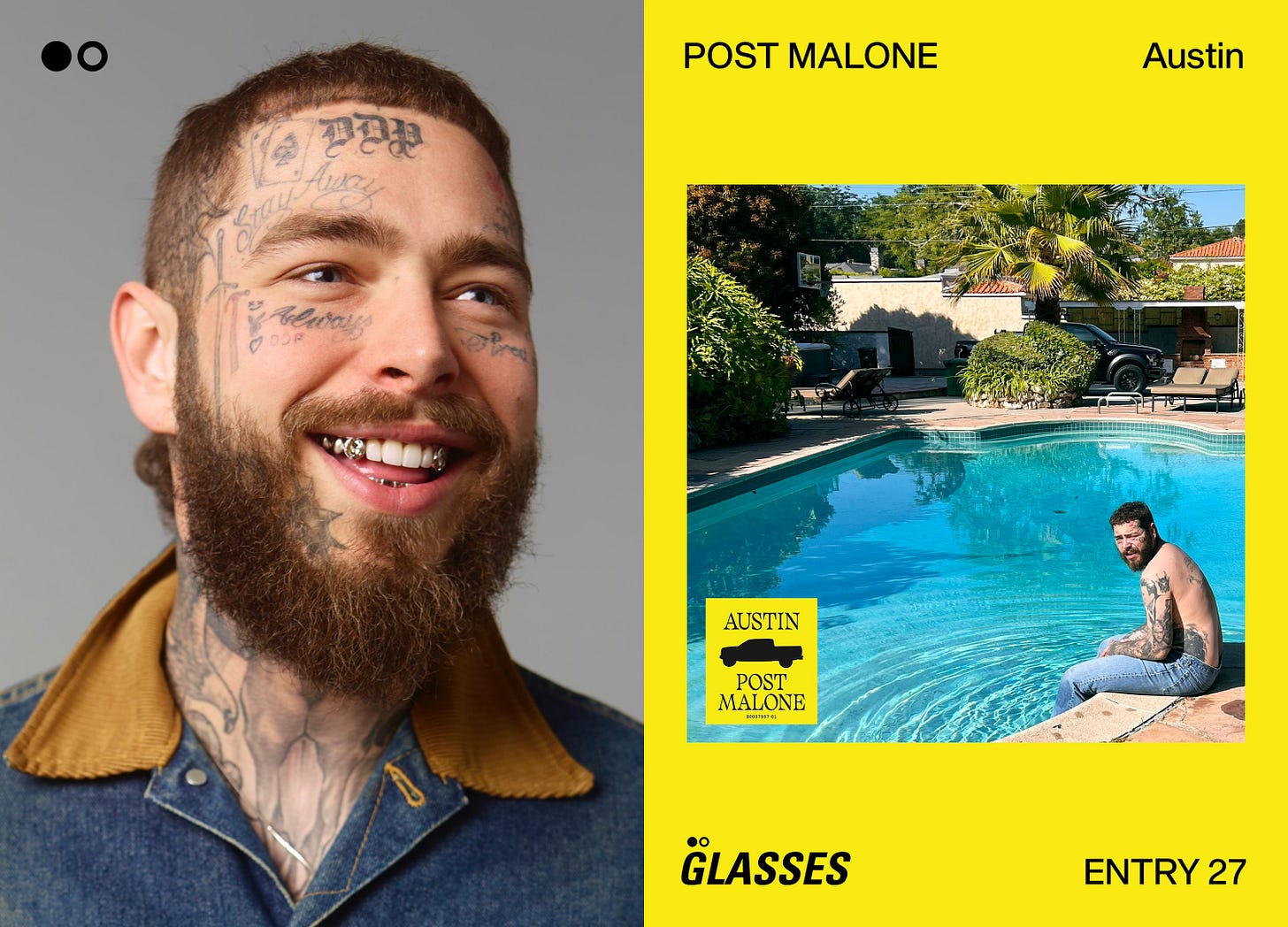
AUSTIN is Post Malone’s fifth studio album, and will be released July 28, 2023. As of writing this, the album, tour, and cover were all announced the other day, so this review is hot off the presses.
Depicted is a shirtless, blue jeaned Post Malone with his feet dangling in a private pool. The setting looks like one of his homes presumably, and it all looks very expensive.
The only graphic intervention on the cover is the construction yellow sticker in the bottom left, which contains the album title, his name, a silhouette of a Ford Raptor, and the album’s UPC. I’m not sure of the Raptor’s significance beyond being in the background of the shot, maybe it’s got more importance than just the iconography. I confirmed with PLAYLAB on Instagram, that the version with the yellow sticker is the official, as the plain photo has been posted a few times online.
update from editor Sam: the album has been added to Apple Music, and contrary to what PLAYLAB told me, for some reason, it does not show the yellow sticker. interesting.
Everything was done by PLAYLAB, INC., a Los Angeles-based creative studio founded in 2009. They’ve worked on Virgil Abloh’s “ARTWORK” catalog-book, Drake’s Scorpion retail pop-up, along with Post’s last album, 2022’s Twelve Carat Toothache.
PLAYLAB has some great work, and they’re clearly a very imaginative studio, but yeah, I’m honestly not too into this cover as of now. It doesn’t stack up to any of his first three album covers, not even a little bit, but honestly, Post may be wanting to distance himself from that more high production, high budget aesthetic that ruled his early career. Perhaps he feels it masked who he’s really trying to show himself to be.

I associate Post Malone with those dark Bryan Rivera/Travis Brothers era graphics so heavily that these new ones feel weird and uncanny. Boy, do I not envy these guys for having to take the creative reigns off of Studio Pending, can you imagine following them up on an undertaking like this? Hats off to PLAYLAB INC., and I sincerely mean that.
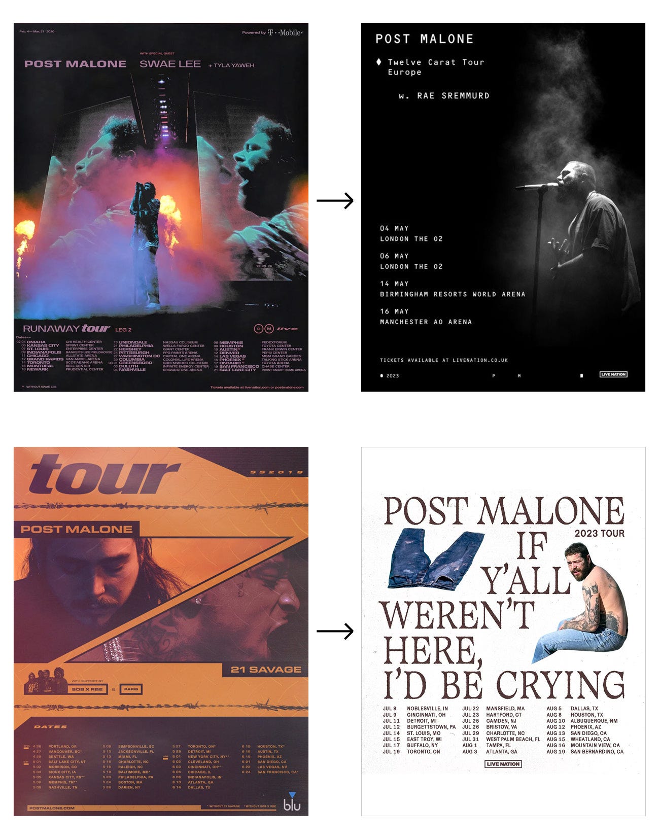
Even when looking at the peripherals like tour posters, comparing the two eras is just unfair. We went from the left to the right.
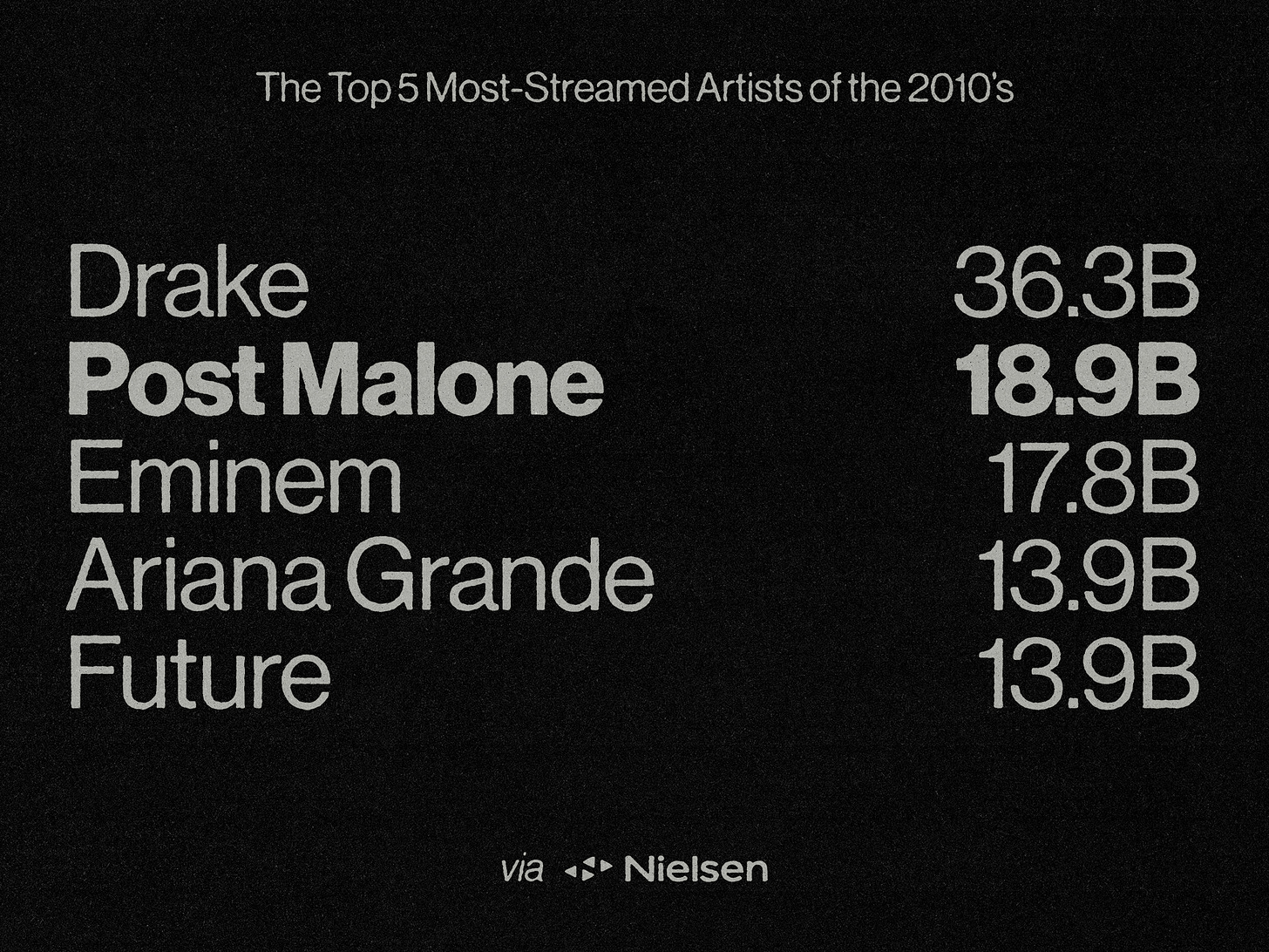
I know nothing lasts forever and things have to change, I fully get that, his music is changing too, and I’ve loved everything so far. This just doesn’t feel like the right move. It’s like some weird industry switch was flipped on him because there was a time in 2018-19 where if he so much as dropped a song, the world stopped and listened. Now, I don’t know why, but things don’t seem to be connecting to the masses nearly as much as they used to. I don’t know why, but it makes me sad!
When considering his numbers drop off, never ever forget this graphic.
As far as the actual photo of Post, it looks like it was shot on iPhone, which paired with the whole “government name self-titled album” thing, leads to us getting a “real” album, something maybe more personal. There’s nothing wrong with shooting on iPhone, obviously, we’ve gotten to a place where when edited, you can barely tell the difference between it and a proper DSLR. It’s just something to note with an artist of this scale.
Post may have just wanted this more raw feeling, which funny enough is very similar to Jack Harlow’s recent project, Jackman. 50% of you rated that cover “meh” by the way lol. Government first name, no typography, no graphics, just an uninterrupted full-frame photo of the (shirtless) artist. Now realising how weird it is that they’re both shirtless, I’m surprised nobody’s mentioned this yet.
Final Thoughts
Look, I don’t know what happened behind the scenes, but I really wish they’d stuck with Studio Pending, as I wholeheartedly believe they would've come up with a more effecting and engaging way to represent this more stripped back approach to Posty’s career. I’ve never seen a miss from them, and their output was and continues to be foundational to who I am as a maker and designer. I think this current AUSTIN rollout is kinda lazy thus far, a bit goofy, and left so much on the table in terms of creativity and exploration.
Again, I have to emphatically reiterate, when you don’t like the visuals of something, the designers and creative team are not always to blame. The artist will sometimes just have a vision and want to stick to it, leading the creatives to follow suit, whether they like it or not. I think that’s probably what happened here, and hey, whatever. These things happen. Regardless of the extremely lacklustre visuals so far, I’m loving the singles we have, and am highly anticipating the rest of the album.


I also noticed the link between posty and jack!! Great read as always