SZA - SOS | ALBUM COVER REVIEW: SZA's Impressive Commitment to Nature
ENTRY 020

SZA’s record-breaking sophomore album is finally here, let’s dive in!
The Album Cover
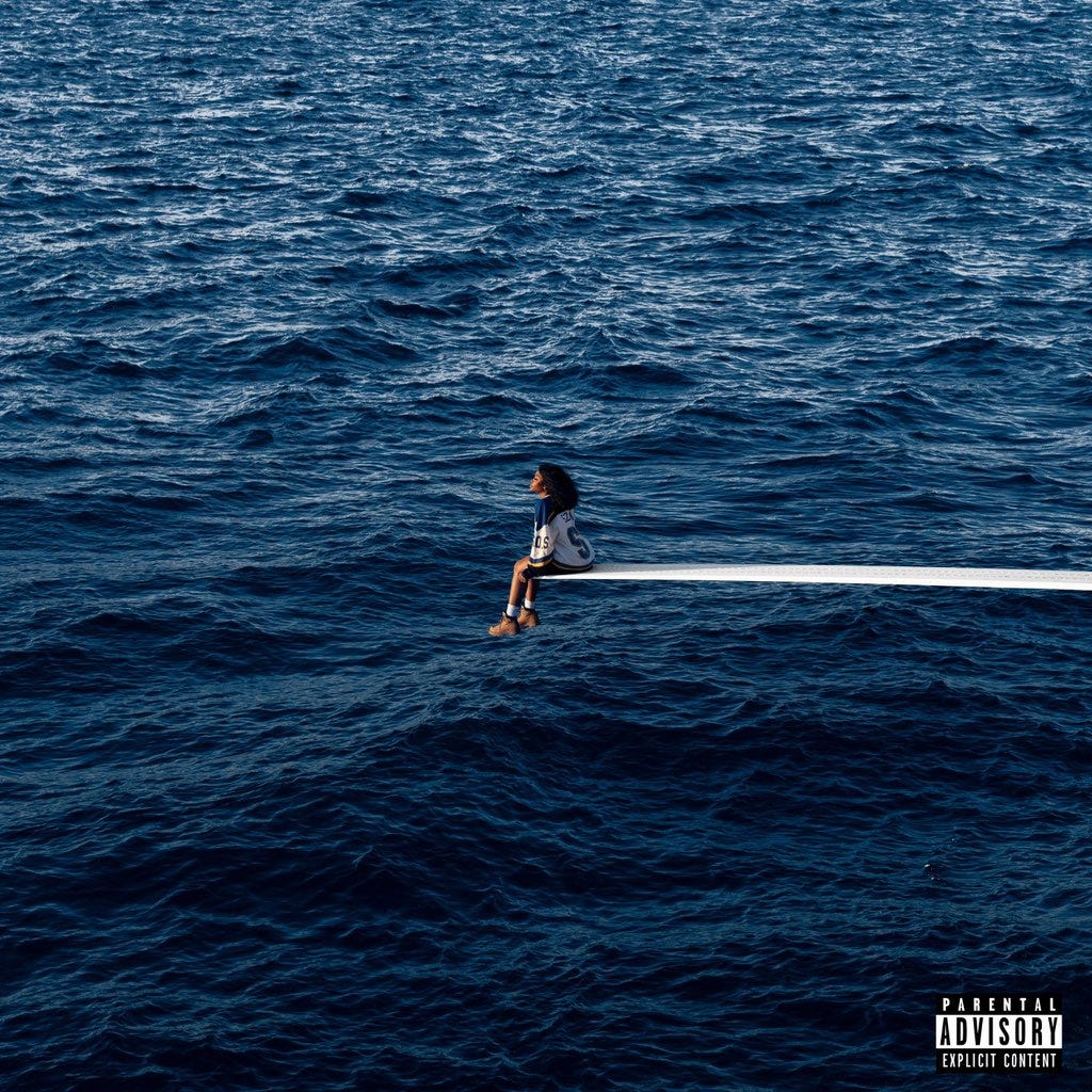
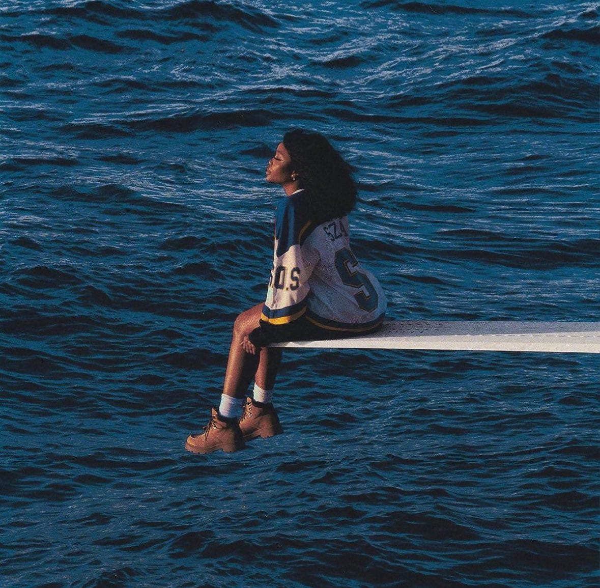
SOS is SZA’s second studio album.
Starting off, there are actually a lot of similarities between her first and second album covers.
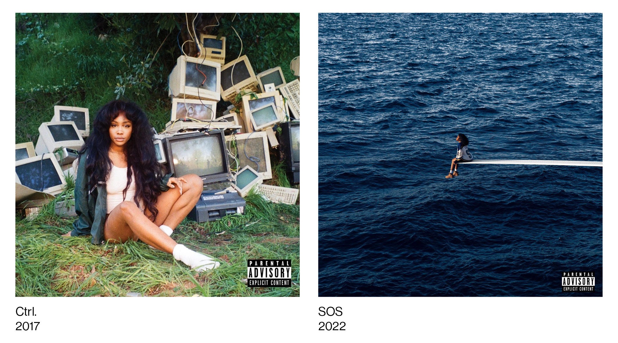
Both are full-bleed photographic covers, with Ctrl being shot by Sage Adams, and SOS by Daniel Sannwald.
Because Ctrl was her debut album, it seems like SZA wanted to be more direct and personal with the visual. SZA is prominent in the frame and dominates the scene. She looks directly into the camera, with no typography in sight to distract from her stare. With SOS being her sophomore effort, this allows her to take more of a backseat, being swallowed up by the sprawling sea around her.
Both album covers are shot in nature; Ctrl showing SZA sat on a grassy plain, and SOS with her over an expansive body of water. At the same time, both scenes include manmade elements. Ctrl’s old boxy computers scattered behind her like piles of garbage at a dump, and SOS’s lengthy diving board, extending into the middle of the frame, seemingly out of nowhere. To me this reads as a conceptual bridging of the gap between her classic soul/R&B influences and the contemporary flares that she mixes together in her music.
Princess Diana
This album cover is a direct reference to a famous photograph of the late Princess Diana.

The photo on the left features Diana in 1997, sat at the end of a white diving board, on a yacht in Italy.
Originally I was supposed to be on top of a shipping barge, but in the references that I pulled for that, I pulled the Diana reference, because I just loved how isolated she felt, and that was what I wanted to convey the most.
SZA, Hot97 Interview
SZA’s vision of capturing this same isolation falls short due to some key details in her shot. Twitter user @blkboyshine makes an important distinction and critique of the recreation:


I couldn’t agree more, as the moods of the photos don’t match at all. While still a gorgeous piece, SZA looks like she’s free, like things are going to work out for her. Diana looks dejected, with her slumped over posture, arm on shoulder, and crossed feet. SZA on the other hand is looking upwards, with the sun shining directly on her, evoking that pivotal hopeful feeling @blkboyshine is talking about.
Viktor’s Version
The original composition and colours of the original are effective, but it’s worth noting designer Viktor H’s “version” of the cover. It features a closer crop of SZA with a different colour grading and textural treatment.
Online, a lot of people mentioned they wished this was the official cover, and I agree! While the original shot captures that wide atmosphere it seems they were going for, Viktor’s version feels more personal, and I love the way the colours of the waves change to a deeper indigo as well.
Final Thoughts
Overall, the creative team did a wonderful job pulling this run together. Both a visually and emotionally striking cover, this is a great continuation of SZA’s discography, and excites me for whatever she has next (even if we have to wait ten years). Will the settings and heavy inclusions of nature continue, or will she try something more graphic and abstract next time?