Tyler, The Creator - CMIYGL: The Estate Sale | ALBUM COVER REVIEW
ENTRY 25: tyler and his love for alternate album covers
We’ve had a couple weeks to digest the new tracks and visuals from Tyler, The Creator’s latest expansion pack, and lemme tell you…
The Album Cover
The Estate Sale is a collection of tracks that didn’t make the original standard version of CMIYGL, Tyler’s killer 2021 album. Before we really talk about this new cover, we should quickly discuss the standard edition.
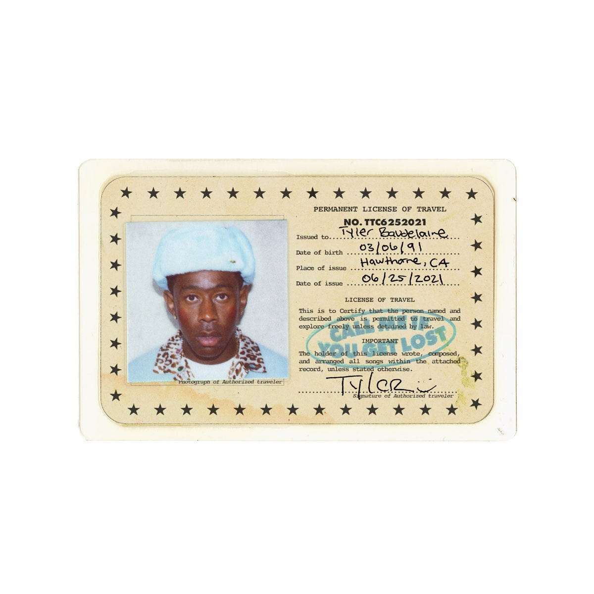
CALL ME IF YOU GET LOST
I adore this album cover, in a year of Donda’s and CLB’s, it was so great to see Tyler continue to commit to great visuals to accompany his music. This one’s incredibly minimal, with a pure white background, and a really vintage passport of Tyler dead-centre. In different release contexts, the passport card’s colour would change. Different streaming services have different colours, as well as the physical releases. This is so fun, as it not only creates natural incentive to seek out those physicals to add to your collection, but it makes your copy feel that much more unique.
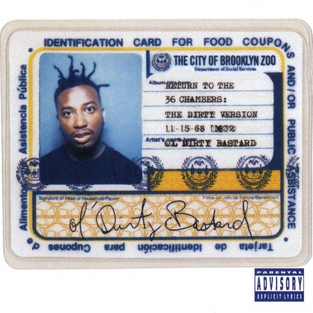
The immediate visual comparison that comes to mind is Ol’ Dirty Bastard’s Return to the 36 Chambers: The Dirty Version, from 1995.
Fans speculated that Tyler was influenced by ODB here, but he actually put the rumour to bed on Twitter early on.
The Estate Sale
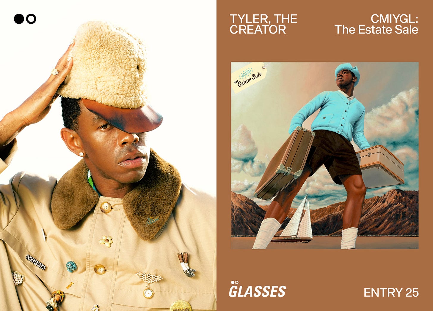
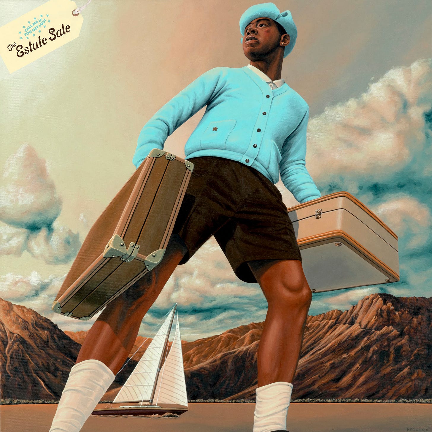
Onto The Estate Sale cover, unsurprisingly, this cover is also absolutely nuts and done entirely without error. We’ve seen this image before during the original release run, but this time it's re-packaged and has a new typographic title element.
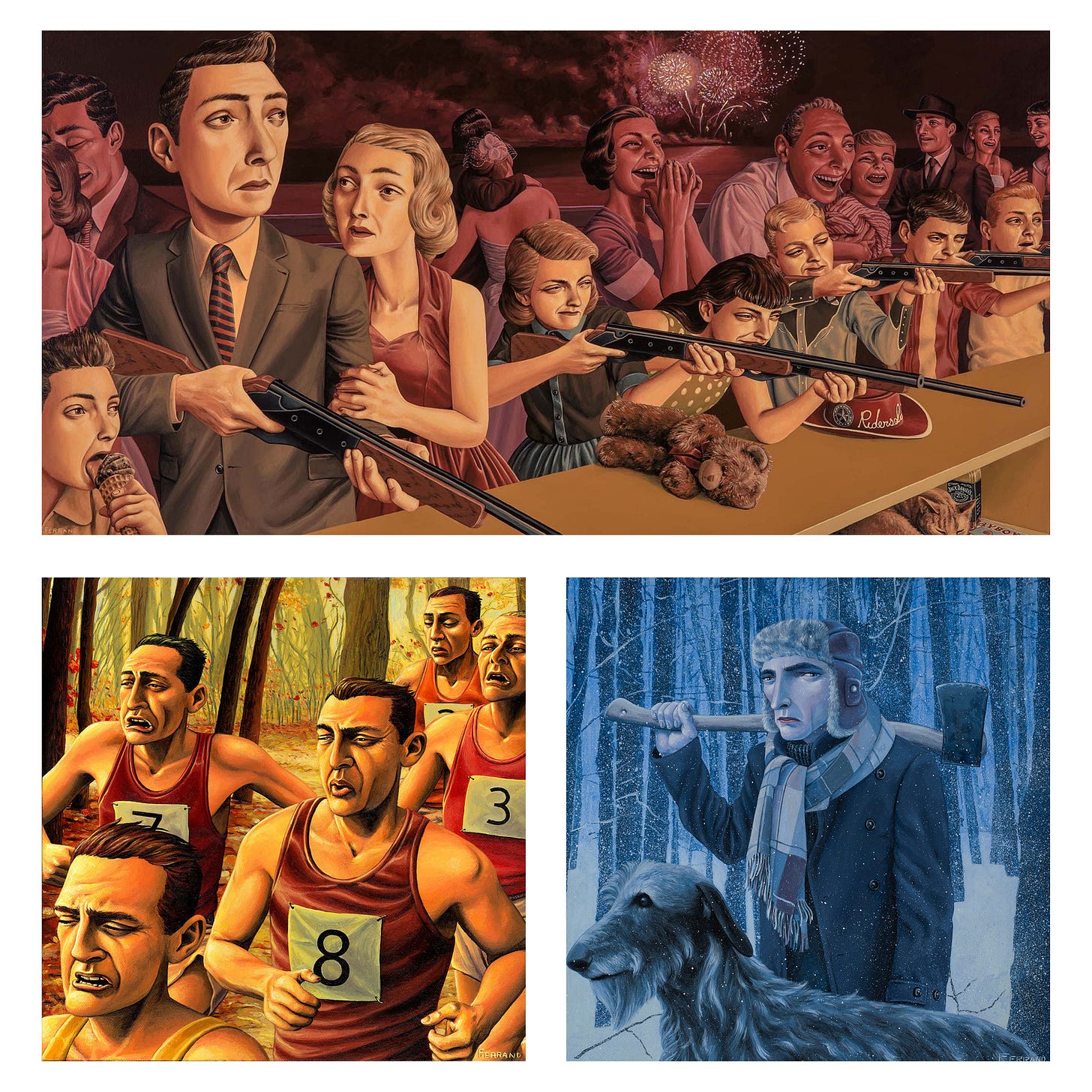
The cover was done by Gregory Ferrand, an American painter and artist, whose paintings “explore the disconnection and alienation we often feel despite (and sometimes because of) the close proximity in which we live to one and other.”1
Bob Flynn on Twitter rightfully states—
“I think it's important to highlight musicians and artists who continue to hire and pay visual artists to illustrate and design for them.”
Tyler has a history of hiring high level creatives to make covers and alternate covers (like this one) for him, which we love to see.
I like that this new expanded edition literally “expands” the feel of the cover, by giving this very wide, almost fish-eye shot of Tyler from below, standing in the vast scenery. Compared to the conservative feel of the standard edition, this one feels more sprawling and adventurous, like we hit the zoom out button and can see so much more now.
Texturally, the cover is smooth, as Ferrand’s perception of lighting and shadow are immaculate, but he retains the painterly qualities you’d want from a piece like this. In certain areas, like the clouds and Tyler’s bright blue sweater, you can actually see the grain of the canvas itself, which is a great little detail.
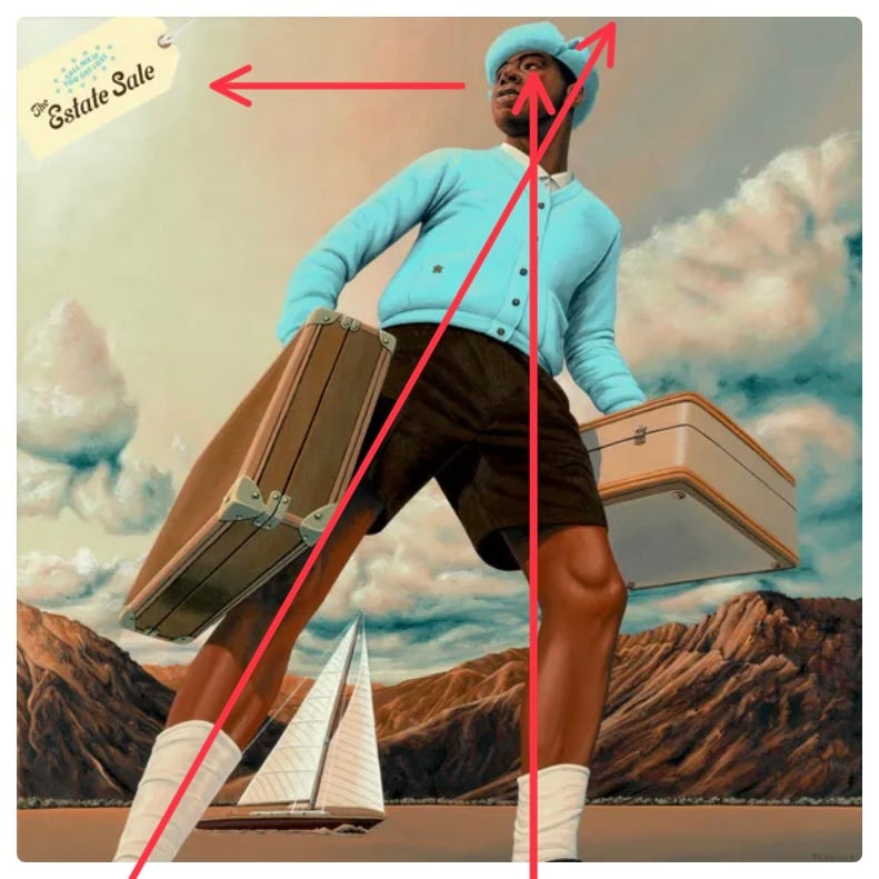
The angle they chose for Tyler to be shown at does wonders for the composition of the cover, as it creates so much movement. It’s got similar formal qualities to the recent 6LACK cover, with a strong triangle shape being created by Tyler’s stance and form.
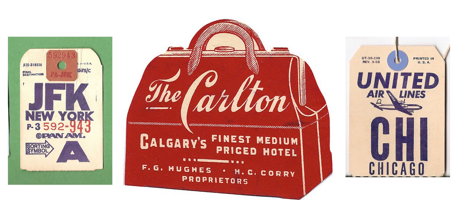
It leads our eyes perfectly up the page to Tyler’s mysterious gaze, which is then peering over to the left, where our title typography lands. The type is inspired by vintage luggage tags and printed media from the 20th century, with its eccentric script font and coloured stamp.
Overall, I’m so happy to see Tyler continuing to take extreme care with each of his visual releases, as he’s easily one of the more influential characters we have in music today. Hopefully his careful hand is studied and iterated upon for years to come, as newer generations of artists come to light, following in his footsteps.


